Style combination · Contrasts
Contemporary Chinese Book Design × Ma
Both leave paper empty and slow the eye, but wabi-sabi prizes the worn, imperfect thing, while these books are precisely engineered, industrially printed objects whose roughness is designed; use wabi-sabi when the patina should be real.
Mix them and make something Contemporary Chinese Book Design Ma
01
What each style brings
Each part of the design comes from the style with the stronger say in it, and each style gives at least two.
Contemporary Chinese Book Design ('Most Beautiful Books of China') Ma & Wabi-sabi Aesthetics
- Type from Contemporary Chinese Book Design
- Colour from Ma
- Form from Ma
- Composition from Contemporary Chinese Book Design
- Surface from Contemporary Chinese Book Design
02
The type
Open fonts standing in for each style’s own type, which is often hand-drawn or commercial.
Display · Contemporary Chinese Book Design
Calm
Shippori Mincho, standing in for Song (Songti), imitation-Song (Fangsong) and Kai (Kaiti, a common printing face modelled on handwritten regular script) text type, the standard faces of the Chinese book, for vertical or horizontal text; Order – The Story of Fangyuan Bookshop (2016) runs its script both ways in one book
Text · Contemporary Chinese Book Design
Chinese book design since 2003, when Shanghai founded the yearly 'Most Beautiful Books of China' award, whose winners go on to Leipzig. The whole book is designed as an object to handle: sewing bared on an open spine, roughened or deckled edges, coloured or gilded fore-edges, blind-pressed marks, leaves left closed at the fold, accordion and loose-sheet formats. Vertical and horizontal Chinese text, ink painting and quiet photography sit in wide margins on cream, kraft and ribbed papers, often with a single red.
Shippori Mincho; Contemporary Chinese Book Design used Song (Songti), imitation-Song (Fangsong) and Kai (Kaiti, a common printing face modelled on handwritten regular script) text type, the standard faces of the Chinese book, for vertical or horizontal text; Order – The Story of Fangyuan Bookshop (2016) runs its script both ways in one book and Characters taken from old woodcut-printed books, used as subheads in The Art of Gardening (2018) to give the new page a calligraphic flavour
03
The colours
The ground and leading colours come from Ma, with a counter-accent from Contemporary Chinese Book Design. The ink reads on the ground at 4.5:1 or more.
Contemporary Chinese Book Design ('Most Beautiful Books of China') Ma & Wabi-sabi Aesthetics
-
#e9e4d8ground · 36% -
#2b2a28ink · 14% -
#7d4e3aaccent · 18% -
#b0342aaccent · 14% -
#b9a88aaccent · 10% -
#a8925aaccent · 8%
As CSS
:root {
  --ground: #e9e4d8;
  --ink: #2b2a28;
  --accent-1: #7d4e3a;
  --accent-2: #b0342a;
  --accent-3: #b9a88a;
  --accent-4: #a8925a;
  --font-display: "Shippori Mincho", serif;
  --font-text: "Shippori Mincho", serif;
}
Use it with care
Contemporary Chinese Book Design ('Most Beautiful Books of China'): Have every Chinese character set and proofread by a fluent reader: image models invent pseudo-characters, and mirrored or random hanzi used as texture read as nonsense. These are recent designs by living designers and publishers, so commission or credit them rather than copying a prize-winning book's structure wholesale, never present a generated image as one of the award winners, and do not crop reproduced scripture, classics or calligraphy into decoration.
04
The two styles
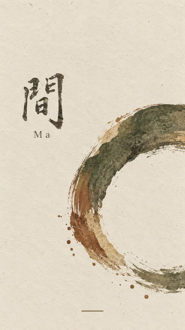
05
More combinations
With Contemporary Chinese Book Design
- Song–Ming Woodblock Book Typography (Songti / Mincho) Pairs well · Tea Canon prints its vertical text in the red line grid of the woodblock page and then loosens the grid into black hairlines on its picture leaves; quote the ruled frame on the text pages and let it dissolve where images begin.
- Ten Bamboo Studio Colour Woodblock (Douban & Gonghua) Pairs well · The late-Ming letter papers pressed uninked blocks into paper (gonghua); use the same blind relief for a title or motif that shows only in raking light, as the colourless debossed title of the 2018 award book Ti'ang: Bai Ming de guodu does.
- Republican Chinese Book Cover Design (Lu Xun & Tao Yuanqing) Contrasts · Lu Xun and Tao Yuanqing made the cover the work: a hand-drawn title and one motif on a plain field, with the untrimmed (毛边) edges that Bu Cai takes up again. In 1996 Lü Jingren and three colleagues called for moving from zhuangzhen (装帧), which by the 1990s had narrowed to dressing the cover, to shuji sheji (书籍设计), designing the whole object: paper, sewing, edges, sequence. Choose between dressing a book and building one.
- German Book Art Movement (Buchkunstbewegung) Pairs well · Both treat paper, type, binding and case as one work of book art; set a German book-art title page beside an exposed-spine Chinese volume to show two national cultures of the crafted book that meet in Leipzig.
- Guochao (China-Chic National Trend) Contrasts · Guochao shouts Chinese heritage with saturated jewel colours, gloss and folk motifs on packaging; these books whisper it with bare paper, thread, one red and at most a matte gilt edge, so choose between the loud and the quiet national voice.
With Ma
- Minimalist Graphic Design Pairs well · Add one rough material or brush mark to a minimalist layout so its emptiness feels lived-in rather than sterile.
- Japanese Postwar Modernism Pairs well · Use a modernist grid but leave whole modules empty, the way Tanaka and Hara let ma structure the page.
- Memphis Design Contrasts · Memphis is loud, synthetic and glossy; set one Memphis squiggle on a vast wabi ground only if you want deliberate friction.
- Scandinavian Functionalism Pairs well · Both prize natural materials and restraint; combine Nordic clarity with wabi irregularity for warm, quiet identities.
- Uli & Nsibidi Line and Sign Tradition Pairs well · Both make the empty interval carry meaning and place a few elements off-centre in earth colours; uli supplies a living line and named signs where wabi-sabi supplies texture and a single mark.
- Slow-Living Editorial (the Kinfolk Look) Pairs well · Leonard Koren, author of the 1994 book on wabi-sabi for designers, joined Kinfolk's editorial board in 2016; add a cracked bowl, raw linen or an off-centre object on a bare ground to make the calm less styled and more lived-in.
- Korean Commercial Calligraphy (Kaelligeurapi) Pairs well · Give one brushed word a wide, quiet field of paper-toned space so its dry streaks and pooled ink read as the whole design.
- Rinpa & Saga-bon Contrasts · Both come from Kyoto's tea culture (Kōetsu also made Raku tea bowls), but wabi-sabi wants rough clay and empty paper where Rinpa wants gold leaf and malachite; one bare field can serve either, so choose the material that fills it.