Style combination · Pairs well
Contemporary Chinese Book Design × Song–Ming Woodblock Book Typography
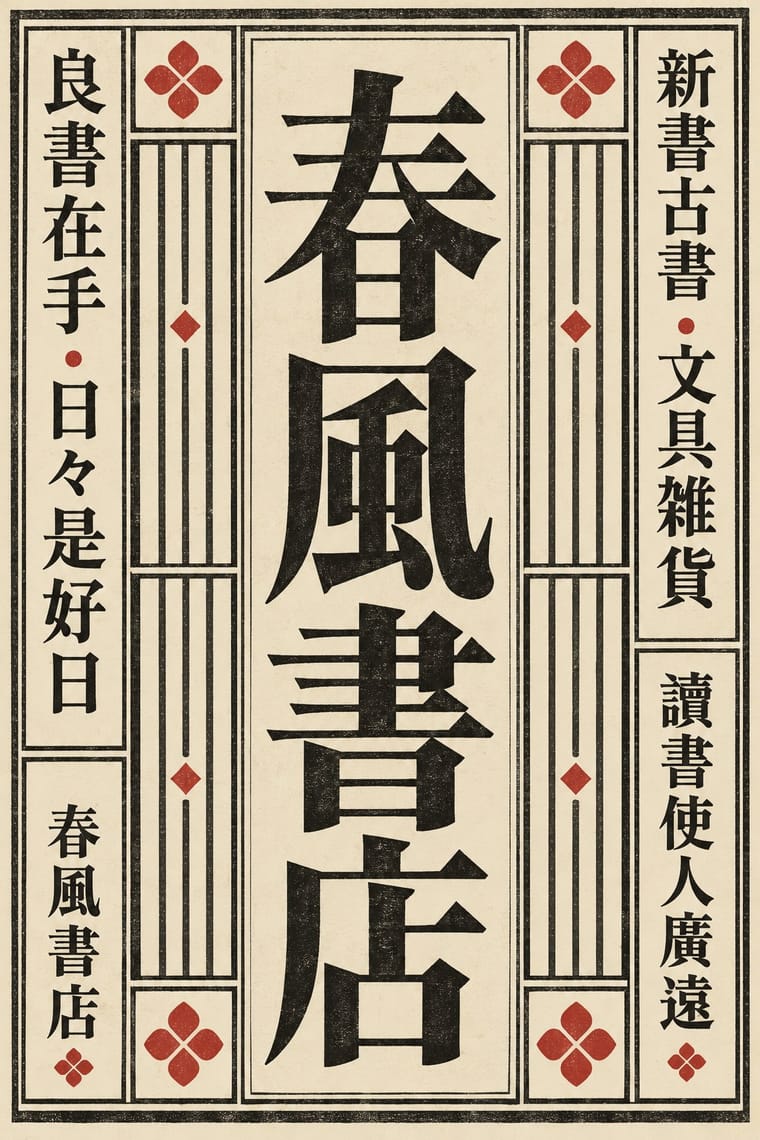
Tea Canon prints its vertical text in the red line grid of the woodblock page and then loosens the grid into black hairlines on its picture leaves; quote the ruled frame on the text pages and let it dissolve where images begin.
Mix them and make something Contemporary Chinese Book Design Song–Ming Woodblock Book Typography
01
What each style brings
Each part of the design comes from the style with the stronger say in it, and each style gives at least two.
Contemporary Chinese Book Design ('Most Beautiful Books of China') Song–Ming Woodblock Book Typography (Songti / Mincho)
- Type from Song–Ming Woodblock Book Typography
- Colour from Song–Ming Woodblock Book Typography
- Form from Song–Ming Woodblock Book Typography
- Composition from Contemporary Chinese Book Design
- Surface from Contemporary Chinese Book Design
02
The type
Open fonts standing in for each style’s own type, which is often hand-drawn or commercial.
Display · Song–Ming Woodblock Book Typography
Calm
Shippori Mincho, standing in for Song block-cut regular script after Ouyang Xun, Yan Zhenqing and Liu Gongquan
Text · Song–Ming Woodblock Book Typography
The page and letter of the East Asian book. Song block cutters copied the regular script of Tang masters; from the mid-16th century Ming cutters straightened it into a knife-made letter of thin horizontals, thick verticals and triangular stroke ends. Equal square characters run in right-to-left vertical columns in a ruled frame folded at a central column. As metal type in Shanghai and Nagasaki it became Mincho, Myeongjo and the standard CJK text face. Frame, rules and fold column belong to the woodblock page; type keeps the letter, the square and, in Japan and Taiwan, the vertical column.
Shippori Mincho; Song–Ming Woodblock Book Typography used Song block-cut regular script after Ouyang Xun, Yan Zhenqing and Liu Gongquan and Ming-style Songti / Mingti, the straightened 'craftsman's' letter, mature by the Wanli era
03
The colours
The ground and leading colours come from Song–Ming Woodblock Book Typography, with a counter-accent from Contemporary Chinese Book Design. The ink reads on the ground at 4.5:1 or more.
Contemporary Chinese Book Design ('Most Beautiful Books of China') Song–Ming Woodblock Book Typography (Songti / Mincho)
-
#f1e9d6ground · 36% -
#16130fink · 14% -
#b5342baccent · 18% -
#d6c49caccent · 14% -
#a8925aaccent · 10% -
#2e3d5caccent · 8%
As CSS
:root {
  --ground: #f1e9d6;
  --ink: #16130f;
  --accent-1: #b5342b;
  --accent-2: #d6c49c;
  --accent-3: #a8925a;
  --accent-4: #2e3d5c;
  --font-display: "Shippori Mincho", serif;
  --font-text: "Shippori Mincho", serif;
}
Use it with care
Contemporary Chinese Book Design ('Most Beautiful Books of China'): Have every Chinese character set and proofread by a fluent reader: image models invent pseudo-characters, and mirrored or random hanzi used as texture read as nonsense. These are recent designs by living designers and publishers, so commission or credit them rather than copying a prize-winning book's structure wholesale, never present a generated image as one of the award winners, and do not crop reproduced scripture, classics or calligraphy into decoration.
Song–Ming Woodblock Book Typography (Songti / Mincho): Have any Chinese, Japanese or Korean text set and proofread by a fluent reader: Song, Mincho and Myeongjo fonts draw some characters differently for each locale, and pseudo-characters, mirrored glyphs or random hanzi used as texture read as nonsense or worse. Pages of Buddhist sutras and other scripture carry devotional text; do not crop them into decoration.
04
The two styles
05
More combinations
With Contemporary Chinese Book Design
- Ten Bamboo Studio Colour Woodblock (Douban & Gonghua) Pairs well · The late-Ming letter papers pressed uninked blocks into paper (gonghua); use the same blind relief for a title or motif that shows only in raking light, as the colourless debossed title of the 2018 award book Ti'ang: Bai Ming de guodu does.
- Ma & Wabi-sabi Aesthetics Contrasts · Both leave paper empty and slow the eye, but wabi-sabi prizes the worn, imperfect thing, while these books are precisely engineered, industrially printed objects whose roughness is designed; use wabi-sabi when the patina should be real.
- Republican Chinese Book Cover Design (Lu Xun & Tao Yuanqing) Contrasts · Lu Xun and Tao Yuanqing made the cover the work: a hand-drawn title and one motif on a plain field, with the untrimmed (毛边) edges that Bu Cai takes up again. In 1996 Lü Jingren and three colleagues called for moving from zhuangzhen (装帧), which by the 1990s had narrowed to dressing the cover, to shuji sheji (书籍设计), designing the whole object: paper, sewing, edges, sequence. Choose between dressing a book and building one.
- German Book Art Movement (Buchkunstbewegung) Pairs well · Both treat paper, type, binding and case as one work of book art; set a German book-art title page beside an exposed-spine Chinese volume to show two national cultures of the crafted book that meet in Leipzig.
- Guochao (China-Chic National Trend) Contrasts · Guochao shouts Chinese heritage with saturated jewel colours, gloss and folk motifs on packaging; these books whisper it with bare paper, thread, one red and at most a matte gilt edge, so choose between the loud and the quiet national voice.
With Song–Ming Woodblock Book Typography
- Dazibao (Big-Character Posters) Contrasts · The big-character poster is the hand-brushed, crowded, personal opposite of the quiet official printed page; set one against the other to weigh public urgency against canonical calm.
- Urdu Katib Lithography Contrasts · Urdu turned down type to keep the calligrapher's hand while Song–Ming printing depersonalised the brush for the block cutter; choose deliberately between a written page and a cut one.
- Out-of-Square Hangul Typography Contrasts · Ahn Sang-soo's typeface broke exactly the equal square that Myeongjo keeps; run Myeongjo body text under out-of-square headings to stage tradition against experiment.
- Chaekgeori & Minhwa Screen Painting Pairs well · Chaekgeori screens paint stacks of the scholar's books; pair a painted bookcase grid with real ruled, framed Myeongjo text pages for a Korean scholarly identity.
- Japanese Postwar Modernism Pairs well · The postwar school set Mincho beside gothic and Latin sans; use a vertical Mincho column beside a flat colour field to give a modern grid a literary voice.
- Renaissance Book Typography Pairs well · Its Western counterpart: both fix one justified text block in a proportioned page with deep margins, so set a Ming face and a Garalde side by side in a bilingual book and let each keep its own grid.
- Ten Bamboo Studio Colour Woodblock (Douban & Gonghua) Pairs well · The same Nanjing book trade cut both: put a ruled Song-style text page opposite a graded colour leaf, as an album or a book with plates.
- Republican Chinese Book Cover Design (Lu Xun & Tao Yuanqing) Contrasts · The ruled woodblock page and Songti type that the new covers left behind; set a Song-type text block against a drawn, off-centre cover title to show old book and new.
All 18 combinations with Song–Ming Woodblock Book Typography