Style combination · Pairs well
Cairo–Beirut Arab Modernist Book × Push Pin Style
Push Pin's revival of historic ornament and bold-contour drawing parallels el-Touni's 'ornament is no crime'; mix the two for eclectic, ornamented covers.
Mix them and make something Cairo–Beirut Arab Modernist Book Push Pin Style
01
What each style brings
Each part of the design comes from the style with the stronger say in it, and each style gives at least two.
Cairo–Beirut Arab Modernist Book & Periodical Design Push Pin Style
- Type from Push Pin Style
- Colour from Cairo–Beirut Arab Modernist Book
- Form from Cairo–Beirut Arab Modernist Book
- Composition from Push Pin Style
- Surface from Cairo–Beirut Arab Modernist Book
02
The type
Open fonts standing in for each style’s own type, which is often hand-drawn or commercial.
Text · Cairo–Beirut Arab Modernist Book
The illustrated book, magazine and children's-book culture that ran from Cairo's post-1952 publishing houses to the Arab nationalist and leftist presses of Beirut. Hand-drawn Arabic titles reworked from Kufic and everyday scripts, rough, expressive pen-and-brush drawing and flat offset colour gave mass readers and children a modern, decolonised Arabic page. Helmi el-Touni and Mohieddin Ellabbad also brought folk ornament and borders back to it.
Reem Kufi; Cairo–Beirut Arab Modernist Book used Hand-drawn Kufic-derived Arabic display lettering and Hand-lettered titles based on Ruqʿa and Naskh
03
The colours
The ground and leading colours come from Cairo–Beirut Arab Modernist Book, with a counter-accent from Push Pin Style. The ink reads on the ground at 4.5:1 or more.
Cairo–Beirut Arab Modernist Book & Periodical Design Push Pin Style
-
#f0e6cfground · 36% -
#1c1a17ink · 14% -
#e1a930accent · 18% -
#c4362caccent · 14% -
#2a8a8aaccent · 10% -
#6b7a3aaccent · 8%
As CSS
:root {
  --ground: #f0e6cf;
  --ink: #1c1a17;
  --accent-1: #e1a930;
  --accent-2: #c4362c;
  --accent-3: #2a8a8a;
  --accent-4: #6b7a3a;
  --font-display: "Righteous", sans-serif;
  --font-text: "Reem Kufi", cursive;
}
04
The two styles
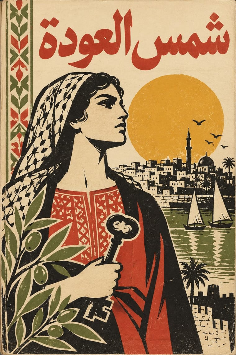
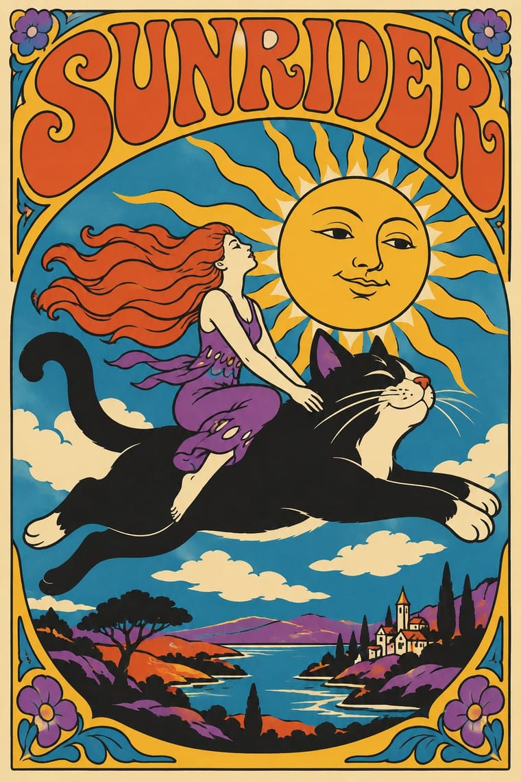
05
More combinations
With Cairo–Beirut Arab Modernist Book
- Iranian Modernist Graphic Design Pairs well · Iran's Kanoon books and posters are the Persian counterpart; combine their stacked calligraphy with Arab folk borders for children's and cultural publishing.
- Corporate Identity Modernism Contrasts · The ornament-free corporate page is what el-Touni argued against; set a folk-bordered Arabic cover beside a strict grid to stage that debate.
- Bulaq (Amiriyya) Naskh Book Printing Pairs well · Wrap a sober, justified Naskh text block in a hand-lettered, illustrated cover printed in flat offset colour, so the inside reads as a classic and the outside as a modern Arab book.
- Arab Children's Comic Magazines (Samir to Majid) Pairs well · The same Cairo and Beirut artists (Ellabbad, Hegazi) drew for both: add its hand-drawn Kufic-derived titles, folk borders and spot colour to a magazine cover.
- Machine-Age Simplified Arabic Type Pairs well · Same cities and decades: hand-drawn Arabic titles and flat offset illustration give a warmer face to magazine and periodical pages whose body text was often set in simplified type (books were slower to accept it).
- Egyptian Painted Film Poster Pairs well · Combine the cinema poster's glamorous painted title with the book designers' rough line and folk borders for a Cairo identity that spans screen and print.
With Push Pin Style
- Psychedelic Poster Pairs well · Both revive Art Nouveau lettering; add Push Pin's clean contour and wit to tame psychedelic excess into readable posters.
- International Typographic Style Contrasts · Push Pin defined itself against Helvetica neutrality; pit a bespoke illustrated letterform against a Swiss grid to dramatise personality versus system.
- Corporate Memphis Contrasts · Generic, faceless corporate figures are the opposite of Push Pin's authored characters; use Push Pin to restore a distinct illustrative voice.
- Belle Époque Lithographic Poster Pairs well · Borrow Chéret's dancing figures alongside Push Pin's revived display faces for exuberant entertainment graphics.
- Phototype Expressive Typography (Lubalin & U&lc) Pairs well · Push Pin revives old styles through drawn figures and Lubalin through the letters themselves; pair a Push Pin illustration with a swash, tightly kerned Lubalin headline for full 1970s New York warmth.
- UPA & Cartoon Modern Contrasts · Its New York contemporary shared UPA's comic, distorted figures and irony but went the opposite way on ornament: Push Pin piled on revived Victorian and Art Nouveau lettering, borders and ornament, while UPA stripped the picture to a figure, a line and a flat field.
- Angura Theatre Poster Pairs well · Yokoo started from Push Pin's illustrated eclecticism; pair Push Pin's period-pastiche lettering with angura's crowded Japanese ephemera.
- Ligne Claire (Franco-Belgian Clear Line) Contrasts · Push Pin also draws in outline and flat colour, but mixes revived Victorian and Art Nouveau display faces, ornament and distortion; switch to ligne claire for one disciplined line, no ornament and evenly legible scenes.