Style combination · Pairs well
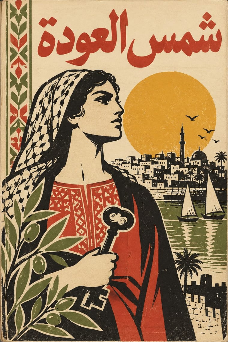
Cairo–Beirut Arab Modernist Book × Machine-Age Simplified Arabic Type
Same cities and decades: hand-drawn Arabic titles and flat offset illustration give a warmer face to magazine and periodical pages whose body text was often set in simplified type (books were slower to accept it).
Mix them and make something Cairo–Beirut Arab Modernist Book Machine-Age Simplified Arabic Type
01
What each style brings
Each part of the design comes from the style with the stronger say in it, and each style gives at least two.
Cairo–Beirut Arab Modernist Book & Periodical Design Machine-Age Simplified Arabic Type
- Type from Cairo–Beirut Arab Modernist Book
- Colour from Cairo–Beirut Arab Modernist Book
- Form from Cairo–Beirut Arab Modernist Book
- Composition from Machine-Age Simplified Arabic Type
- Surface from Machine-Age Simplified Arabic Type
02
The type
Open fonts standing in for each style’s own type, which is often hand-drawn or commercial.
Display · Cairo–Beirut Arab Modernist Book
Rise
Rakkas, standing in for Hand-drawn Kufic-derived Arabic display lettering
Text · Machine-Age Simplified Arabic Type
Arabic redrawn for the machine rather than the reed pen. From 1947 reformers cut down the four positional forms of each letter: Nasri Khattar's Unified Arabic gave every letter one shape, set apart like Latin type in its detached print form, and Linotype's Simplified Arabic (1959, made with Beirut's al-Hayat) mostly two, so a newspaper fount fitted one 90-channel magazine; ASV Codar in Morocco gave the vowels letters of their own. Flat-based, even and with few ligatures, it became the common face of Arab newspapers and lives on in Windows system fonts.
Newsreader; Machine-Age Simplified Arabic Type used Mrowa-Linotype Simplified Arabic (Kamel Mrowa, Nabih Jaroudi and Walter Tracy for Linotype & Machinery; Series 2 with 3, 1959) and its redesign by Jaroudi, Series 8 with 9 (1962), named Yakout in 1967 and Intertype Abridged Arabic
03
The colours
The ground and leading colours come from Cairo–Beirut Arab Modernist Book, with a counter-accent from Machine-Age Simplified Arabic Type. The ink reads on the ground at 4.5:1 or more.
Cairo–Beirut Arab Modernist Book & Periodical Design Machine-Age Simplified Arabic Type
-
#f0e6cfground · 36% -
#1c1a17ink · 14% -
#e1a930accent · 18% -
#1d4f9eaccent · 14% -
#c4362caccent · 10% -
#cfc6b0accent · 8%
As CSS
:root {
  --ground: #f0e6cf;
  --ink: #1c1a17;
  --accent-1: #e1a930;
  --accent-2: #1d4f9e;
  --accent-3: #c4362c;
  --accent-4: #cfc6b0;
  --font-display: "Rakkas", cursive;
  --font-text: "Newsreader", serif;
}
Use it with care
Machine-Age Simplified Arabic Type: Arabic is a living script and the script of the Qur'an, and simplified type was long resisted for books, government work and the Qur'an, so do not set Qur'anic verses, hadith or the names of God and the Prophet in reduced or detached forms, or use them as texture. Set Arabic right to left with correct joining, never pass off the disconnected letters of a software error as Unified Arabic, have every word read by a fluent reader, and do not present script reform as the correction of a deficient script: the Academy of the Arabic Language in Cairo rejected ASV Codar in 1958, and the type historian Titus Nemeth calls the survival of simplified forms in digital fonts a legacy of technical compromise that digital type no longer needs.
04
The two styles
05
More combinations
With Cairo–Beirut Arab Modernist Book
- Push Pin Style Pairs well · Push Pin's revival of historic ornament and bold-contour drawing parallels el-Touni's 'ornament is no crime'; mix the two for eclectic, ornamented covers.
- Iranian Modernist Graphic Design Pairs well · Iran's Kanoon books and posters are the Persian counterpart; combine their stacked calligraphy with Arab folk borders for children's and cultural publishing.
- Corporate Identity Modernism Contrasts · The ornament-free corporate page is what el-Touni argued against; set a folk-bordered Arabic cover beside a strict grid to stage that debate.
- Bulaq (Amiriyya) Naskh Book Printing Pairs well · Wrap a sober, justified Naskh text block in a hand-lettered, illustrated cover printed in flat offset colour, so the inside reads as a classic and the outside as a modern Arab book.
- Arab Children's Comic Magazines (Samir to Majid) Pairs well · The same Cairo and Beirut artists (Ellabbad, Hegazi) drew for both: add its hand-drawn Kufic-derived titles, folk borders and spot colour to a magazine cover.
- Egyptian Painted Film Poster Pairs well · Combine the cinema poster's glamorous painted title with the book designers' rough line and folk borders for a Cairo identity that spans screen and print.
With Machine-Age Simplified Arabic Type
- Contemporary Arabic & Dual-Script Type Design Pairs well · Its digital successor: dual-script families pair Arabic with a matched Latin while keeping the firm baseline, even colour and reduced stacking that simplification made familiar. 29LT's UA Neo (2013), detached revivals of Khattar's Unified Arabic, is where the two touch.
- Bulaq (Amiriyya) Naskh Book Printing Contrasts · The full calligraphic repertoire it gave up: a Bulaq-style Naskh title over simplified body text shows exactly what was traded for speed and economy.
- Urdu Katib Lithography Contrasts · Urdu made the opposite choice, keeping the katib's hand because metal type could not carry Nastaʿlīq; set side by side they show economy against calligraphic fidelity.
- Roman-like Thai Typography (modern loopless Thai) Pairs well · A parallel machine-age simplification of another script; both strip traditional details to an even, rational line, and both stayed contested for long reading.