Style combination · Pairs well
Arab Children's Comic Magazines × Cairo–Beirut Arab Modernist Book
The same Cairo and Beirut artists (Ellabbad, Hegazi) drew for both: add its hand-drawn Kufic-derived titles, folk borders and spot colour to a magazine cover.
Mix them and make something Arab Children's Comic Magazines Cairo–Beirut Arab Modernist Book
01
What each style brings
Each part of the design comes from the style with the stronger say in it, and each style gives at least two.
Arab Children's Comic Magazines (Samir to Majid) Cairo–Beirut Arab Modernist Book & Periodical Design
- Type from Arab Children's Comic Magazines
- Colour from Arab Children's Comic Magazines
- Form from Cairo–Beirut Arab Modernist Book
- Composition from Arab Children's Comic Magazines
- Surface from Cairo–Beirut Arab Modernist Book
02
The type
Open fonts standing in for each style’s own type, which is often hand-drawn or commercial.
Display · Arab Children's Comic Magazines
Yay!
Rakkas, standing in for Hand-lettered Arabic balloon text, read right to left (in colloquial Egyptian Arabic in most of Samir's stories, in literary Arabic in Bisat al-Rih)
Text · Cairo–Beirut Arab Modernist Book
The illustrated book, magazine and children's-book culture that ran from Cairo's post-1952 publishing houses to the Arab nationalist and leftist presses of Beirut. Hand-drawn Arabic titles reworked from Kufic and everyday scripts, rough, expressive pen-and-brush drawing and flat offset colour gave mass readers and children a modern, decolonised Arabic page. Helmi el-Touni and Mohieddin Ellabbad also brought folk ornament and borders back to it.
Reem Kufi; Cairo–Beirut Arab Modernist Book used Hand-drawn Kufic-derived Arabic display lettering and Hand-lettered titles based on Ruqʿa and Naskh
03
The colours
The ground and leading colours come from Arab Children's Comic Magazines, with a counter-accent from Cairo–Beirut Arab Modernist Book. The ink reads on the ground at 4.5:1 or more.
Arab Children's Comic Magazines (Samir to Majid) Cairo–Beirut Arab Modernist Book & Periodical Design
-
#f6f0dcground · 36% -
#1d1a17ink · 14% -
#f6c928accent · 18% -
#e23b2eaccent · 14% -
#2f8fd0accent · 10% -
#3f9b4aaccent · 8%
As CSS
:root {
  --ground: #f6f0dc;
  --ink: #1d1a17;
  --accent-1: #f6c928;
  --accent-2: #e23b2e;
  --accent-3: #2f8fd0;
  --accent-4: #3f9b4a;
  --font-display: "Rakkas", cursive;
  --font-text: "Reem Kufi", cursive;
}
Use it with care
Arab Children's Comic Magazines (Samir to Majid): Samir, Majid, Kaslan Jiddan, Fudooli, Ammouna and the magazines' mastheads belong to their publishers (Dar al-Hilal, Abu Dhabi Media) and artists, and the Arabic Disney and Tintin pages to Disney and Hergé's estate: draw your own mascot, characters and masthead, never ask an image model for these characters or a named artist's hand, and never present a generated page as a vintage issue. The tradition's artists also drew caricature, such as 'Ib Goha and Sambo' by Samir co-founder Haroon, about an Arab boy and his Black Nubian sidekick Sambo: give every character, Black, Nubian, foreign or villain, the same drawing care, and never make skin colour or features the joke. Draw everyday Egyptian, Levantine and Gulf children in the dress they actually wear (gallabiya, kandura and ghutra, shayla, school uniforms), not Orientalist shorthand (camels, harem veils, oil-sheikh caricatures, pseudo-Arabic squiggles), and do not copy Hergé's stereotyped Arabs of the invented Khemed, who are 'always the punchline' (Nadim Damluji). Leave religious pages to writers and readers of the faith, and have all Arabic lettering written or checked by a fluent reader, joined and running right to left.
04
The two styles
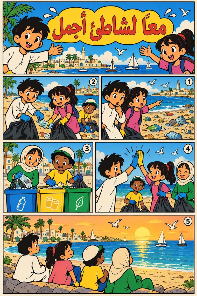
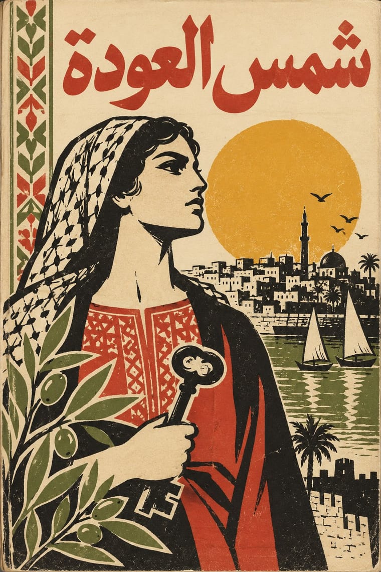
05
More combinations
With Arab Children's Comic Magazines
- Arab Independent Comics (Samandal, TokTok, Lab619, Skefkef) Contrasts · The adult, black-ink, dialect satire of Samandal and TokTok answers these mostly state-backed children's weeklies: set one raw independent strip against a bright magazine page to show the break.
- Amar Chitra Katha Comics Pairs well · Another postcolonial children's comic that teaches heritage in flat colour; combine its narrated caption boxes with the Arab weekly's gag strips and puzzle pages.
- Turkish Weekly Humour Magazines (Gırgır to Uykusuz) Contrasts · The same weekly cartoon-magazine machine aimed at adults and at power: its swollen caricature and political covers show what the children's weeklies kept out.
- Ligne Claire (Franco-Belgian Clear Line) Pairs well · Samir took the Belgian Tintin weekly as its model; borrow the even contour and evenly lit, legible settings to tighten a looser cartoon page.
With Cairo–Beirut Arab Modernist Book
- Push Pin Style Pairs well · Push Pin's revival of historic ornament and bold-contour drawing parallels el-Touni's 'ornament is no crime'; mix the two for eclectic, ornamented covers.
- Iranian Modernist Graphic Design Pairs well · Iran's Kanoon books and posters are the Persian counterpart; combine their stacked calligraphy with Arab folk borders for children's and cultural publishing.
- Corporate Identity Modernism Contrasts · The ornament-free corporate page is what el-Touni argued against; set a folk-bordered Arabic cover beside a strict grid to stage that debate.
- Bulaq (Amiriyya) Naskh Book Printing Pairs well · Wrap a sober, justified Naskh text block in a hand-lettered, illustrated cover printed in flat offset colour, so the inside reads as a classic and the outside as a modern Arab book.
- Machine-Age Simplified Arabic Type Pairs well · Same cities and decades: hand-drawn Arabic titles and flat offset illustration give a warmer face to magazine and periodical pages whose body text was often set in simplified type (books were slower to accept it).
- Egyptian Painted Film Poster Pairs well · Combine the cinema poster's glamorous painted title with the book designers' rough line and folk borders for a Cairo identity that spans screen and print.