Style combination · Contrasts
Urdu Katib Lithography × Victorian Letterpress
Movable-type jobbing print is the technology Urdu turned down; set its centred, mixed metal faces against a flowing, hand-ruled lithographic page.
Mix them and make something Urdu Katib Lithography Victorian Letterpress
01
What each style brings
Each part of the design comes from the style with the stronger say in it, and each style gives at least two.
Urdu Katib Lithography Victorian Letterpress & Wood Type
- Type from Urdu Katib Lithography
- Colour from Victorian Letterpress
- Form from Victorian Letterpress
- Composition from Urdu Katib Lithography
- Surface from Victorian Letterpress
02
The type
Open fonts standing in for each style’s own type, which is often hand-drawn or commercial.
Text · Victorian Letterpress
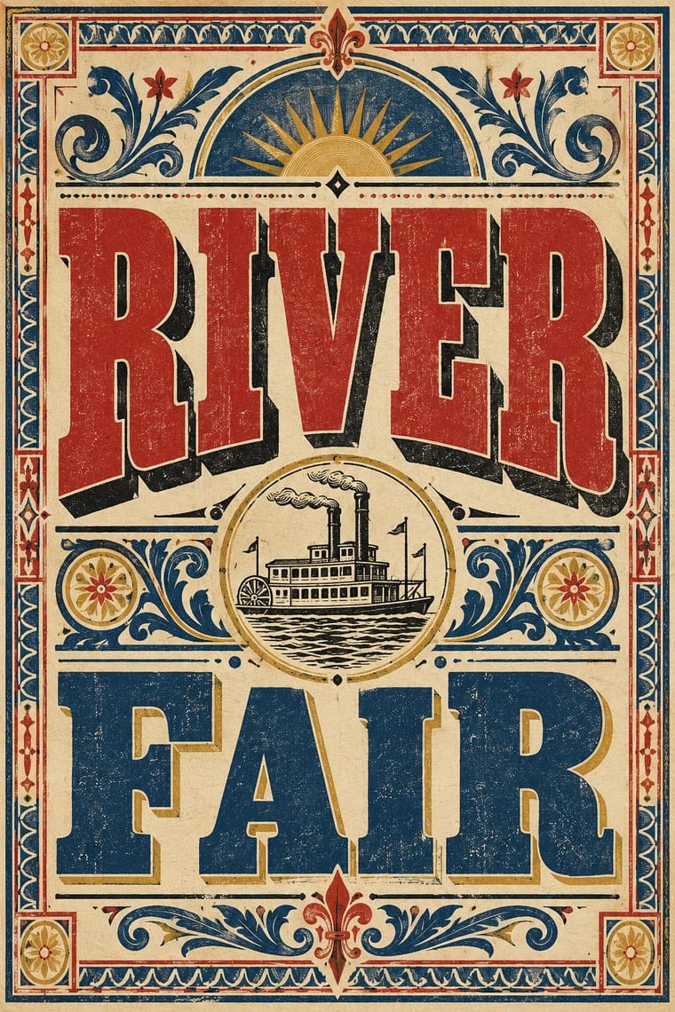
The commercial jobbing print of the industrial century: posters, playbills, auction notices and ephemera built from a flood of new display types (fat faces, Egyptians, grotesques, Tuscans and condensed wood type). Lines are centred and each is set in a different face and size to fill the measure, framed in rules and stock borders and printed in black with one or two flat colours.
Zilla Slab; Victorian Letterpress used Fat face romans and Egyptian / Antique slab serifs
03
The colours
The ground and leading colours come from Victorian Letterpress, with a counter-accent from Urdu Katib Lithography. The ink reads on the ground at 4.5:1 or more.
Urdu Katib Lithography Victorian Letterpress & Wood Type
-
#efe4c9ground · 36% -
#1b1a17ink · 14% -
#b3322baccent · 18% -
#d9b45aaccent · 14% -
#c9bfa6accent · 10% -
#24477daccent · 8%
As CSS
:root {
  --ground: #efe4c9;
  --ink: #1b1a17;
  --accent-1: #b3322b;
  --accent-2: #d9b45a;
  --accent-3: #c9bfa6;
  --accent-4: #24477d;
  --font-display: "Rakkas", cursive;
  --font-text: "Zilla Slab", serif;
}
Use it with care
Urdu Katib Lithography: Urdu pages often carry Qur'anic phrases, the names of God and the Prophet and religious verse; never use Nastaʿlīq as meaningless texture or set invented text that imitates it, and have every word read by a fluent Urdu reader. Katibs were rarely credited; name the calligrapher where known, and commission a working khushnawees rather than tracing archival pages.
04
The two styles
05
More combinations
With Urdu Katib Lithography
- Contemporary Arabic & Dual-Script Type Design Contrasts · Simplified Kufi- and Naskh-based dual-script type flattens the stacked Nastaʿlīq ligature; choose deliberately between the katib's cascade and a screen-friendly baseline.
- Dazibao (Big-Character Posters) Pairs well · Both are handwritten public text pages; use their crowded, hand-ruled columns and enlarged brush headlines for an editorial or protest broadsheet.
- Islamic Geometric & Calligraphic Tradition Pairs well · Crown a dense Nastaʿlīq news or book page with a manuscript-style illuminated headpiece or a Thuluth masthead drawn from the khatt tradition.
- Nirnaya Sagar Devanagari Typography (Bombay Metal Type) Contrasts · Urdu kept the katib's hand on the litho stone because type could not hold Nastaʿlīq, while Javaji took a lithographed almanac into metal type; choose a written page or a set one deliberately.
- Song–Ming Woodblock Book Typography (Songti / Mincho) Contrasts · Urdu turned down type to keep the calligrapher's hand while Song–Ming printing depersonalised the brush for the block cutter; choose deliberately between a written page and a cut one.
- Early Turkish Republican Graphic Design Contrasts · Urdu print kept hand-written Arabic-script lithography for another century, while Turkey abolished Arabic letters in 1928; set the two side by side to show two answers to modern print.
- Persian Popular Narrative (Lithographs & Coffeehouse Painting) Pairs well · The same lithographed Nastaʿlīq page culture across Iran and India: Khoi's Tehran Shahnameh followed the pictures of the Persian-language Bombay edition of 1846, written by Reza al-Hoseini al-Shirazi. Add hatched, framed scenes to a katib's dense columns for an illustrated Persian or Urdu text page.
- Machine-Age Simplified Arabic Type Contrasts · Urdu made the opposite choice, keeping the katib's hand because metal type could not carry Nastaʿlīq; set side by side they show economy against calligraphic fidelity.
With Victorian Letterpress
- Hand-Painted Signage & Vernacular Lettering Pairs well · Sign writers and type founders traded letterforms; add brushed shading and drop shadows to wood-type headlines for a street-made feel.
- Push Pin Style Pairs well · Push Pin revived Victorian display faces with irony; mix one wood-type headline with modern illustration for the same knowing nostalgia.
- International Typographic Style Contrasts · One face, flush left and white space against a centred clamour of faces: use the contrast to test whether hierarchy needs variety at all.
- Arts & Crafts Movement Contrasts · Morris reacted against exactly this commercial clutter; set the two side by side to show craft restraint versus jobbing exuberance.
- HfG Ulm Systematic Design Contrasts · A Victorian mixed-face handbill is the clutter Ulm's one-family rule was meant to cure; use it as a before-and-after foil.
- Victorian Colour Toy Books (Evans, Crane, Caldecott and Greenaway) Contrasts · Its black-letter-dense, type-and-ornament jobbing page is the opposite of a picture-led page; combine them by hanging a wood-type title over a flat colour picture.
- Dada Pairs well · Raid Victorian wood type and stock ornaments as the Dadaists did, but scatter them instead of centring them.
- American Four-Colour Comic Book (Golden to Bronze Age) Pairs well · Both are cheap letterpress print that shouts to passers-by; borrow the playbill's stacked display capitals, banners and rules for a comic cover's blurbs and price box, while keeping the comic's hand-drawn letters and keyline art.