Style combination · Pairs well
Art Deco × Egyptian Cigarette Packaging
Move the border bands to stepped, sunburst Deco patterns, as the later Maspero box did, for an interwar version of the tin.
Mix them and make something Art Deco Egyptian Cigarette Packaging
01
What each style brings
Each part of the design comes from the style with the stronger say in it, and each style gives at least two.
Art Deco Egyptian Cigarette Packaging (Cairo Tobacco Houses)
- Type from Egyptian Cigarette Packaging
- Colour from Art Deco
- Form from Egyptian Cigarette Packaging
- Composition from Art Deco
- Surface from Art Deco
02
The type
Open fonts standing in for each style’s own type, which is often hand-drawn or commercial.
Display · Egyptian Cigarette Packaging
Soirée
Bungee Shade, standing in for Shaded, outlined and spurred serif capitals for the maker's name ('M. MELACHRINO & Co.')
Text · Art Deco
The glamorous modern style named after the 1925 Paris Exposition des Arts Décoratifs, which disciplined ornament into geometry: sunbursts, chevrons, stepped forms and sleek stylised figures rendered in lacquer-smooth colour with metallic accents. In Cassandre's and Colin's posters, fashion magazines, cinemas and luxury packaging it spoke of speed, travel, jazz and wealth.
Jost; Art Deco used Broadway and Bifur
03
The colours
The ground and leading colours come from Art Deco, with a counter-accent from Egyptian Cigarette Packaging. The ink reads on the ground at 4.5:1 or more.
Art Deco Egyptian Cigarette Packaging (Cairo Tobacco Houses)
-
#111111ground · 36% -
#f1e6cfink · 14% -
#c9a227accent · 18% -
#c8322aaccent · 14% -
#8c1c26accent · 10% -
#0f5c55accent · 8%
As CSS
:root {
  --ground: #111111;
  --ink: #f1e6cf;
  --accent-1: #c9a227;
  --accent-2: #c8322a;
  --accent-3: #8c1c26;
  --accent-4: #0f5c55;
  --font-display: "Bungee Shade", sans-serif;
  --font-text: "Jost", sans-serif;
}
Use it with care
Egyptian Cigarette Packaging (Cairo Tobacco Houses): These boxes sold an Orientalist fantasy of Egypt to Western smokers: the turbaned pipe smoker and the jewelled odalisque are stereotypes, and pharaonic gods and statues were turned into trade marks, so do not reuse them as neutral 'Egyptian' decoration or as a picture of Egyptian life. The crescent and star (an Ottoman and Egyptian state emblem, now widely read as a sign of Islam) and the Arabic inscriptions are state and religious signs, not ornament: do not scatter them or fake Arabic lettering as exotic texture. Tobacco branding is now restricted by advertising bans and plain-packaging laws in many countries, so do not use the style to make real cigarette packs look attractive, and Camel is a live trade mark: draw new marks rather than copying any brand's crest or name.
04
The two styles
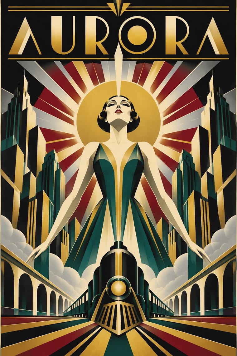
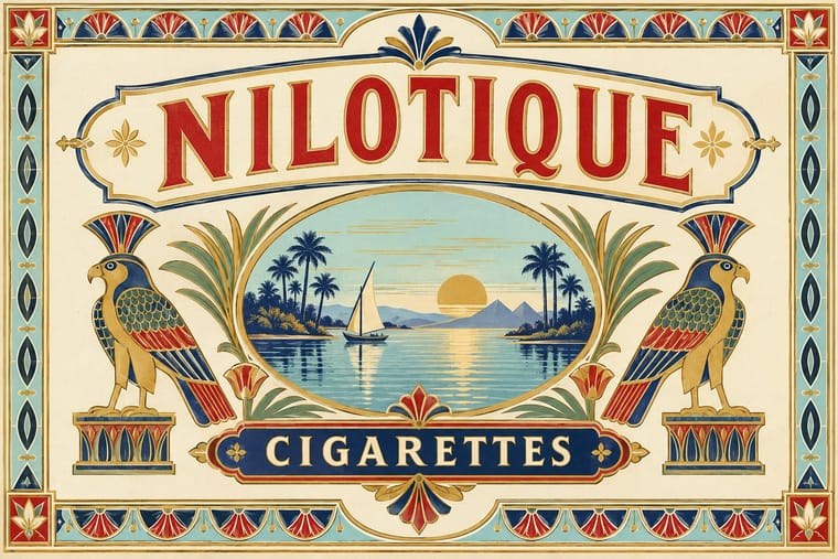
05
More combinations
With Art Deco
- Googie & Atomic Age Pairs well · Googie's atomic starbursts extend Deco's celestial ornament; mix them for retro hospitality and signage.
- Punk & DIY Zine Contrasts · Puncture Deco polish with a single torn, photocopied edge when luxury needs irony.
- Art Nouveau Contrasts · Deco straightened Nouveau's whiplash; place a rigid sunburst beside one sinuous curve to show the evolution.
- Streamline Moderne Pairs well · Fold Streamline speed lines and rounded corners into a Deco layout to move from stepped geometry toward aerodynamic sweep.
- Basel Object Poster (Swiss Sachplakat) Contrasts · A source as well as a foil: Leupin studied at the École Paul Colin in Paris in 1935-36 and took strong impressions from Colin and from Colin's rival Cassandre. Both make a product a heroic icon, but Deco stylises it into a geometric silhouette with airbrushed gradation and geometric capitals, while Basel paints the real object, its material and its label, as a still life.
- Estridentismo (Stridentist) Graphics Pairs well · Both drew the 1920s skyline; pair Deco's setback towers and block display letters with Stridentist black-and-white relief for a skyscraper poster with a rougher, revolutionary edge.
- Vienna Secession Pairs well · Carry the Secession's squares, chequers and gold into Deco's stepped geometry for a luxurious but disciplined look.
- Greek Tourism Modernism (EOT) Contrasts · Katzourakis studied poster design under Paul Colin in Paris; set a Deco travel poster's heroic, airbrushed destination beside this flat, cut-out sign to show how the tourist poster was stripped down after the war.
With Egyptian Cigarette Packaging
- Cuban Tobacco Lithography (Habilitaciones & Marquillas) Pairs well · Borrow the Havana labels' embossed medals and ribbon banners for a richer lid, but keep the Cairo tin's calm pale ground so it does not tip into clutter.
- Egyptian Painted Film Poster Pairs well · Pair the tin's French-Arabic heraldic lid with the film poster's painted Arabic titling for a Cairo print identity that spans both.
- Plain Tobacco Packaging Contrasts · Its regulatory opposite: plain packs strip out every crest, border and vignette this style uses to sell, a sharp foil for any critique of tobacco branding.
- International Typographic Style Contrasts · Set one heraldic, bordered lid against an asymmetric grotesque grid to show the jump from trading-house guarantee to objective information.
- Ancient Egyptian Hieroglyphic & Register Composition Pairs well · Draw the pharaonic motifs from real register compositions rather than souvenir clichés to give the vignettes more weight and accuracy.