Style combination · Pairs well
Armenian Manuscript Illumination × Mir iskusstva Book Art
Bilibin's circle turned medieval ornament into the borders and initials of a modern book; follow that route to use canon-table arcades as a frame for new text rather than copying a sacred page.
Mix them and make something Armenian Manuscript Illumination Mir iskusstva Book Art
01
What each style brings
Each part of the design comes from the style with the stronger say in it, and each style gives at least two.
Armenian Manuscript Illumination Mir iskusstva Book Art
- Type from Armenian Manuscript Illumination
- Colour from Armenian Manuscript Illumination
- Form from Mir iskusstva Book Art
- Composition from Armenian Manuscript Illumination
- Surface from Mir iskusstva Book Art
02
The type
Open fonts standing in for each style’s own type, which is often hand-drawn or commercial.
Display · Armenian Manuscript Illumination
Soirée
Uncial Antiqua, standing in for Erkatagir ('iron letters'), the uncial held to be Mesrop Mashtots's original form of the alphabet of 405, used for manuscript text from the 5th to the 13th century and still preferred for inscriptions
Text · Mir iskusstva Book Art
The graphic idiom of the St Petersburg World of Art circle (journal 1898–1904, exhibitions until Paris 1927) and the book artists around it. Ivan Bilibin's state-printed, lithographed fairy tales set firmly outlined, flat-washed pictures and text inside folk-ornament borders drawn from lubki, crafts and icons; Benois and Somov revived the eighteenth century of Versailles and old Petersburg in vignettes and rococo scenes. Both branches made the book one ensemble of cover, headpiece, initial, plate and tailpiece, in watercolour, gouache or black ink rather than oil.
Libre Caslon Text; Mir iskusstva Book Art used Ivan Bilibin's hand-drawn cover titles and illuminated initials in an Old Russian manner, drawn as part of the page and Typeset Cyrillic text in a single block inside an ornamental border, opened by an illuminated initial and closed by a tailpiece
03
The colours
The ground and leading colours come from Armenian Manuscript Illumination, with a counter-accent from Mir iskusstva Book Art. The ink reads on the ground at 4.5:1 or more.
Armenian Manuscript Illumination Mir iskusstva Book Art
-
#f0e6cfground · 36% -
#2b1e16ink · 14% -
#c0392baccent · 18% -
#c99a3aaccent · 14% -
#1e3a8faccent · 10% -
#2e7d5baccent · 8%
As CSS
:root {
  --ground: #f0e6cf;
  --ink: #2b1e16;
  --accent-1: #c0392b;
  --accent-2: #c99a3a;
  --accent-3: #1e3a8f;
  --accent-4: #2e7d5b;
  --font-display: "Uncial Antiqua", sans-serif;
  --font-text: "Libre Caslon Text", serif;
}
Use it with care
Armenian Manuscript Illumination: These are Gospel books, lectionaries and Bibles of the Armenian Apostolic Church, and their crosses, evangelist symbols, portraits of Christ and the saints and holy names keep their sacred meaning; do not use them as texture, logos or decoration on trivial products. Armenian letter art, including ornamental letters made of birds, animals and people, is living heritage (UNESCO Representative List, 2019) practised by calligraphers, carpet weavers, embroiderers and jewellers, so commission or collaborate with Armenian artists rather than lifting motifs, and have any Armenian text written or checked by a fluent reader instead of assembling letters as pseudo-script. Manuscripts were seized, scattered or lost in the Armenian Genocide of 1915, the Zeyt'un Gospels among them (its canon tables were removed and sold to the J. Paul Getty Museum in 1994; a 2015 agreement acknowledged the Armenian Church as their owner while the leaves stayed at the Getty), and several of the scriptoria (Vaspurakan, Cilicia) now lie outside Armenia: credit the work as Armenian, naming its Byzantine models, and the Syriac ones of the earliest books, where they matter, and do not fold it into a generic 'Byzantine' or 'Oriental' style.
Mir iskusstva Book Art: This 'Russian' folk look is a refined, partly state-commissioned idiom of the imperial capital, assembled by professional artists from northern peasant crafts, lubki and icons: do not present it as timeless ethnic Russian folk art or as a neutral emblem of the Russian state, and keep icon-derived holy figures out of trivial uses. Its makers were not all Russian: Heorhiy Narbut, for example, became rector of the Ukrainian Academy of Arts and designed the Ukrainian People's Republic's banknotes and stamps, so credit artists by their own identities. Benois (d. 1960) and Dobuzhinsky (d. 1957) remain in copyright in the EU and Russia (life plus 70 years, so at least until 2031 and 2028), while Bilibin (d. 1942), Somov (d. 1939) and Narbut (d. 1920) are in the public domain there: draw new borders, figures and lettering rather than reproducing their pages. Somov's Le Livre de la Marquise is explicitly erotic, above all the 1918 edition, so keep its plates out of children's or general-audience pastiche.
04
The two styles
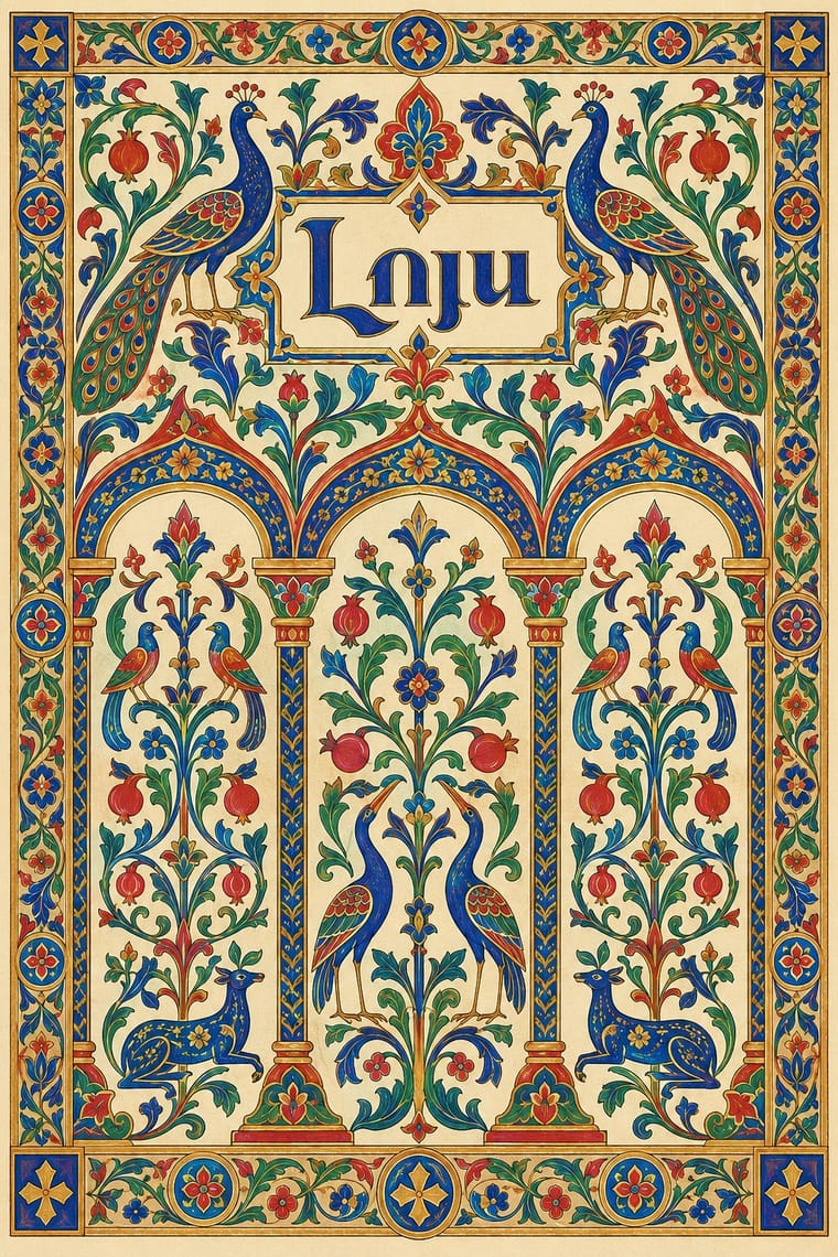
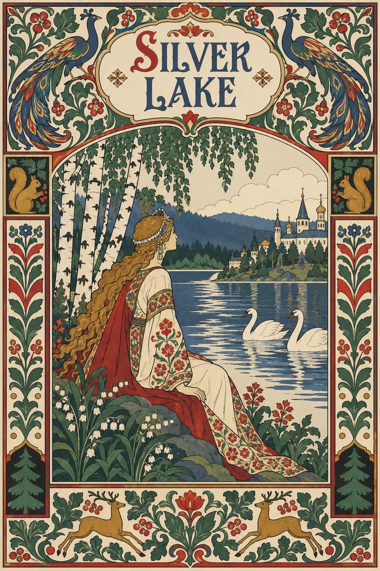
05
More combinations
With Armenian Manuscript Illumination
- Islamic Geometric & Calligraphic Tradition Contrasts · Horseshoe arches and vegetal and geometric ornament are shared, but the Islamic geometric tradition keeps its arches and fields aniconic, while Armenian books fill the same arches with birds, beasts and painted saints; choose whether a frame should carry figures or only pattern.
- Ethiopian Ge'ez Manuscript & Haräg Illumination Pairs well · Another Eastern Christian Gospel tradition in two columns of its own script that opens with Eusebian canon tables under bird-topped arches; compare the Ethiopian black-and-red page and haräg bands with Armenian gold-and-ultramarine canon arcades when building a framed headpiece system.
- Celtic Revival Illumination & Lettering Pairs well · Both build letters out of animals and interlace; set a bird-letter initial beside a knotted Celtic one to compare an initial made of whole birds with one made of interlaced beasts.
- International Typographic Style Contrasts · Its opposite: symmetrical, gilded, ornament-filled arcades against an asymmetric grid, neutral sans-serif and open white space; a single bird letter can warm a strict grid.
- Persian Miniature (Ilkhanid, Timurid and Safavid Book Painting) Contrasts · Both frame jewel-coloured paintings with gold and ornament, but Armenian Gospel books build symmetrical arcades, canon tables and bird letters for sacred text, while Persian pages crowd secular epic and lyric scenes into an asymmetric, climbing space; decide whether the frame or the story leads.
- Gothic Book of Hours (Illuminated Devotional Book) Contrasts · Compare how distinct Christian book traditions organise sacred reading: this entry centres the lay prayer cycle and Gothic text block, rather than Armenian Gospel incipits and canon-table arcades; retain each tradition's own scripts and context.
- Vyaz (Ornamental Slavonic Lettering) Pairs well · Another Eastern Christian book culture in which titles and initials carry the ornament; set a vyaz title in gold and azurite beside a canon-table arcade to compare a heading built from joined letters with an initial built from birds.
With Mir iskusstva Book Art
- Leningrad Avant-Garde Picture Book Contrasts · Lebedev's Leningrad books dropped the frame, the ornament and the fairy-tale past, floating a few flat planes on bare paper; set them side by side to decide between a bordered, retrospective page and an open, modern one.
- Vienna Secession Contrasts · Both enclose pictures in symmetrical frames, but Vienna squared the frame into grids and bars while the Russian book filled a wide border with folk and rococo motifs; pick geometric order or narrative ornament.
- Bezalel School Pairs well · In the same years both used Art Nouveau's ornamental frame to build a national book art from older ornament; set Bilibin's folk borders beside Raban's filigree frames to compare two revivals, or combine their framed, lettered pages.
- Ligne Claire (Franco-Belgian Clear Line) Pairs well · Both draw an even black contour and fill it with flat colour; give a clear-line page Bilibin's ornamental border and headpiece for a storybook with a heritage frame.
- Russian Futurist Book Contrasts · Both drew on the lubok, but the Futurists kept its crude cut, rough paper and handwriting while the World of Art refined it into a polished, bordered ensemble; choose between raw and ennobled folk sources.
- Celtic Revival Illumination & Lettering Pairs well · A parallel national revival of the same decades: both turned medieval and folk ornament into the borders and initials of a modern book; combine for a heritage storybook framed in old ornament.
- Vyaz (Ornamental Slavonic Lettering) Pairs well · Bilibin's circle drew titles and initials in an Old Russian manner into bordered fairy-tale books; put a newly drawn vyaz title under a folk-ornament headpiece for a Russian Revival page rather than copying a liturgical heading.
- Norwegian and Finnish National Romantic Graphics (Munthe & Karelianism) Pairs well · A parallel national revival of the same years: Bilibin framed Russian fairy tales in Old Russian borders as Munthe framed the sagas; combine for a northern storybook, but keep the Norse and Russian sources distinct.