Style combination · Pairs well
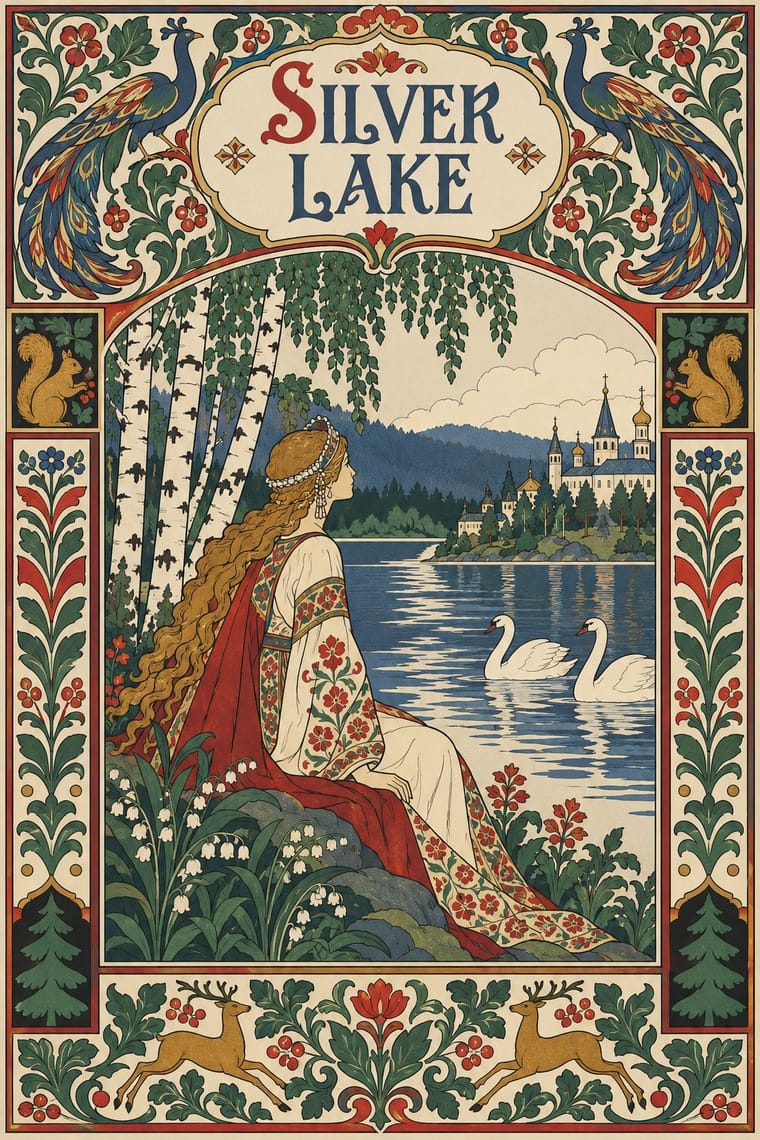
Mir iskusstva Book Art × Norwegian and Finnish National Romantic Graphics
A parallel national revival of the same years: Bilibin framed Russian fairy tales in Old Russian borders as Munthe framed the sagas; combine for a northern storybook, but keep the Norse and Russian sources distinct.
Mix them and make something Mir iskusstva Book Art Norwegian and Finnish National Romantic Graphics
01
What each style brings
Each part of the design comes from the style with the stronger say in it, and each style gives at least two.
Mir iskusstva Book Art Norwegian and Finnish National Romantic Graphics (Munthe & Karelianism)
- Type from Mir iskusstva Book Art
- Colour from Norwegian and Finnish National Romantic Graphics
- Form from Mir iskusstva Book Art
- Composition from Mir iskusstva Book Art
- Surface from Norwegian and Finnish National Romantic Graphics
02
The type
Open fonts standing in for each style’s own type, which is often hand-drawn or commercial.
Display · Mir iskusstva Book Art
Again
Federant; Mir iskusstva Book Art used Ivan Bilibin's hand-drawn cover titles and illuminated initials in an Old Russian manner, drawn as part of the page and Typeset Cyrillic text in a single block inside an ornamental border, opened by an illuminated initial and closed by a tailpiece
Text · Norwegian and Finnish National Romantic Graphics
The flat, decorative branch of Norway's and Finland's national romanticism, which turned Viking carving, the sagas, the Kalevala and old peasant weaving into modern ornament. Gerhard Munthe set the woodcut-like pen style and blackletter type of the 1899 saga edition, had Draumkvæde (1904) hand-lettered after Norse saga manuscripts, and designed tapestries of stiff myth figures in flat folk colour; Akseli Gallen-Kallela gave the Kalevala bold outlines and flat colour in woodcuts, frescoes, ryijy rugs and book vignettes; Dragestil timber buildings carried dragon heads.
Space Mono; Norwegian and Finnish National Romantic Graphics used The hand-lettered text of Draumkvæde (1904) and The blackletter text type Munthe chose for Snorre Sturlason
03
The colours
The ground and leading colours come from Norwegian and Finnish National Romantic Graphics, with a counter-accent from Mir iskusstva Book Art. The ink reads on the ground at 4.5:1 or more.
Mir iskusstva Book Art Norwegian and Finnish National Romantic Graphics (Munthe & Karelianism)
-
#e8dcc2ground · 36% -
#2a1f17ink · 14% -
#c9932eaccent · 18% -
#a3342baccent · 14% -
#2e4a7daccent · 10% -
#56703faccent · 8%
As CSS
:root {
  --ground: #e8dcc2;
  --ink: #2a1f17;
  --accent-1: #c9932e;
  --accent-2: #a3342b;
  --accent-3: #2e4a7d;
  --accent-4: #56703f;
  --font-display: "Federant", sans-serif;
  --font-text: "Space Mono", monospace;
}
Use it with care
Mir iskusstva Book Art: This 'Russian' folk look is a refined, partly state-commissioned idiom of the imperial capital, assembled by professional artists from northern peasant crafts, lubki and icons: do not present it as timeless ethnic Russian folk art or as a neutral emblem of the Russian state, and keep icon-derived holy figures out of trivial uses. Its makers were not all Russian: Heorhiy Narbut, for example, became rector of the Ukrainian Academy of Arts and designed the Ukrainian People's Republic's banknotes and stamps, so credit artists by their own identities. Benois (d. 1960) and Dobuzhinsky (d. 1957) remain in copyright in the EU and Russia (life plus 70 years, so at least until 2031 and 2028), while Bilibin (d. 1942), Somov (d. 1939) and Narbut (d. 1920) are in the public domain there: draw new borders, figures and lettering rather than reproducing their pages. Somov's Le Livre de la Marquise is explicitly erotic, above all the 1918 edition, so keep its plates out of children's or general-audience pastiche.
Norwegian and Finnish National Romantic Graphics (Munthe & Karelianism): In Norway the fascist Nasjonal Samling (1933–45) took a golden sun cross on red, which it claimed as St Olav's shield, for its emblem, leaned heavily on Viking art and symbolism and built on romantic nationalism, so keep saga warriors, dragon ships and the Olav cross away from ethnic-nationalist framing. Old signs near this material, the othala rune, the sun cross (also called Odin's cross) and Odin's valknut, are used by neo-Nazis and other white supremacists, though non-racist pagans also use the othala rune and the valknut: check how such a sign reads in context before borrowing it. Gallen-Kallela's 1918 insignia for the White Army's Order of the Cross of Liberty set a golden swastika into the cross: do not borrow it. Karelianism cast Karelia as a refuge of authentic Finnishness, and some of its ideas later fed the irredentist Greater Finland project, so do not present Karelian or Orthodox folk culture as merely Finland's past: Karelians are a living people with their own language and crafts. In these decades Norway's Norwegianisation policy pressed the Sámi to assimilate: do not fold Sámi duodji motifs into this Norse ornament.
04
The two styles
05
More combinations
With Mir iskusstva Book Art
- Leningrad Avant-Garde Picture Book Contrasts · Lebedev's Leningrad books dropped the frame, the ornament and the fairy-tale past, floating a few flat planes on bare paper; set them side by side to decide between a bordered, retrospective page and an open, modern one.
- Vienna Secession Contrasts · Both enclose pictures in symmetrical frames, but Vienna squared the frame into grids and bars while the Russian book filled a wide border with folk and rococo motifs; pick geometric order or narrative ornament.
- Bezalel School Pairs well · In the same years both used Art Nouveau's ornamental frame to build a national book art from older ornament; set Bilibin's folk borders beside Raban's filigree frames to compare two revivals, or combine their framed, lettered pages.
- Ligne Claire (Franco-Belgian Clear Line) Pairs well · Both draw an even black contour and fill it with flat colour; give a clear-line page Bilibin's ornamental border and headpiece for a storybook with a heritage frame.
- Russian Futurist Book Contrasts · Both drew on the lubok, but the Futurists kept its crude cut, rough paper and handwriting while the World of Art refined it into a polished, bordered ensemble; choose between raw and ennobled folk sources.
- Celtic Revival Illumination & Lettering Pairs well · A parallel national revival of the same decades: both turned medieval and folk ornament into the borders and initials of a modern book; combine for a heritage storybook framed in old ornament.
- Vyaz (Ornamental Slavonic Lettering) Pairs well · Bilibin's circle drew titles and initials in an Old Russian manner into bordered fairy-tale books; put a newly drawn vyaz title under a folk-ornament headpiece for a Russian Revival page rather than copying a liturgical heading.
- Armenian Manuscript Illumination Pairs well · Bilibin's circle turned medieval ornament into the borders and initials of a modern book; follow that route to use canon-table arcades as a frame for new text rather than copying a sacred page.
With Norwegian and Finnish National Romantic Graphics
- Finnish Bold Print (Marimekko Modernism) Contrasts · Later Finnish flat printing abstracts into large repeat patterns what this style still draws as myth figures; put a Kalevala frieze against a bold abstract field to show the shift.
- Celtic Revival Illumination & Lettering Pairs well · Both turned medieval interlace and beast heads into the ornament of a national book; set Norse dragon-head vignettes beside Insular knotwork for a North Sea saga cycle.
- Black Metal Graphics Contrasts · Norway's second-wave black metal put Theodor Kittelsen's pictures on Burzum's Filosofem (1996), quoted blackletter and kept a pagan tone in grainy black and white; set one Munthe-style saga vignette against such a sleeve to show a decorative national revival turned to misanthropy, minding the far-right uses named in the caution.
- Scandinavian Functionalism Contrasts · The Nordic modernism that followed rejected its myth and ornament; drop one carved dragon-head vignette or saga figure into a functionalist layout to warm it.
- Skønvirke (Danish Art Nouveau, Bindesbøll) Contrasts · The neighbouring Nordic revival tells sagas with dragons and figures; Bindesbøll's strand of Skønvirke keeps ornament abstract, so borrow its interlace and flora but leave the saga figures out.
- Swedish Painted Wall Hangings (Dalmålning, Bonadsmålning and Kurbits) Contrasts · A learned 1880–1920 revival of ornament versus the peasant painters' own freehand working tradition.
- Nordic Fairy-Tale and Troll Illustration (Werenskiold, Kittelsen, Bauer) Contrasts · The same decades and some of the same artists (Werenskiold led the illustrators of the 1899 Kongesagaer), but flat, frontal and ornamental where this is deep, tonal and atmospheric; frame one deep troll forest with a Munthe-style flat border to show the two branches side by side.