Style combination · Contrasts
Mir iskusstva Book Art × Russian Futurist Book
Both drew on the lubok, but the Futurists kept its crude cut, rough paper and handwriting while the World of Art refined it into a polished, bordered ensemble; choose between raw and ennobled folk sources.
Mix them and make something Mir iskusstva Book Art Russian Futurist Book
01
What each style brings
Each part of the design comes from the style with the stronger say in it, and each style gives at least two.
Mir iskusstva Book Art Russian Futurist Book
- Type from Mir iskusstva Book Art
- Colour from Russian Futurist Book
- Form from Mir iskusstva Book Art
- Composition from Mir iskusstva Book Art
- Surface from Russian Futurist Book
02
The type
Open fonts standing in for each style’s own type, which is often hand-drawn or commercial.
Display · Mir iskusstva Book Art
Daydream
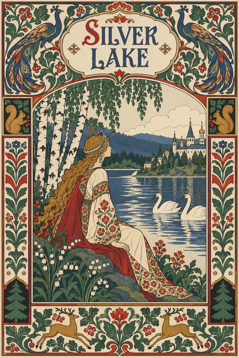
Federant; Mir iskusstva Book Art used Ivan Bilibin's hand-drawn cover titles and illuminated initials in an Old Russian manner, drawn as part of the page and Typeset Cyrillic text in a single block inside an ornamental border, opened by an illuminated initial and closed by a tailpiece
Text · Russian Futurist Book
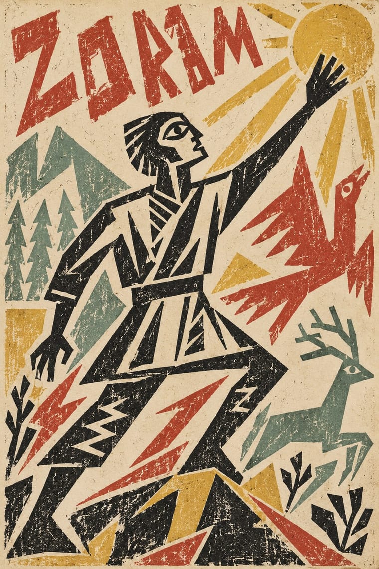
The cheap, small-run books of the Russian Cubo-Futurist poets and painters, from Kruchenykh and Khlebnikov to Goncharova, Larionov and Rozanova. Against the luxurious Symbolist book, they lithographed handwriting and crude neo-primitive drawings together, at times with rubber stamps or colour hectograph, or printed mixed letterpress founts on wallpaper, in thin sewn or stapled pamphlets. Transrational zaum words made the letter itself a visual sound. They adopted Marinetti's manifesto but obstructed his 1914 visit. The Burliuks, Malevich and Kruchenykh were Ukrainian-born, Zdanevich Georgian.
Caveat; Russian Futurist Book used The poets' own handwriting transferred to the lithographic stone and Rubber-stamp letters for zaum poems
03
The colours
The ground and leading colours come from Russian Futurist Book, with a counter-accent from Mir iskusstva Book Art. The ink reads on the ground at 4.5:1 or more.
Mir iskusstva Book Art Russian Futurist Book
-
#ede4cfground · 36% -
#1c1a17ink · 14% -
#d6b44aaccent · 18% -
#b5463aaccent · 14% -
#b8996aaccent · 10% -
#8ea596accent · 8%
As CSS
:root {
  --ground: #ede4cf;
  --ink: #1c1a17;
  --accent-1: #d6b44a;
  --accent-2: #b5463a;
  --accent-3: #b8996a;
  --accent-4: #8ea596;
  --font-display: "Federant", sans-serif;
  --font-text: "Caveat", cursive;
}
Use it with care
Mir iskusstva Book Art: This 'Russian' folk look is a refined, partly state-commissioned idiom of the imperial capital, assembled by professional artists from northern peasant crafts, lubki and icons: do not present it as timeless ethnic Russian folk art or as a neutral emblem of the Russian state, and keep icon-derived holy figures out of trivial uses. Its makers were not all Russian: Heorhiy Narbut, for example, became rector of the Ukrainian Academy of Arts and designed the Ukrainian People's Republic's banknotes and stamps, so credit artists by their own identities. Benois (d. 1960) and Dobuzhinsky (d. 1957) remain in copyright in the EU and Russia (life plus 70 years, so at least until 2031 and 2028), while Bilibin (d. 1942), Somov (d. 1939) and Narbut (d. 1920) are in the public domain there: draw new borders, figures and lettering rather than reproducing their pages. Somov's Le Livre de la Marquise is explicitly erotic, above all the 1918 edition, so keep its plates out of children's or general-audience pastiche.
04
The two styles
05
More combinations
With Mir iskusstva Book Art
- Leningrad Avant-Garde Picture Book Contrasts · Lebedev's Leningrad books dropped the frame, the ornament and the fairy-tale past, floating a few flat planes on bare paper; set them side by side to decide between a bordered, retrospective page and an open, modern one.
- Vienna Secession Contrasts · Both enclose pictures in symmetrical frames, but Vienna squared the frame into grids and bars while the Russian book filled a wide border with folk and rococo motifs; pick geometric order or narrative ornament.
- Bezalel School Pairs well · In the same years both used Art Nouveau's ornamental frame to build a national book art from older ornament; set Bilibin's folk borders beside Raban's filigree frames to compare two revivals, or combine their framed, lettered pages.
- Ligne Claire (Franco-Belgian Clear Line) Pairs well · Both draw an even black contour and fill it with flat colour; give a clear-line page Bilibin's ornamental border and headpiece for a storybook with a heritage frame.
- Celtic Revival Illumination & Lettering Pairs well · A parallel national revival of the same decades: both turned medieval and folk ornament into the borders and initials of a modern book; combine for a heritage storybook framed in old ornament.
- Vyaz (Ornamental Slavonic Lettering) Pairs well · Bilibin's circle drew titles and initials in an Old Russian manner into bordered fairy-tale books; put a newly drawn vyaz title under a folk-ornament headpiece for a Russian Revival page rather than copying a liturgical heading.
- Norwegian and Finnish National Romantic Graphics (Munthe & Karelianism) Pairs well · A parallel national revival of the same years: Bilibin framed Russian fairy tales in Old Russian borders as Munthe framed the sagas; combine for a northern storybook, but keep the Norse and Russian sources distinct.
- Armenian Manuscript Illumination Pairs well · Bilibin's circle turned medieval ornament into the borders and initials of a modern book; follow that route to use canon-table arcades as a frame for new text rather than copying a sacred page.
With Russian Futurist Book
- Risograph & Indie Print Culture Pairs well · Small-run riso artist's books on tinted stock, with handwritten text and a collaged cover, recreate the Futurist pamphlet's economy today.
- Suprematism Contrasts · Malevich went from drawing crude figures in these books to pure geometry on white; pick Suprematism for cosmic order and the Futurist book for crowded, earthy handwork.
- Punk & DIY Zine Pairs well · Both turn cheap reproduction into an anti-professional stance; swap the photocopier for hand lithography or riso to get a punk zine with an archaic, painterly voice.
- Lubok Popular Print Pairs well · The Futurists borrowed the lubok's crude contour and hand-cut lettering; pair them for folk-voiced print whose letters and figures are drawn by the same hand.
- Russian Constructivism Contrasts · Constructivism replaced this handwritten, primitivist page with grotesque type, rules and photomontage; set the two side by side to stage hand against machine.
- Leningrad Avant-Garde Picture Book Contrasts · The Futurist book crowds handwriting and crude drawing onto rough paper; the Leningrad picture book clears the page and lets a few flat planes float on it; choose between a dense handmade page and an airy, ordered one.
- Kultur-Lige & Yiddish Avant-Garde Book Design Contrasts · Its parent in method: artists drawing the whole page and printing it by lithography in small runs. The Futurist book is Cyrillic, mostly black and deliberately crude; the Kultur-Lige book is in Yiddish, earnest, and at its most ambitious in colour, and builds its pages from the Hebrew letter and synagogue ornament.
- Zenitism (Zenit Magazine Typography) Pairs well · Both treat the printed page as a manifesto in rough mixed type; combine them for a polemical artist's book.