Style combination · Pairs well
Contemporary Arabic × Seoul Independent Graphic Design
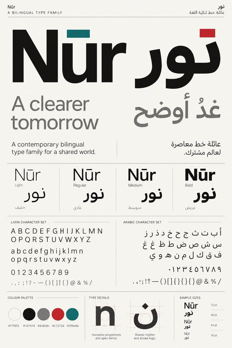
Both answer the type industry's turn to multi-script families, as Favorit Hangul pairs with Dinamo's Latin; borrow that culture's matched, equal-weight scripts when a Seoul poster or book must run in Korean and English.
Mix them and make something Contemporary Arabic Seoul Independent Graphic Design
01
What each style brings
Each part of the design comes from the style with the stronger say in it, and each style gives at least two.
Contemporary Arabic & Dual-Script Type Design Seoul Independent Graphic Design (Small-Studio Scene)
- Type from Contemporary Arabic
- Colour from Contemporary Arabic
- Form from Seoul Independent Graphic Design
- Composition from Seoul Independent Graphic Design
- Surface from Seoul Independent Graphic Design
02
The type
Open fonts standing in for each style’s own type, which is often hand-drawn or commercial.
Display · Contemporary Arabic
Grid
Fira Sans, standing in for Frutiger Arabic and Helvetica Arabic (Nadine Chahine)
Text · Seoul Independent Graphic Design
Graphic design by Seoul's small, self-run studios, which from about 2005 chose to stay small. They design for low-budget culture (exhibitions, festivals, humanities books) and for their own imprints and journals. Typography carries the work: Hangul is reshaped within or beyond its syllable blocks, set beside Latin as one system and enlarged into the picture. Layouts are often centred, in one colour, with circles, repetition and letters treated as objects. Runs are short, in offset, risograph or silkscreen.
Zen Kaku Gothic New; Seoul Independent Graphic Design used Favorit Hangul (Yoon Mingoo with Dinamo, 2019), a Hangul companion to Dinamo's Latin Favorit, part of the type industry's turn to multi-script families and Protoform, Sulki & Min's first Korean font family, drawn by the designers themselves
03
The colours
The ground and leading colours come from Contemporary Arabic, with a counter-accent from Seoul Independent Graphic Design. The ink reads on the ground at 4.5:1 or more.
Contemporary Arabic & Dual-Script Type Design Seoul Independent Graphic Design (Small-Studio Scene)
-
#f7f6f2ground · 36% -
#141414ink · 14% -
#c1272daccent · 18% -
#2448d8accent · 14% -
#0f6e6eaccent · 10% -
#ff5aa5accent · 8%
As CSS
:root {
  --ground: #f7f6f2;
  --ink: #141414;
  --accent-1: #c1272d;
  --accent-2: #2448d8;
  --accent-3: #0f6e6e;
  --accent-4: #ff5aa5;
  --font-display: "Fira Sans", sans-serif;
  --font-text: "Zen Kaku Gothic New", sans-serif;
}
Use it with care
Contemporary Arabic & Dual-Script Type Design: Arabic must be set with correct contextual shaping and right-to-left direction; disconnected or reversed letters are a common and offensive error. Have every Arabic word checked by a fluent reader, avoid setting Qur'anic verses or the names of God and the Prophet as decorative texture, and commission or credit Arabic type designers rather than deriving Arabic glyphs from a Latin font.
Seoul Independent Graphic Design (Small-Studio Scene): These are living, named designers and studios, so never attribute a generated poster or book to Sulki & Min, Everyday Practice or any other studio, and never prompt an image model with their names. Image models often produce pseudo-Hangul: have every Hangul word written or checked by a Korean reader, or leave the text out. Do not paste hanbok, dancheong patterns or a taegeuk emblem on as decoration to signal 'Korean'; where the studios touch such ideas (Sulki & Min's patterns on Hangul vowels and yin-yang), they work them out through the structure of the letters. Choi Sung Min warns that the pressure on Korean designers to find a 'true self' is a problematic Orientalism, and this scene works through type and concept, not national motifs.
04
The two styles
05
More combinations
With Contemporary Arabic
- Corporate Identity Modernism Pairs well · Roll a matched Arabic–Latin family through a standards manual so both scripts carry the identity with equal authority.
- Urdu Katib Lithography Contrasts · The katib's stacked Nastaʿlīq cascade is everything a screen-optimised Arabic sans gives up; quote it where warmth and history matter more than efficiency.
- International Typographic Style Pairs well · Use a strict, mirrored grid and a neutral sans so Arabic and Latin columns align in rhythm and weight.
- Machine-Age Simplified Arabic Type Pairs well · Its digital successor: dual-script families pair Arabic with a matched Latin while keeping the firm baseline, even colour and reduced stacking that simplification made familiar. 29LT's UA Neo (2013), detached revivals of Khattar's Unified Arabic, is where the two touch.
- Ottoman Tughra & Dîvânî Chancery Calligraphy Pairs well · Keep hand-drawn calligraphy for the mark itself and set the running text in a well-made contemporary Arabic typeface with a matched Latin companion, instead of imitating Dîvânî in body text.
- Post-Binary Typography (Bye Bye Binary and Inclusive French Type) Contrasts · Both extend a typeface's character set for a language need, but dual-script design matches two scripts for neutral, institutional legibility, while post-binary type invents new characters within one script and keeps them visible as a political statement.
- Early Turkish Republican Graphic Design Contrasts · Turkey replaced Arabic letters with Latin in 1928, and Emin Barın carried calligraphic habits into the new script; contemporary dual-script type design keeps both scripts and matches them as equals. Compare the two to show replacement against coexistence.
- Bulaq (Amiriyya) Naskh Book Printing Pairs well · Set long reading text in an Amiri-style calligraphic Naskh and use a low-contrast contemporary Arabic sans for headings, captions and screens, so each register does one job.
With Seoul Independent Graphic Design
- Korean Commercial Calligraphy (Kaelligeurapi) Contrasts · Commercial calligraphy writes one warm brushed word for a soju label or a drama title; the small studios construct and systematise Hangul, even when they reinterpret old calligraphic scripts. Decide between a signature and a system.
- Out-of-Square Hangul Typography Pairs well · Ahn Sang-soo freed Hangul from the square in 1985, and Sulki & Min have gone further back, to Cho Young-jae's 1976 proposal to restructure Hangul for typewriters, a study they say has rarely been discussed with the depth it deserves, and to the origins of unsquared Hangul; set a hanging, de-squared headline in a centred one-colour poster to join the generations.
- Neo-Swiss Revival Contrasts · The Seoul studios share Neo-Swiss's Dutch and Swiss roots (Mevis & Van Deursen, Jude Kang's studies in Switzerland, Favorit Hangul extending the Swiss foundry Dinamo's Favorit), but Neo-Swiss sets one Latin grotesque flush left on a modular grid, while the Seoul studios centre their text, repeat circles and letters as objects, and make Hangul, reshaped and set beside Latin, the main material.
- Risograph & Indie Print Culture Pairs well · Corners (founded 2012), which runs a risograph print shop and publishing house, set up a print shop with Manual inside the Ilmin exhibition in 2016; print a small-studio poster in one or two riso inks, but keep the Hangul–Latin type system as the subject rather than illustration.
- Newtro (Korean New-Retro) Contrasts · Both are contemporary and Korean, but newtro reissues big brands' old labels and mascots in flat spot colours, while the small studios design for low-budget culture with type alone; choose newtro for nostalgia on a shelf and the small-studio idiom for an exhibition or a book.