Style combination · Contrasts
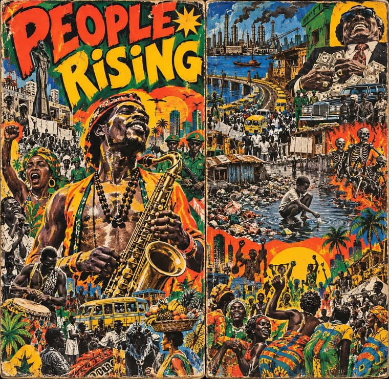
Afrobeat Sleeve Art × Pop Art Graphics
Shares photo collage and flat colour but not the stance; use pop's cool quotation as the foil to decide whether a cover comments or merely cites.
Mix them and make something Afrobeat Sleeve Art Pop Art Graphics
01
What each style brings
Each part of the design comes from the style with the stronger say in it, and each style gives at least two.
Afrobeat Sleeve Art Pop Art Graphics
- Type from Afrobeat Sleeve Art
- Colour from Pop Art Graphics
- Form from Afrobeat Sleeve Art
- Composition from Afrobeat Sleeve Art
- Surface from Pop Art Graphics
02
The type
Open fonts standing in for each style’s own type, which is often hand-drawn or commercial.
Display · Afrobeat Sleeve Art
Yay!
Bangers, standing in for Comic-strip hand lettering in speech balloons
Text · Pop Art Graphics
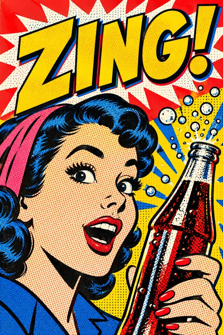
Pop turned the commercial imagery of post-war consumer culture (comics, packaging, celebrity photographs and advertising) into both its subject and its method. Images are appropriated, enlarged, flattened and repeated; colour is bright and unmodulated; and the printing process itself, from Ben-Day dots to off-register silkscreen, is left visible as a sign of mass production.
Archivo; Pop Art Graphics used Comic-book hand lettering and Franklin Gothic
03
The colours
The ground and leading colours come from Pop Art Graphics, with a counter-accent from Afrobeat Sleeve Art. The ink reads on the ground at 4.5:1 or more.
Afrobeat Sleeve Art Pop Art Graphics
-
#fbf8f0ground · 36% -
#111111ink · 14% -
#ffd400accent · 18% -
#e8401caccent · 14% -
#e10600accent · 10% -
#2a5caaaccent · 8%
As CSS
:root {
  --ground: #fbf8f0;
  --ink: #111111;
  --accent-1: #ffd400;
  --accent-2: #e8401c;
  --accent-3: #e10600;
  --accent-4: #2a5caa;
  --font-display: "Bangers", sans-serif;
  --font-text: "Archivo", sans-serif;
}
04
The two styles
05
More combinations
With Afrobeat Sleeve Art
- Minimalist Graphic Design Contrasts · Its exact opposite on density; a single minimal element on a Lemi-style sleeve stands out sharply, and vice versa.
- Ghanaian Movie Poster Pairs well · Another West African painted vernacular with bodies crowding the frame; borrow its looming heads for a sleeve's front and Afrobeat's strips for the back.
- Afrofuturist Design Pairs well · Afrobeat supplies the grounded Pan-African politics and Afrofuturism the cosmic horizon; combine them for music packaging that is both angry and visionary.
- Tropicália Graphic Design Contrasts · Both crowd a political record sleeve with photographs and drawing, but Lemi Ghariokwu states the argument openly as captioned satire, while Tropicália hides it in irony and allegory to get past the censor.
- Post-Punk Record Sleeve (Stiff, Factory, 4AD) Contrasts · Lemi Ghariokwu's sleeves fill every inch to state the record's argument, while post-punk sleeves leave the name off and say nothing; use the pair to decide how much a cover should explain.
- Fania and Nuyorican Salsa LP Sleeves Pairs well · Another label-driven diaspora sleeve idiom of crowded polychrome portraits; Afrobeat sleeves are painted, so the link is parallel, not direct.
- Blue Note Jazz Sleeve Modernism Contrasts · The same twelve-inch square used two ways: Lemi Ghariokwu packs it with painted, captioned satire, Reid Miles empties it to one photograph, one colour and one giant word.
- Jamaican Dancehall Signs & Sleeve Art Pairs well · Limonious's comic dancehall sleeves and Lagos album art share crowded caricature and speech balloons; mix them for satirical music packaging.
With Pop Art Graphics
- International Typographic Style Contrasts · Set one loud appropriated Pop image inside a strict grid with a neutral grotesque so the irony reads as deliberate rather than chaotic.
- Ma & Wabi-sabi Aesthetics Contrasts · Where Pop multiplies glossy commodities, wabi-sabi values the single worn object; use one to puncture the mood of the other.
- Guna Mola Pairs well · Guna women redraw brand logos and cartoons (RCA Victor, Bullwinkle) in reverse appliqué; let that act of translation inspire Pop work, but buy or commission molas rather than imitating them.
- Neo-Brutalism Pairs well · Lift Pop's thick black outlines and flat primaries into UI cards and buttons for a confident, comic-strip interface.
- Risograph & Indie Print Culture Pairs well · Print Ben-Day dot screens in fluorescent pink and yellow riso inks to give Pop's mass-media imagery a small-run, handmade warmth.
- Screenprinted Gig & Alt-Movie Poster Pairs well · Shepard Fairey called Kozik 'the punk rock Warhol'; take Pop's appropriated cartoons and halftones and give them a gig poster's single idea and hand-lettered title.
- Finnish Bold Print (Marimekko Modernism) Pairs well · Contemporaries in saturated flat colour at a giant scale; borrow pop's isolated, enlarged object for a poster, but drop its halftone and irony to keep Marimekko's sincerity.
- Superflat Contrasts · Both turn commodities into art; take Pop's repetition and frontal commodity but swap its halftone and off-register silkscreen for Superflat's smooth vector fills and anime characters, so the print process disappears.