Style combination · Contrasts
Adinkra × Ma
Saturated, meaning-dense repetition versus quiet emptiness: decide whether your message needs abundance or a single sign.
01
What each style brings
Each part of the design comes from the style with the stronger say in it, and each style gives at least two.
Adinkra & Kente Symbol Systems Ma & Wabi-sabi Aesthetics
- Type from Ma
- Colour from Adinkra
-
Ma avoids full polychrome: this is where the two pull against each other, which is the point of the contrast.
- Form from Adinkra
- Composition from Adinkra
- Surface from Ma
02
The type
Open fonts standing in for each style’s own type, which is often hand-drawn or commercial.
Text · Adinkra
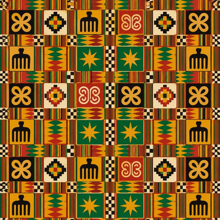
The Akan textile languages of Ghana. In adinkra, named symbols carrying proverbs (Gye Nyame, Sankofa, Dwennimmen) are stamped in black with carved calabash stamps on cloth ruled into squares; kente is narrow-strip cloth woven in named warp-faced blocks of gold, green, red and blue and sewn into checkerboards. Pattern is a vocabulary: each motif and colour is chosen for its meaning.
Archivo; Adinkra used Adinkra stamped glyphs as a pictographic set and Ghanaian hand-painted sign lettering for accompanying text
03
The colours
The ground and leading colours come from Adinkra, with a counter-accent from Ma. The ink reads on the ground at 4.5:1 or more.
Adinkra & Kente Symbol Systems Ma & Wabi-sabi Aesthetics
-
#efe2c4ground · 36% -
#151412ink · 14% -
#e3a51caccent · 18% -
#7d4e3aaccent · 14% -
#b52a1faccent · 10% -
#b9a88aaccent · 8%
As CSS
:root {
  --ground: #efe2c4;
  --ink: #151412;
  --accent-1: #e3a51c;
  --accent-2: #7d4e3a;
  --accent-3: #b52a1f;
  --accent-4: #b9a88a;
  --font-display: "Shippori Mincho", serif;
  --font-text: "Archivo", sans-serif;
}
Use it with care
Adinkra & Kente Symbol Systems: Adinkra symbols and kente patterns are named, proverb-bearing Akan heritage, and some kente designs were historically reserved for the Asantehene and royal lineages. Learn each symbol's meaning before use, keep sacred signs such as Gye Nyame out of trivial or demeaning contexts, and commission or credit Ghanaian stampers and weavers (for example in Ntonso and Bonwire) rather than printing faux kente.
04
The two styles
05
More combinations
With Adinkra
- International Typographic Style Pairs well · A modular grid holds adinkra squares naturally; pair them with a neutral grotesque for contemporary Ghanaian institutional work.
- Bògòlanfini Mud Cloth Pairs well · Adinkra stamps dark signs on light cloth while bògòlan leaves light signs in a dark mud-dyed ground; use the reversal for a light and dark pattern pair, with each motif's meaning and makers credited.
- Isotype Pictorial Statistics Pairs well · Treat adinkra as a consistent icon family on a strict grid, as Isotype did with pictograms, for wayfinding or data with local voice.
- Afrofuturist Design Pairs well · Afrofuturist identities draw on adinkra; render named symbols as glowing or metallic glyphs while keeping their meanings intact.
- Amazigh Sign System & Tifinagh Contrasts · Both are sign systems that carry meaning, but adinkra stamps named symbols into a ruled grid of squares. Amazigh weavers and tattooists vary the size and spacing of their signs by hand within bands and lattices, and share them with a script.
- Andean Woven Graphic Systems Contrasts · Adinkra stamps named symbols into ruled squares and kente joins woven strips, whereas Andean cells are woven into one garment and distorted toward its edges; keep the two languages distinct.
- Pacific Barkcloth (Tapa) Design Pairs well · Both are gridded ceremonial cloths of named motifs; borrow their shared square-by-square logic for a layout, while keeping each motif tied to its own culture and meaning.
- Fante Asafo Flags (Frankaa) Contrasts · Both put Akan proverbs on cloth, but adinkra stamps abstract named signs in a ruled grid and kente weaves blocks of pattern, while an asafo flag spells the proverb out as one pictorial scene of appliquéd figures on an open ground.
With Ma
- Minimalist Graphic Design Pairs well · Add one rough material or brush mark to a minimalist layout so its emptiness feels lived-in rather than sterile.
- Japanese Postwar Modernism Pairs well · Use a modernist grid but leave whole modules empty, the way Tanaka and Hara let ma structure the page.
- Memphis Design Contrasts · Memphis is loud, synthetic and glossy; set one Memphis squiggle on a vast wabi ground only if you want deliberate friction.
- Scandinavian Functionalism Pairs well · Both prize natural materials and restraint; combine Nordic clarity with wabi irregularity for warm, quiet identities.
- Uli & Nsibidi Line and Sign Tradition Pairs well · Both make the empty interval carry meaning and place a few elements off-centre in earth colours; uli supplies a living line and named signs where wabi-sabi supplies texture and a single mark.
- Slow-Living Editorial (the Kinfolk Look) Pairs well · Leonard Koren, author of the 1994 book on wabi-sabi for designers, joined Kinfolk's editorial board in 2016; add a cracked bowl, raw linen or an off-centre object on a bare ground to make the calm less styled and more lived-in.
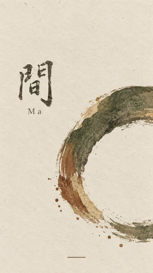
- Korean Commercial Calligraphy (Kaelligeurapi) Pairs well · Give one brushed word a wide, quiet field of paper-toned space so its dry streaks and pooled ink read as the whole design.
- Rinpa & Saga-bon Contrasts · Both come from Kyoto's tea culture (Kōetsu also made Raku tea bowls), but wabi-sabi wants rough clay and empty paper where Rinpa wants gold leaf and malachite; one bare field can serve either, so choose the material that fills it.