Style combination · Pairs well
Kawaii Design × Taishō Roman
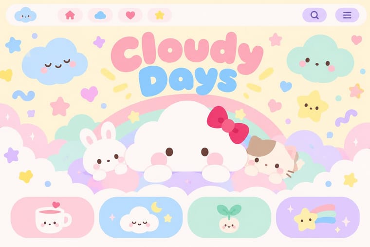
Nakahara Jun'ichi's large-eyed girls link the two; give kawaii characters Taishō's muted palette and wistful mood for an older, nostalgic audience.
01
What each style brings
Each part of the design comes from the style with the stronger say in it, and each style gives at least two.
Kawaii Design Taishō Roman & Lyrical Illustration
- Type from Kawaii Design
- Colour from Kawaii Design
- Form from Kawaii Design
- Composition from Taishō Roman
- Surface from Taishō Roman
02
The type
Open fonts standing in for each style’s own type, which is often hand-drawn or commercial.
Display · Kawaii Design
Reverie
Zen Maru Gothic, standing in for Maru-ji (rounded teenage handwriting, 1970s)
Text · Taishō Roman
The lyrical illustration (jojōga) of late-Meiji to early-Shōwa Japan, led by Takehisa Yumeji: willowy, large-eyed women in kimono drawn with an Art Nouveau contour, set among camellias and kimono patterns and lettered by hand. Made for sheet-music covers, girls' magazines, postcards and paper goods, it is intimate and melancholic rather than ornamental, and its eyes and moods passed through Nakahara Jun'ichi into shōjo manga.
Shippori Mincho; Taishō Roman used Hand-drawn title lettering mixing kanji, kana and Latin and Brush-written kana for lyric poems
03
The colours
The ground and leading colours come from Kawaii Design, with a counter-accent from Taishō Roman. The ink reads on the ground at 4.5:1 or more.
Kawaii Design Taishō Roman & Lyrical Illustration
-
#fff4a3ground · 36% -
#141414ink · 14% -
#e60033accent · 18% -
#b8333aaccent · 14% -
#a8d8ffaccent · 10% -
#c9a548accent · 8%
As CSS
:root {
  --ground: #fff4a3;
  --ink: #141414;
  --accent-1: #e60033;
  --accent-2: #b8333a;
  --accent-3: #a8d8ff;
  --accent-4: #c9a548;
  --font-display: "Zen Maru Gothic", sans-serif;
  --font-text: "Shippori Mincho", serif;
}
04
The two styles
05
More combinations
With Kawaii Design
- Techno-Futurist Graphics Pairs well · A cute mascot inside a dense techno-corporate layout softens its satire; Groovisions' Chappie is the model.
- Grunge Typography Contrasts · Grunge's dirt and illegibility is kawaii's opposite; one cute character on a distressed texture creates knowing dissonance.
- Memphis Design Pairs well · Kawaii characters sit happily on Memphis pastel geometry; combine them for playful packaging with a little more edge.
- Dark Tech Minimalism Contrasts · Use a single pastel mascot or emoji moment to humanise a cold, dark interface without changing its structure.
- Claymorphism & Soft 3D Pairs well · Kawaii's oversized heads, minimal faces and scattered sparkles translate directly into clay volumes; use its character rules for mascots and emoji so the 3D figures stay simple and readable at small sizes.
- Moomin Graphics (Tove Jansson's Pen-Drawn World and its Licensed Afterlife) Contrasts · Its round, white characters sit near kawaii fancy goods, but they keep a hatched, melancholy world around them that kawaii fancy goods leave out.
- Superflat Contrasts · Kawaii offers sincere, simple, pastel cuteness for fancy goods; switch to Superflat when the cute should be saturated, crowded, many-eyed and ironic, a comment on consumer culture rather than a product of it.
- VTuber Avatar and Stream Graphics Contrasts · Its parent in cute character culture, but kawaii fixes a static mascot on pastel goods and print; switch to VTuber graphics when the character has to move, talk and answer a live chat, with a performer's voice and a whole stream screen around it.
With Taishō Roman
- Ukiyo-e Woodblock Prints Pairs well · Yumeji's beauties continue the bijin-ga print; pair a woodblock-printed pattern ground with a lyrical modern figure.
- Japanese Postwar Modernism Contrasts · Postwar modernism replaced this sentimental figure with emblems and empty fields; set one against the other to calibrate warmth against austerity.
- Art Nouveau Pairs well · Its source of line: keep Art Nouveau's contour but drop the ornamental excess, leaving one figure and a few flowers for an intimate Taishō register.
- Shōjo Manga (Japanese Girls' Comics) Pairs well · Its root: Takahashi Macoto took Nakahara Jun'ichi's large, doll-like eyes with highlights and long lashes and added dots, stars and colour to the iris. Borrow jojōga's single wistful figure, muted cream paper and hand lettering for a cover or title page with a period mood.
- Mavo Contrasts · The same Taishō Tokyo in two moods: pastel lyrical illustration of modern girls against Mavo's black linocuts, newsprint and price tags.
- Story Manga (Postwar Japanese Comics) Pairs well · Jojōga's large, highlighted, long-lashed eyes passed from Nakahara Jun'ichi to Takahashi Macoto, who added stars and dots to the iris, and so into shōjo manga; add Taishō lyrical faces, kimono patterns and soft lines to a manga page for a period romance.
- Republican Chinese Book Cover Design (Lu Xun & Tao Yuanqing) Pairs well · Feng Zikai found Takehisa Yumeji's lyrical drawings in Tokyo; Yumeji's soft line suits the quiet, literary register of these covers.
- Angura Theatre Poster Pairs well · Angura recycled Meiji and Taishō imagery as found material; cut a Taishō beauty into an angura collage for ironic retro nostalgia.