Style combination · Contrasts
International Typographic Style × Yeşilçam Film Poster
A grid, white space and neutral sans-serif are the opposite of the crowded, hand-lettered, many-coloured afiş.
Mix them and make something International Typographic Style Yeşilçam Film Poster
01
What each style brings
Each part of the design comes from the style with the stronger say in it, and each style gives at least two.
International Typographic Style Yeşilçam Film Poster (Turkish Hand-Painted Afiş)
- Type from International Typographic Style
-
Yeşilçam Film Poster avoids grotesque & neo-grotesque: this is where the two pull against each other, which is the point of the contrast.
- Colour from International Typographic Style
- Form from Yeşilçam Film Poster
- Composition from International Typographic Style
-
Yeşilçam Film Poster avoids modular grid: this is where the two pull against each other, which is the point of the contrast.
- Surface from Yeşilçam Film Poster
02
The type
Open fonts standing in for each style’s own type, which is often hand-drawn or commercial.
Text · Yeşilçam Film Poster
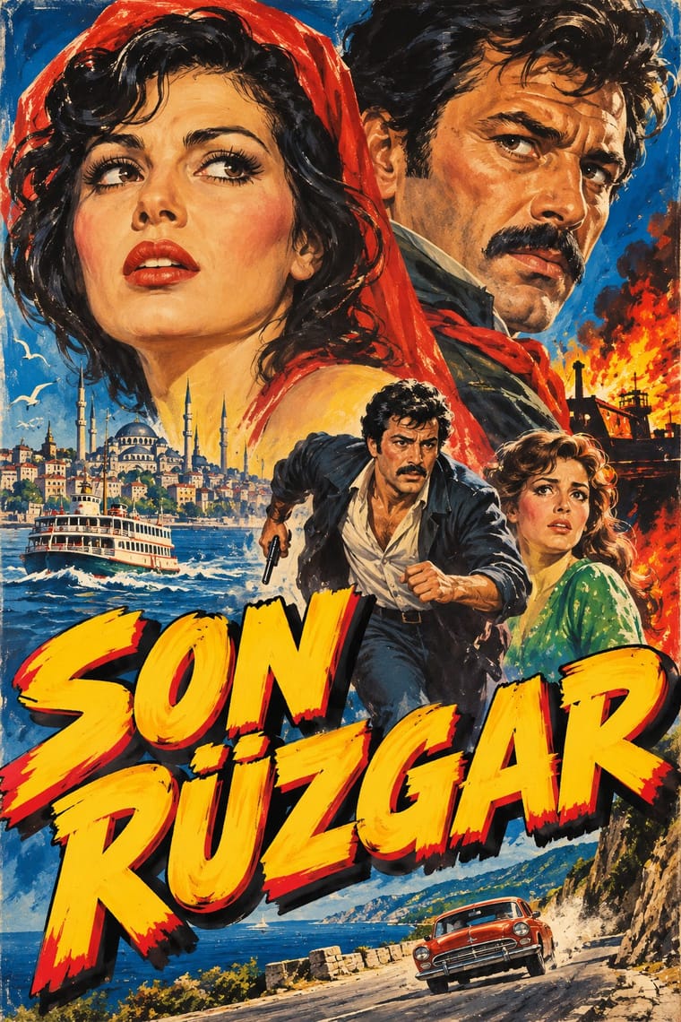
Painted publicity of Turkish popular cinema by workshop artists such as Mehmet Bal, Kemal Borteçin and İbrahim Enez. Working from set photographs and plot briefings, painters sketched for approval, then painted gouache on paper for posters; facade lanterns used earth pigment and glue. Latin-script titles are hand-lettered in saturated colour. Painters were mostly anonymous, posters unsigned, originals often lost; the industry declined after the 1980 coup, ending 1988.
Archivo; Yeşilçam Film Poster used Hand-painted Latin display capitals for Turkish film titles, with diacritics and Outlined and shadowed cast and credit lettering painted by the poster artist
03
The colours
The ground and leading colours come from International Typographic Style, with a counter-accent from Yeşilçam Film Poster. The ink reads on the ground at 4.5:1 or more.
International Typographic Style Yeşilçam Film Poster (Turkish Hand-Painted Afiş)
-
#f2f0e9ground · 36% -
#111111ink · 14% -
#e1251baccent · 18% -
#f5c518accent · 14% -
#1f4e9caccent · 10% -
#7a7a7aaccent · 8%
As CSS
:root {
  --ground: #f2f0e9;
  --ink: #111111;
  --accent-1: #e1251b;
  --accent-2: #f5c518;
  --accent-3: #1f4e9c;
  --accent-4: #7a7a7a;
  --font-display: "Inter Tight", sans-serif;
  --font-text: "Archivo", sans-serif;
}
04
The two styles

05
More combinations
With International Typographic Style
- Art Nouveau Contrasts · Ornamental curves against an orthogonal grid make a strong deliberate tension.
- Brutalist Web Design Pairs well · Strip the grid to raw HTML defaults to get a rawer, contemporary take on Swiss honesty.
- Psychedelic Poster Contrasts · Its exact opposite on legibility; borrow one swirling element to break a too-cold Swiss layout.
- Japanese Postwar Modernism Pairs well · Add Japanese restraint and emblematic colour fields to the grid for warmth without losing order.
- American Traditional Tattoo Flash Contrasts · Rational grid and sans-serif against sentimental, hand-lettered emblems: one flash motif on a Swiss layout makes a sharp contrast.
- Graffiti & Hip-Hop Graphics Contrasts · Put a single tag or throw-up over a strict Swiss grid to stage the clash between institutional order and a street voice.
- Pop Art Graphics Contrasts · Set one loud appropriated Pop image inside a strict grid with a neutral grotesque so the irony reads as deliberate rather than chaotic.
- Italian Painted Film Poster (Rome Studios) Contrasts · Grid, restraint and photographic objectivity are the opposite of a crowded painted montage.
With Yeşilçam Film Poster
- Egyptian Painted Film Poster Pairs well · Both put painted star heads above a melodramatic scene. Pair them to compare Latin-script Istanbul lettering with Arabic calligraphic titles.
- Early Turkish Republican Graphic Design Pairs well · Both use hand-drawn Latin Turkish lettering; Republican graphics are calm and official, the film poster is crowded and emotional.
- Hand-Painted Bollywood Poster Pairs well · Hand-painted star portraits and billboard lettering link the two; borrow Bollywood's saturated hoarding colour for a Yeşilçam-style revival.