Style combination · Pairs well
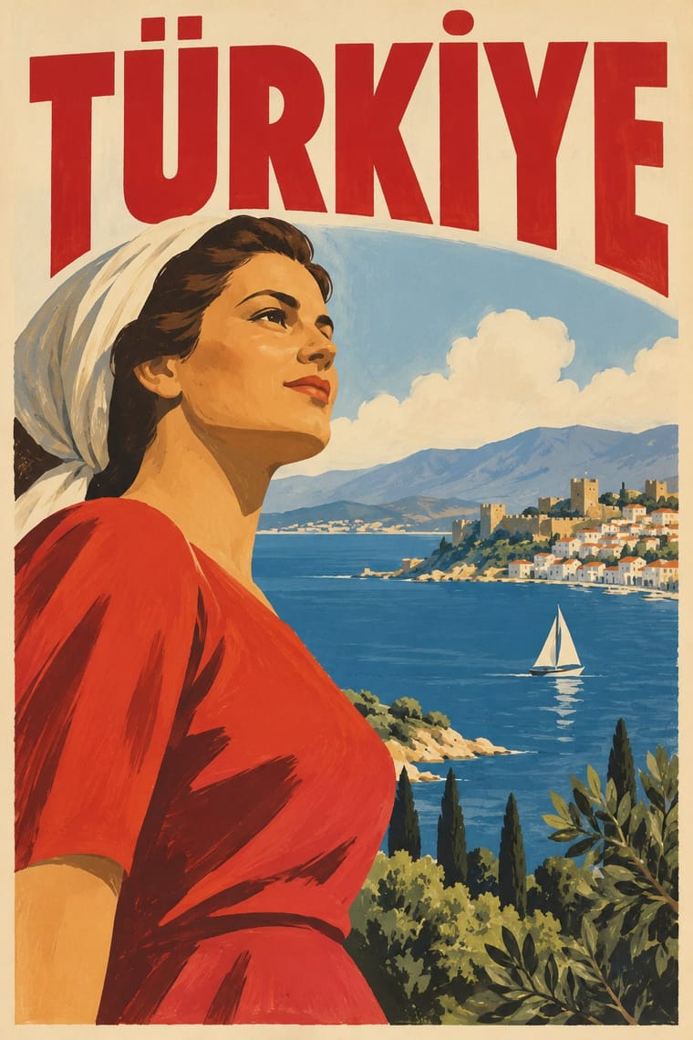
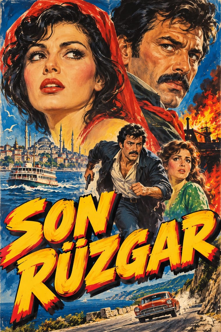
Early Turkish Republican Graphic Design × Yeşilçam Film Poster
Both use hand-drawn Latin Turkish lettering; Republican graphics are calm and official, the film poster is crowded and emotional.
Mix them and make something Early Turkish Republican Graphic Design Yeşilçam Film Poster
01
What each style brings
Each part of the design comes from the style with the stronger say in it, and each style gives at least two.
Early Turkish Republican Graphic Design Yeşilçam Film Poster (Turkish Hand-Painted Afiş)
- Type from Early Turkish Republican Graphic Design
- Colour from Yeşilçam Film Poster
- Form from Early Turkish Republican Graphic Design
- Composition from Early Turkish Republican Graphic Design
- Surface from Yeşilçam Film Poster
02
The type
Open fonts standing in for each style’s own type, which is often hand-drawn or commercial.
Display · Early Turkish Republican Graphic Design
Public
Bungee Shade, standing in for Shaded and extruded display letters and giant numerals (Milli Piyango '7', İş Bankası '12', Köy Halk Kıraatı)
Text · Yeşilçam Film Poster
Painted publicity of Turkish popular cinema by workshop artists such as Mehmet Bal, Kemal Borteçin and İbrahim Enez. Working from set photographs and plot briefings, painters sketched for approval, then painted gouache on paper for posters; facade lanterns used earth pigment and glue. Latin-script titles are hand-lettered in saturated colour. Painters were mostly anonymous, posters unsigned, originals often lost; the industry declined after the 1980 coup, ending 1988.
Archivo; Yeşilçam Film Poster used Hand-painted Latin display capitals for Turkish film titles, with diacritics and Outlined and shadowed cast and credit lettering painted by the poster artist
03
The colours
The ground and leading colours come from Yeşilçam Film Poster, with a counter-accent from Early Turkish Republican Graphic Design. The ink reads on the ground at 4.5:1 or more.
Early Turkish Republican Graphic Design Yeşilçam Film Poster (Turkish Hand-Painted Afiş)
-
#f2e6c9ground · 36% -
#1a1a1aink · 14% -
#f5c518accent · 18% -
#cf1f2eaccent · 14% -
#c89b3caccent · 10% -
#1e63b5accent · 8%
As CSS
:root {
  --ground: #f2e6c9;
  --ink: #1a1a1a;
  --accent-1: #f5c518;
  --accent-2: #cf1f2e;
  --accent-3: #c89b3c;
  --accent-4: #1e63b5;
  --font-display: "Bungee Shade", sans-serif;
  --font-text: "Archivo", sans-serif;
}
Use it with care
Early Turkish Republican Graphic Design: Atatürk's likeness, the Turkish flag and the star and crescent are living national symbols, and Turkey's Law No. 5816 (1951) criminalises insulting Atatürk's memory, so do not caricature, distort or trivialise them when borrowing this style. Much of this imagery was produced for a one-party state and its campaigns, and Kemalist iconography (the unveiled "modern" woman, the six arrows, Atatürk portraits) is still politically charged in Turkey, read differently by secularists, religious conservatives and minorities whom the nation-building imagery left out. Do not present the regime's modernising narrative as neutral, and do not reuse party emblems as decoration.
04
The two styles
05
More combinations
With Early Turkish Republican Graphic Design
- WPA Silkscreen Posters Pairs well · Both are 1930s state-backed poster programmes for public institutions and tourism; combine WPA silkscreen flatness with Görey's modelled figures for civic campaigns.
- Urdu Katib Lithography Contrasts · Urdu print kept hand-written Arabic-script lithography for another century, while Turkey abolished Arabic letters in 1928; set the two side by side to show two answers to modern print.
- Contemporary Arabic & Dual-Script Type Design Contrasts · Turkey replaced Arabic letters with Latin in 1928, and Emin Barın carried calligraphic habits into the new script; contemporary dual-script type design keeps both scripts and matches them as equals. Compare the two to show replacement against coexistence.
- Die Neue Typographie Contrasts · In the same years German modernists replaced illustration with sans-serif type and photography; Turkish Republican graphics kept Munich's pictorial poster and hand-drawn letters.
- Egyptian Painted Film Poster Pairs well · Görey was born in Cairo and worked for Egyptian clients; Cairo's painted lithographic posters share his modelled faces and hand-lettered titles, in Arabic rather than Latin script.
- Mongol Bichig Calligraphy & Ugalz Ornament Contrasts · Both make the state's alphabet part of its official graphics, by opposite moves: Turkish Republican posters hand-letter the new Latin alphabet at display size to promote it, while Mongolia sets its revived old script beside Cyrillic on seals, signboards and letterheads as a national mark.
- Ottoman Tughra & Dîvânî Chancery Calligraphy Contrasts · The end of the sultanate in 1922 retired the tughra (its last on stamps that year), and the Republic replaced Arabic script with the Latin alphabet in 1928; its hand-lettered Latin posters are the deliberate opposite of the chancery's sultanic calligraphy.
- Australian Travel Poster (ANTA Era) Pairs well · A state-promoted lithographic school of the same years that also advertised tourism under bold drawn lettering. Görey's figures, from his Munich training in Hohlwein's orbit, stand in crisp patches of light on a light ground where ANTA opens a painted vista; borrow its framed emblem and giant letters for a tighter, flatter ANTA sheet.
All 12 combinations with Early Turkish Republican Graphic Design
With Yeşilçam Film Poster
- Egyptian Painted Film Poster Pairs well · Both put painted star heads above a melodramatic scene. Pair them to compare Latin-script Istanbul lettering with Arabic calligraphic titles.
- International Typographic Style Contrasts · A grid, white space and neutral sans-serif are the opposite of the crowded, hand-lettered, many-coloured afiş.
- Hand-Painted Bollywood Poster Pairs well · Hand-painted star portraits and billboard lettering link the two; borrow Bollywood's saturated hoarding colour for a Yeşilçam-style revival.