Style combination · Contrasts
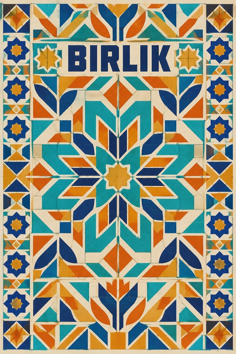
Soviet Central Asian Ornamental Modernism × International Typographic Style
Set a strict ornament-free information layer of grid and grotesque against one ornamental panel to keep wayfinding legible on a patterned wall.
Mix them and make something Soviet Central Asian Ornamental Modernism International Typographic Style
01
What each style brings
Each part of the design comes from the style with the stronger say in it, and each style gives at least two.
Soviet Central Asian Ornamental Modernism International Typographic Style
- Type from International Typographic Style
- Colour from International Typographic Style
- Form from Soviet Central Asian Ornamental Modernism
- Composition from International Typographic Style
- Surface from Soviet Central Asian Ornamental Modernism
02
The type
Open fonts standing in for each style’s own type, which is often hand-drawn or commercial.
Text · Soviet Central Asian Ornamental Modernism
The monumental art of Soviet Central Asia after the 1966 Tashkent earthquake: a strand of Socialist Realism mixed with Islamic and national ornament. Prefabricated housing blocks and public buildings in Tashkent and Almaty, and Tashkent's metro stations, got a skin of smalt and ceramic mosaic and concrete sun-screen grilles (panjara) that enlarge Central Asian and Islamic pattern to façade scale. Near-abstract geometric and floral pattern carries much of it; figurative panels add flat, stylised musicians, epic lovers, cosmonauts and scientists in turquoise, deep blue, ochre and orange.
Jost; Soviet Central Asian Ornamental Modernism used The sources document no lettering of the style's own, so the genome's all-caps weight (0.3) is a design recommendation, not an observed choice: for graphics, keep words few and set Cyrillic, Uzbek and Kazakh names in plain capitals so that pattern and figure carry the design and Zhurnalnaya rublenaya, or Magazine Grotesque (designed 1940–56 at the Polygraphmash type bureau under Anatoliy Shchukin, released 1947, Latin added 1962), a Soviet geometric sans after Erbar-Grotesk and Metro, for Cyrillic captions and signs
03
The colours
The ground and leading colours come from International Typographic Style, with a counter-accent from Soviet Central Asian Ornamental Modernism. The ink reads on the ground at 4.5:1 or more.
Soviet Central Asian Ornamental Modernism International Typographic Style
-
#f2f0e9ground · 36% -
#111111ink · 14% -
#e1251baccent · 18% -
#d79a2baccent · 14% -
#1f4e9caccent · 10% -
#d2602baccent · 8%
As CSS
:root {
  --ground: #f2f0e9;
  --ink: #111111;
  --accent-1: #e1251b;
  --accent-2: #d79a2b;
  --accent-3: #1f4e9c;
  --accent-4: #d2602b;
  --font-display: "Inter Tight", sans-serif;
  --font-text: "Jost", sans-serif;
}
Use it with care
Soviet Central Asian Ornamental Modernism: This is official Soviet monumental art made in Central Asia under rule from Moscow: treat its motifs as Uzbek, Kazakh, Kyrgyz and Tajik heritage rather than generic 'Oriental' decoration; credit named artists, among them the Jarsky brothers, Ahmet Shaymuradov and the Kazakh artist Moldakhmet Kenbaev; keep Qur'anic and other sacred Arabic inscriptions, and pseudo-Arabic letters, out of reworked tile patterns; and draw new panels instead of copying surviving mosaics. They are attributed works whose makers or heirs may still hold rights; 157 of them have been listed heritage in Uzbekistan since 25 March 2024, while Almaty has no policy to protect its monumental art, and many mosaics there have been painted over, demolished or hidden behind hoardings and advertisements.
04
The two styles

05
More combinations
With Soviet Central Asian Ornamental Modernism
- Socialist Realist Propaganda Poster Contrasts · The parent doctrine in its painted poster form, with leaders, slogans and rising diagonals, is the foil: choose ornament, folklore and a flat frontal figure where it chooses the call to arms.
- Thaw Modernism (Soviet and Czechoslovak) Pairs well · Borrow its laconic flat figures, orbits and rockets for posters and booklets that sit beside a mosaic wall about science and space.
- Islamic Geometric & Calligraphic Tradition Pairs well · Take its star-and-polygon tilings at full strength for the grille or the mosaic field, then set them on a plain concrete slab beside secular figures instead of sacred script.
- Square Kufic (Bannāʾī) Contrasts · The atlas's Soviet Central Asian entry recommends display capitals built on its mosaic or panjara module after the bannāʾī principle of tiles as pixels, for Cyrillic and Latin names only and with no Arabic script or pseudo-Kufic; use that route when a grid-built wordmark must stay secular, and square Kufic only for Arabic-script words read and approved by a fluent reader.
With International Typographic Style
- Art Nouveau Contrasts · Ornamental curves against an orthogonal grid make a strong deliberate tension.
- Brutalist Web Design Pairs well · Strip the grid to raw HTML defaults to get a rawer, contemporary take on Swiss honesty.
- Psychedelic Poster Contrasts · Its exact opposite on legibility; borrow one swirling element to break a too-cold Swiss layout.
- Japanese Postwar Modernism Pairs well · Add Japanese restraint and emblematic colour fields to the grid for warmth without losing order.
- American Traditional Tattoo Flash Contrasts · Rational grid and sans-serif against sentimental, hand-lettered emblems: one flash motif on a Swiss layout makes a sharp contrast.
- Graffiti & Hip-Hop Graphics Contrasts · Put a single tag or throw-up over a strict Swiss grid to stage the clash between institutional order and a street voice.
- Pop Art Graphics Contrasts · Set one loud appropriated Pop image inside a strict grid with a neutral grotesque so the irony reads as deliberate rather than chaotic.
- Italian Painted Film Poster (Rome Studios) Contrasts · Grid, restraint and photographic objectivity are the opposite of a crowded painted montage.