Style combination · Contrasts
Turkish Weekly Humour Magazines × Turkish Modernist Poster
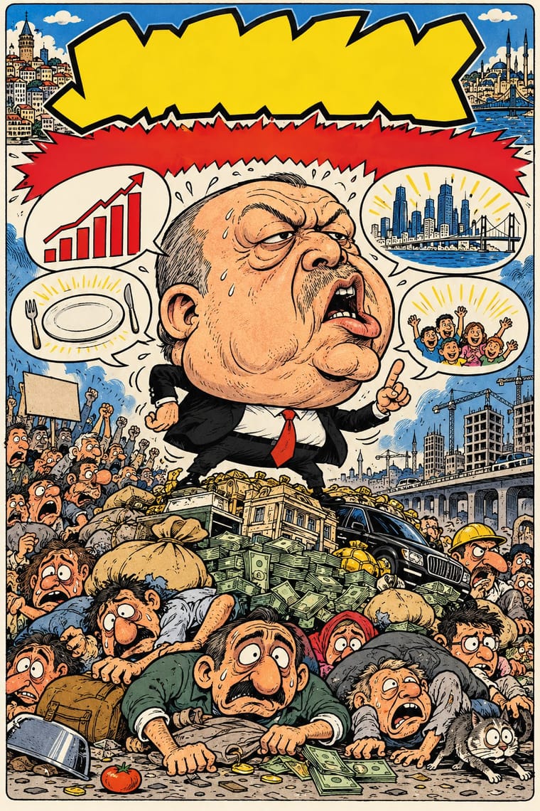
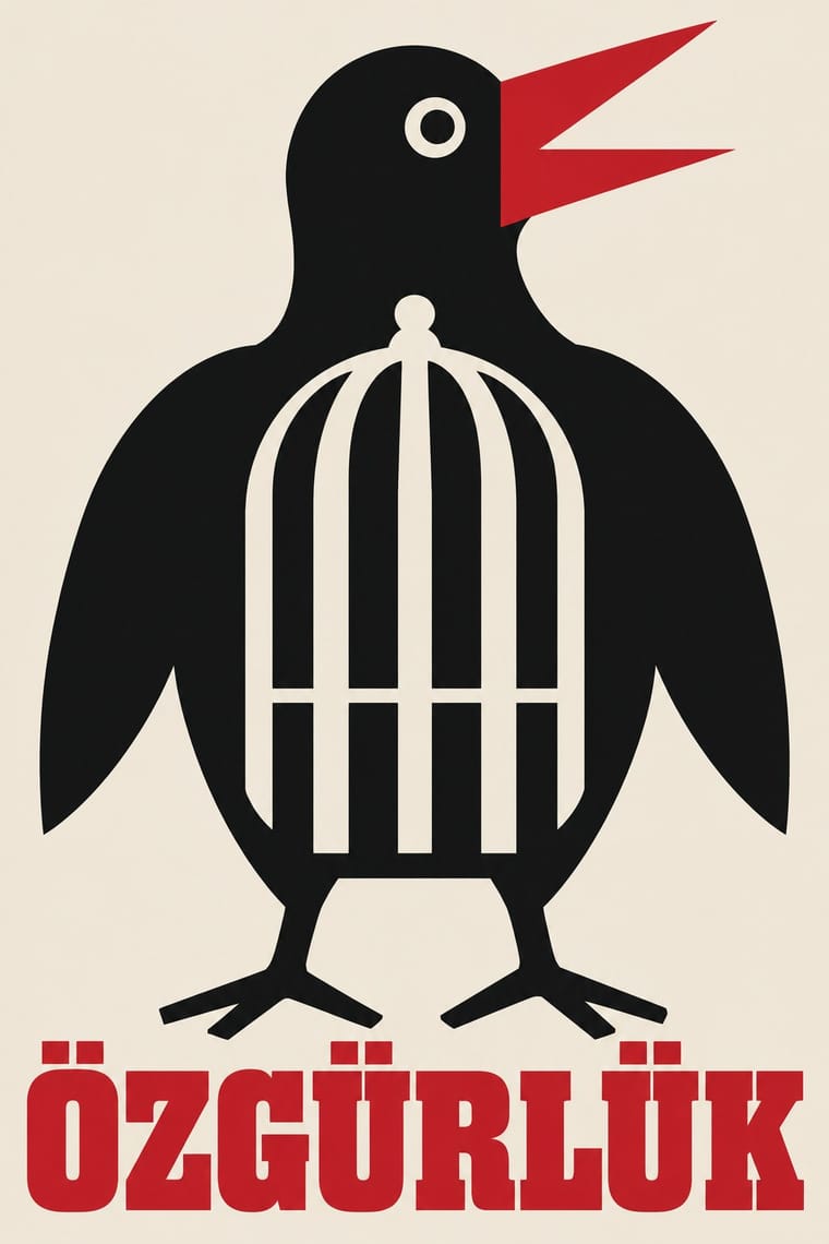
Same city, same decades, opposite density: Istanbul's poster designers reduced a play or film to one flat idea on an open field, while the humour weeklies packed a cover with a caricature, balloons, headline band and price box. Borrow the poster's single idea to calm a crowded cover.
Mix them and make something Turkish Weekly Humour Magazines Turkish Modernist Poster
01
What each style brings
Each part of the design comes from the style with the stronger say in it, and each style gives at least two.
Turkish Weekly Humour Magazines (Gırgır to Uykusuz) Turkish Modernist Poster & Graphic Design
- Type from Turkish Weekly Humour Magazines
- Colour from Turkish Modernist Poster
- Form from Turkish Weekly Humour Magazines
- Composition from Turkish Modernist Poster
- Surface from Turkish Weekly Humour Magazines
02
The type
Open fonts standing in for each style’s own type, which is often hand-drawn or commercial.
Display · Turkish Weekly Humour Magazines
Wow
Londrina Solid, standing in for Hand-lettered capitals in speech balloons and caption blocks, with the Turkish İ, Ş, Ğ and Ç drawn in (the Uykusuz cover of 12 November 2008, the Gırgır cover of 10 August 2011)
Text · Turkish Modernist Poster
The posters of Istanbul's first generation of professional graphic designers for theatres, films, festivals and exhibitions. Mengü Ertel, Yurdaer Altıntaş and later Bülent Erkmen reduced each play or film to one visual idea or pun: a figure, mask, eye or object drawn as flat, simplified shapes in two or three inks on an open field of colour or white, with a hand-drawn or bold serif title. From the 1980s Erkmen pared the language down further to a giant word, a stripe or one photographed detail.
Newsreader; Turkish Modernist Poster used Hand-drawn title lettering by the designers themselves, e.g. Altıntaş's heavy lowercase 'aptal kız' (Kent Oyuncuları, 1961) and his condensed brush capitals for Dormen Tiyatrosu's 'Bugün Git Yarın Gel' and Bold and book serif titles centred above the image (Erkmen's Kent Oyuncuları posters and 'Les Civilisations Anatoliennes', 1983, in a Times-like transitional serif), and heavy serif capitals on Ertel's 'Jan Dark'ın Çilesi' and 'Le Gardien'
03
The colours
The ground and leading colours come from Turkish Modernist Poster, with a counter-accent from Turkish Weekly Humour Magazines. The ink reads on the ground at 4.5:1 or more.
Turkish Weekly Humour Magazines (Gırgır to Uykusuz) Turkish Modernist Poster & Graphic Design
-
#efe8dcground · 36% -
#111214ink · 14% -
#c8162daccent · 18% -
#007266accent · 14% -
#2f5ea8accent · 10% -
#36345aaccent · 8%
As CSS
:root {
  --ground: #efe8dc;
  --ink: #111214;
  --accent-1: #c8162d;
  --accent-2: #007266;
  --accent-3: #2f5ea8;
  --accent-4: #36345a;
  --font-display: "Londrina Solid", cursive;
  --font-text: "Newsreader", serif;
}
Use it with care
Turkish Weekly Humour Magazines (Gırgır to Uykusuz): Avanak Avni, Penguen's penguin trying to fly, Uykusuz's man in a vest and the magazines' mastheads belong to their makers and publishers: draw your own characters and masthead, never ask an image model for a named cartoonist's hand or a real magazine's cover, and do not present a generated cover as an issue of Gırgır, LeMan, Penguen or Uykusuz. This satire has cost its makers dearly (Penguen's Bahadır Baruter faced a one-year prison sentence in 2011 over words drawn on a mosque wall, and LeMan's editors were detained in 2025 over a cartoon read as depicting the Prophet Muhammad), and it carried its own prejudices: Uykusuz and Gırgır caricatures that turned Erdoğan into Obama drew their humour from exaggerating Obama's racial features (Çetintaş 2023), and gag strips such as Otisabi on Uykusuz's back cover made comedy of a man's manipulative seduction of women, which a 2026 study reads as objectifying them, even as it finds the strips also critique and subvert those norms. Do not reproduce either. Aim the satire at power and its pomposity, not at faith, ethnicity, gender or the bodies of the powerless: the swollen head belongs to the leader. Remember too that caricaturing a Turkish head of state has repeatedly brought lawsuits.
Turkish Modernist Poster & Graphic Design: These posters are the signed work of named designers, several of them living or recently dead: borrow the method (one flat sign, two or three inks, an open field), not a particular poster. Karagöz shadow theatre is a living tradition on UNESCO's Representative List of the Intangible Cultural Heritage of Humanity (2009), and square Kufic often spells sacred names such as Allah, Muhammad or Ali, so do not cut either into decoration without knowing what it says.
04
The two styles
05
More combinations
With Turkish Weekly Humour Magazines
- Escuela Bruguera (Spanish Humour Comics) Contrasts · Both are weekly humour magazines from a stable of cartoonists, with grotesque caricature in hand-lettered panels. Bruguera kept its satire of manners under children's slapstick for Franco's censors; the Turkish weeklies put named politicians on the cover every week and took the lawsuits that followed.
- Arab Independent Comics (Samandal, TokTok, Lab619, Skefkef) Contrasts · Both are collectives' magazines that satirise power in street dialect and have been taken to court for it. The Arab magazines are small art-comics anthologies with no house style and no topical cover; the Turkish weeklies were mass newsstand titles built around one cover caricature of the week's news.
- ROSTA Windows Contrasts · Both turn the day's political news into hand-lettered satirical drawings for a mass audience. ROSTA stencilled numbered frames as agitation for the new state; the Turkish weeklies caricatured whoever held power, from Özal to Erdoğan, and were banned or sued for it.
- American Four-Colour Comic Book (Golden to Bronze Age) Contrasts · Both lettered balloons by hand in capitals over cartoon figures for the newsstand, and Gırgır took its balloons and photomontage from Mad, which began in 1952 as Harvey Kurtzman's comic book for EC. The American comic book told serial adventures in four-colour letterpress; the Turkish weeklies built each issue around one topical caricature of the week's politics, then an anthology of signed gag corners.
- Arab Children's Comic Magazines (Samir to Majid) Contrasts · The same weekly cartoon-magazine machine aimed at adults and at power: its swollen caricature and political covers show what the children's weeklies kept out.
- Simplicissimus Satirical Style (Munich) Contrasts · A later weekly humour magazine of the same satirical stance: Gırgır, Penguen and Uykusuz pack covers with speech balloons, comic strips and colour; Simplicissimus gives one framed drawing and one caption.
- Underground Comix Contrasts · Both learned from Mad and crowd hand-lettered caricature into the panel, but the Istanbul weeklies are mass-circulation collective magazines whose cover lampoons the week's politics, while comix are self-published books whose shock is sex, drugs and taboo.
- O Pasquim Satirical Press Pairs well · Another cartoonist-led weekly where satire and local idiom carry political commentary under pressure.
With Turkish Modernist Poster
- Polish Poster School Contrasts · The same conceptual-poster network: Turkish designers showed at the Warsaw Poster Biennale from 1966 and Ertel's posters entered the Wilanów archive in 1968. The Polish school paints, collages and distorts its single idea; the Turkish posters cut it into flat shapes in two or three clean inks. Choose Warsaw for unease, Istanbul for a crisp visual pun.
- Square Kufic (Bannāʾī) Pairs well · Erkmen set the Latin initials TİEM on a square-Kufic grid for the Türk ve İslam Eserleri Müzesi logo, and Ertel drew on Kufic for a Ministry of Culture logo; borrow the bannāʾī grid as a structure for a mark, but check what any Kufic letters spell before using them.
- International Typographic Style Pairs well · A background influence that came through teaching rather than through the poster makers themselves: the Bauhaus-modelled State School of Applied Fine Arts (1957), whose functionalism Erzincan sees following 'a trajectory parallel to the International Typographic Style', trained Aydın Erkmen and İlhan Bilge, not Ertel, Altıntaş or Bülent Erkmen, and the Academy's Grafik Atölyesi taught 'less is more' from 1967. Set a festival's credits on a column grid beside one flat figure, as Altıntaş set the credits of the film poster 'Sen de Gitme' (1996) in three columns.
- Iranian Modernist Graphic Design Contrasts · Its Iranian contemporary also learned from the Polish poster, but built its posters on Persian calligraphy and miniature; after the 1928 alphabet reform Turkish designers worked in Latin letters and quoted Kufic only as a reduced sign. Choose Tehran when the letterform should be the protagonist, Istanbul when a drawn figure should be.
- Early Turkish Republican Graphic Design Contrasts · İhap Hulusi's generation modelled figures in lithographed light and shade for banks, monopolies and state campaigns; the modernists who followed worked for theatres and festivals and replaced the modelled figure with a flat sign and, later, with type. Use the Republican posters for warmth and official confidence, the modernists for wit.