Style combination · Pairs well
Pop Art Graphics × YouTube Thumbnail Style
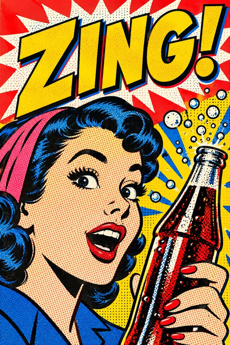
Both turn a famous face and an everyday product into an icon on a saturated field; borrow Pop's Ben-Day dots and flat primaries for a thumbnail that winks at its own salesmanship.
Mix them and make something Pop Art Graphics YouTube Thumbnail Style
01
What each style brings
Each part of the design comes from the style with the stronger say in it, and each style gives at least two.
Pop Art Graphics YouTube Thumbnail Style (the 'YouTube Face')
- Type from Pop Art Graphics
- Colour from Pop Art Graphics
- Form from YouTube Thumbnail Style
- Composition from YouTube Thumbnail Style
- Surface from Pop Art Graphics
02
The type
Open fonts standing in for each style’s own type, which is often hand-drawn or commercial.
Display · Pop Art Graphics
Wow
Bangers; Pop Art Graphics used Comic-book hand lettering and Franklin Gothic
Text · YouTube Thumbnail Style
The custom thumbnail of YouTube's creator economy: a 16:9 still made to be read at fingernail size in a feed of recommendations. One brightly lit, retouched face, for years the open-mouthed 'YouTube Face' and since 2023 more often a closed-mouth smile, fills about a third of the frame against a simplified, saturated photomontage, with an enlarged prop, a red arrow and at most a few words in heavy white letters outlined in black. Versions are A/B-tested for watch time.
Nunito; YouTube Thumbnail Style used Heavy, comic-style display capitals, white with a thick black outline, a word or two in a corner and A heavy rounded sans in lowercase, white with a black outline and drop shadow, as a label beside a red arrow
03
The colours
The ground and leading colours come from Pop Art Graphics, with a counter-accent from YouTube Thumbnail Style. The ink reads on the ground at 4.5:1 or more.
Pop Art Graphics YouTube Thumbnail Style (the 'YouTube Face')
-
#fbf8f0ground · 36% -
#111111ink · 14% -
#ffd400accent · 18% -
#e10600accent · 14% -
#1f8fffaccent · 10% -
#0057b8accent · 8%
As CSS
:root {
  --ground: #fbf8f0;
  --ink: #111111;
  --accent-1: #ffd400;
  --accent-2: #e10600;
  --accent-3: #1f8fff;
  --accent-4: #0057b8;
  --font-display: "Bangers", sans-serif;
  --font-text: "Nunito", sans-serif;
}
Use it with care
YouTube Thumbnail Style (the 'YouTube Face'): Thumbnails sell with real faces, so do not put a real person's likeness, a celebrity's, a stranger's or a child's, into a thumbnail without their consent, and never pass off a generated face as a real creator's. Do not promise what the video does not deliver: YouTube's own tests pick the thumbnail with the most watch time, not the most clicks, and custom thumbnails must follow its Community Guidelines, which bar nudity or sexually provocative images, hate speech, violence and harmful or dangerous content. Treat before-and-after body pictures with care and do not shame anyone's body for a click, and do not use sexualised images of people as bait.
04
The two styles
05
More combinations
With Pop Art Graphics
- International Typographic Style Contrasts · Set one loud appropriated Pop image inside a strict grid with a neutral grotesque so the irony reads as deliberate rather than chaotic.
- Ma & Wabi-sabi Aesthetics Contrasts · Where Pop multiplies glossy commodities, wabi-sabi values the single worn object; use one to puncture the mood of the other.
- Guna Mola Pairs well · Guna women redraw brand logos and cartoons (RCA Victor, Bullwinkle) in reverse appliqué; let that act of translation inspire Pop work, but buy or commission molas rather than imitating them.
- Neo-Brutalism Pairs well · Lift Pop's thick black outlines and flat primaries into UI cards and buttons for a confident, comic-strip interface.
- Risograph & Indie Print Culture Pairs well · Print Ben-Day dot screens in fluorescent pink and yellow riso inks to give Pop's mass-media imagery a small-run, handmade warmth.
- Screenprinted Gig & Alt-Movie Poster Pairs well · Shepard Fairey called Kozik 'the punk rock Warhol'; take Pop's appropriated cartoons and halftones and give them a gig poster's single idea and hand-lettered title.
- Finnish Bold Print (Marimekko Modernism) Pairs well · Contemporaries in saturated flat colour at a giant scale; borrow pop's isolated, enlarged object for a poster, but drop its halftone and irony to keep Marimekko's sincerity.
- Superflat Contrasts · Both turn commodities into art; take Pop's repetition and frontal commodity but swap its halftone and off-register silkscreen for Superflat's smooth vector fills and anime characters, so the print process disappears.
With YouTube Thumbnail Style
- Minimalist Graphic Design Contrasts · Veritasium's dark grounds and one short serif line show how far restraint can go in the same feed; strip a thumbnail to one object and open space when loud faces would undercut a serious subject.
- VTuber Avatar and Stream Graphics Pairs well · VTubers follow the same rules for their thumbnails, a big cut-out at a third of the frame, a few outlined words, warm colours; swap the photographed face for the avatar to bring the idiom to a channel whose performer stays unseen.
- Nollywood Video Jacket & Film Poster Contrasts · Both sell a video with cut-out photographs of real faces in loud colour, but the Nollywood jacket crowds the whole cast, a blurb and credits onto the sheet; the thumbnail keeps one face, one prop and a few words, because it has to read at phone size.
- Internet Ugly & Meme Vernacular Contrasts · Its parent: early thumbnails were as crude as its pictures, with bright arrows drawn on and MS Paint–looking images (MrBeast's, before Appleby rebuilt them with colour and contrast), and both caption pictures in white capitals outlined in black. Use Internet Ugly when the picture should look quick, crude and made for a crowd to remix, and the thumbnail style when one creator's polished, retouched face has to sell a single video.
- 'Good Morning' Greeting Images (WhatsApp Forward Vernacular) Contrasts · Both put outlined words over a saturated photograph for a phone screen, but the thumbnail sells a click while the greeting asks for nothing.
- Brazilian Baile Funk Digital Flyer Pairs well · Loosely similar: both put cut-out people in front of big type for the feed, but the purpose differs (event promotion versus video click-through); limited affinity.