Style combination · Contrasts
Minimalist Graphic Design × YouTube Thumbnail Style
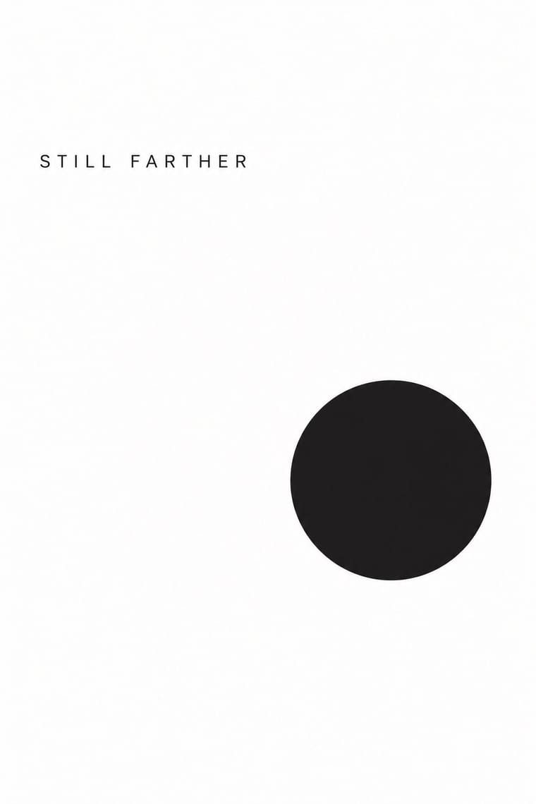
Veritasium's dark grounds and one short serif line show how far restraint can go in the same feed; strip a thumbnail to one object and open space when loud faces would undercut a serious subject.
Mix them and make something Minimalist Graphic Design YouTube Thumbnail Style
01
What each style brings
Each part of the design comes from the style with the stronger say in it, and each style gives at least two.
Minimalist Graphic Design YouTube Thumbnail Style (the 'YouTube Face')
- Type from Minimalist Graphic Design
-
YouTube Thumbnail Style avoids wide letterspacing: this is where the two pull against each other, which is the point of the contrast.
- Colour from Minimalist Graphic Design
- Form from YouTube Thumbnail Style
- Composition from Minimalist Graphic Design
- Surface from YouTube Thumbnail Style
02
The type
Open fonts standing in for each style’s own type, which is often hand-drawn or commercial.
Display · Minimalist Graphic Design
Still
Inter Tight, standing in for Helvetica Neue (light weights)
Text · YouTube Thumbnail Style
The custom thumbnail of YouTube's creator economy: a 16:9 still made to be read at fingernail size in a feed of recommendations. One brightly lit, retouched face, for years the open-mouthed 'YouTube Face' and since 2023 more often a closed-mouth smile, fills about a third of the frame against a simplified, saturated photomontage, with an enlarged prop, a red arrow and at most a few words in heavy white letters outlined in black. Versions are A/B-tested for watch time.
Nunito; YouTube Thumbnail Style used Heavy, comic-style display capitals, white with a thick black outline, a word or two in a corner and A heavy rounded sans in lowercase, white with a black outline and drop shadow, as a label beside a red arrow
03
The colours
The ground and leading colours come from Minimalist Graphic Design, with a counter-accent from YouTube Thumbnail Style. The ink reads on the ground at 4.5:1 or more.
Minimalist Graphic Design YouTube Thumbnail Style (the 'YouTube Face')
-
#ffffffground · 36% -
#1a1a1aink · 14% -
#d9d6d0accent · 18% -
#ffd400accent · 14% -
#8c8a86accent · 10% -
#1f8fffaccent · 8%
As CSS
:root {
  --ground: #ffffff;
  --ink: #1a1a1a;
  --accent-1: #d9d6d0;
  --accent-2: #ffd400;
  --accent-3: #8c8a86;
  --accent-4: #1f8fff;
  --font-display: "Inter Tight", sans-serif;
  --font-text: "Nunito", sans-serif;
}
Use it with care
YouTube Thumbnail Style (the 'YouTube Face'): Thumbnails sell with real faces, so do not put a real person's likeness, a celebrity's, a stranger's or a child's, into a thumbnail without their consent, and never pass off a generated face as a real creator's. Do not promise what the video does not deliver: YouTube's own tests pick the thumbnail with the most watch time, not the most clicks, and custom thumbnails must follow its Community Guidelines, which bar nudity or sexually provocative images, hate speech, violence and harmful or dangerous content. Treat before-and-after body pictures with care and do not shame anyone's body for a click, and do not use sexualised images of people as bait.
04
The two styles
05
More combinations
With Minimalist Graphic Design
- ECM Sleeve Aesthetic (Munich) Pairs well · ECM's record sleeves carry the same reduction into music since 1970: one corresponding image, a few lines of small type and a great deal of silence; borrow their wintry photograph and tiny type when a minimal layout needs mood rather than system.
- Ma & Wabi-sabi Aesthetics Pairs well · Add one imperfect texture or natural material so the emptiness feels contemplative rather than sterile.
- Memphis Design Contrasts · Memphis's clashing patterns are the antidote to minimal reticence; a single Memphis accent makes a minimal layout playful.
- Dark Tech Minimalism Pairs well · Invert the palette to near-black and keep the same reduction for a contemporary technology register.
- Neo-Andean Architecture (Cholets) Contrasts · Its exact opposite on ornament and colour; one symmetrical fluorescent panel in a white, empty layout reads as a loud statement of identity.
- Neoclassical Book Typography Pairs well · Set a single Didone headline in minimalism's empty, monochrome field for the classic luxury-fashion register.
- Renaissance Book Typography Pairs well · Keep classical page proportions and a humanist serif but strip the ornament to give minimal layouts warmth and authority.
- Afrobeat Sleeve Art Contrasts · Its exact opposite on density; a single minimal element on a Lemi-style sleeve stands out sharply, and vice versa.
With YouTube Thumbnail Style
- VTuber Avatar and Stream Graphics Pairs well · VTubers follow the same rules for their thumbnails, a big cut-out at a third of the frame, a few outlined words, warm colours; swap the photographed face for the avatar to bring the idiom to a channel whose performer stays unseen.
- Pop Art Graphics Pairs well · Both turn a famous face and an everyday product into an icon on a saturated field; borrow Pop's Ben-Day dots and flat primaries for a thumbnail that winks at its own salesmanship.
- Nollywood Video Jacket & Film Poster Contrasts · Both sell a video with cut-out photographs of real faces in loud colour, but the Nollywood jacket crowds the whole cast, a blurb and credits onto the sheet; the thumbnail keeps one face, one prop and a few words, because it has to read at phone size.
- Internet Ugly & Meme Vernacular Contrasts · Its parent: early thumbnails were as crude as its pictures, with bright arrows drawn on and MS Paint–looking images (MrBeast's, before Appleby rebuilt them with colour and contrast), and both caption pictures in white capitals outlined in black. Use Internet Ugly when the picture should look quick, crude and made for a crowd to remix, and the thumbnail style when one creator's polished, retouched face has to sell a single video.
- 'Good Morning' Greeting Images (WhatsApp Forward Vernacular) Contrasts · Both put outlined words over a saturated photograph for a phone screen, but the thumbnail sells a click while the greeting asks for nothing.
- Brazilian Baile Funk Digital Flyer Pairs well · Loosely similar: both put cut-out people in front of big type for the feed, but the purpose differs (event promotion versus video click-through); limited affinity.