Style combination · Pairs well
Pacific Barkcloth Design × Risograph
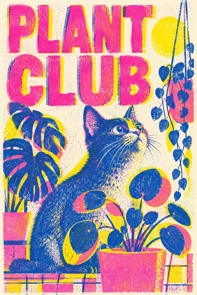
Two earth-toned inks on cream stock and a slightly broken, rubbed impression give print work tapa's material warmth without copying its motifs.
Mix them and make something Pacific Barkcloth Design Risograph
01
What each style brings
Each part of the design comes from the style with the stronger say in it, and each style gives at least two.
Pacific Barkcloth (Tapa) Design Risograph & Indie Print Culture
- Type from Risograph
- Colour from Risograph
-
Pacific Barkcloth Design avoids fluorescent & neon: this is where the two pull against each other.
- Form from Pacific Barkcloth Design
- Composition from Pacific Barkcloth Design
- Surface from Risograph
02
The type
Open fonts standing in for each style’s own type, which is often hand-drawn or commercial.
Display · Risograph
Fiesta
Inter Tight, standing in for Neo-grotesques set large (e.g. Akzidenz-Grotesk, Helvetica)
Text · Pacific Barkcloth Design
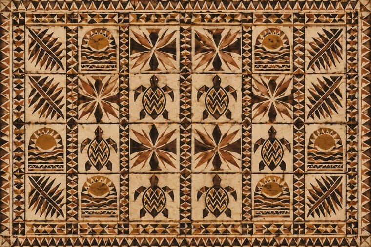
Barkcloth beaten from paper-mulberry inner bark and decorated across Polynesia and Fiji for gift exchange at weddings, funerals and chiefly investitures. Motifs are transferred rather than simply drawn: rubbed over pattern boards in Tonga and Samoa, stencilled in Fiji, stamped in Hawai'i, then sharpened by hand. The palette is earth browns and soot black on cream bark, inside ruled squares and bands on cloths that can run past twenty metres.
Archivo; Pacific Barkcloth Design used Freehand-painted numerals and capitals on ngatu, from length markers to commemorative inscriptions and Faces with full support for Tongan, Samoan, Fijian and Hawaiian orthographies (ʻokina and macrons), e.g. Noto Sans, for accompanying text
03
The colours
The ground and leading colours come from Risograph, with a counter-accent from Pacific Barkcloth Design. The ink reads on the ground at 4.5:1 or more.
Pacific Barkcloth (Tapa) Design Risograph & Indie Print Culture
-
#f4f1eaground · 36% -
#3255a4ink · 14% -
#ff48b0accent · 18% -
#b9772faccent · 14% -
#f15060accent · 10% -
#8a3b1faccent · 8%
As CSS
:root {
  --ground: #f4f1ea;
  --ink: #3255a4;
  --accent-1: #ff48b0;
  --accent-2: #b9772f;
  --accent-3: #f15060;
  --accent-4: #8a3b1f;
  --font-display: "Inter Tight", sans-serif;
  --font-text: "Archivo", sans-serif;
}
Use it with care
Pacific Barkcloth (Tapa) Design: Tapa is women's ceremonial wealth, made collectively and presented at weddings, funerals and the investiture of chiefly titles; particular motifs commemorate events, lineages and royalty, and some designs belong to families, villages or chiefly lines. Commission and pay tapa makers and their work groups (such as the koka'anga in Tonga), credit the island and the maker, and do not lift motifs from museum cloths onto products or treat Tongan, Samoan, Fijian and Hawaiian traditions as one interchangeable 'Polynesian' pattern.
04
The two styles
05
More combinations
With Pacific Barkcloth Design
- Adinkra & Kente Symbol Systems Pairs well · Both are gridded ceremonial cloths of named motifs; borrow their shared square-by-square logic for a layout, while keeping each motif tied to its own culture and meaning.
- International Typographic Style Pairs well · A ruled grid already underlies ngatu; set text in a neutral grotesque within the same squares for exhibition and institutional graphics made with tapa makers.
- Kōwhaiwhai & Toi Māori Design Contrasts · Kōwhaiwhai flows in curvilinear koru bands while tapa is ruled into squares filled with angular repeats, a reminder that 'Pacific pattern' is not one style.
- Tiki Pop (Polynesian Pop) Contrasts · Tiki menus borrowed tapa-like zigzag bands as mere borders; real ngatu, siapo and kapa are women's ceremonial wealth with named motifs, so set the two side by side to see what was flattened, and commission tapa makers rather than copying their patterns.
With Risograph
- Corporate Identity Modernism Contrasts · Exact Pantone-matched corporate colour is the opposite of riso's drifting inks; use the contrast to signal independence.
- Neo-Swiss Revival Pairs well · Print neo-Swiss grids in two fluorescent riso inks to soften their rigour with grain and overprint.
- Y2K Futurism Contrasts · Glossy chrome renders are everything a riso cannot print; set frictionless screen gloss against tactile grain for deliberate friction.
- WPA Silkscreen Posters Pairs well · WPA silkscreen's flat, separated colour translates directly to riso drums; borrow its layered spot-colour scenes.
- Literatura de Cordel Woodcut Pairs well · Print a cordel-style woodcut on a riso in one ink on tinted stock to keep the pocket-chapbook economy for zines and poetry pamphlets.
- Cubist Pictorial Space Pairs well · Print synthetic-Cubist planes as overlapping flat riso inks so the overprints do the faceting for you.
- Leningrad Avant-Garde Picture Book Pairs well · Today's riso picture books share the few flat inks, bare paper and speckled texture; print a Lebedev-style sequence of floating figures in two or three riso inks.
- Die Neue Typographie Pairs well · Two-colour riso printing suits its black-plus-red restraint for low-budget editorial and posters.