Style combination · Pairs well
Onitsha Market Pamphlets × Victorian Letterpress
Borrow the stepped, mixed-face centred title from the jobbing poster, then drop a captioned found photograph beneath it as the Onitsha printers did.
Mix them and make something Onitsha Market Pamphlets Victorian Letterpress
01
What each style brings
Each part of the design comes from the style with the stronger say in it, and each style gives at least two.
Onitsha Market Pamphlets Victorian Letterpress & Wood Type
- Type from Victorian Letterpress
- Colour from Onitsha Market Pamphlets
- Form from Victorian Letterpress
-
Onitsha Market Pamphlets avoids abundant decoration: this is where the two pull against each other.
- Composition from Onitsha Market Pamphlets
- Surface from Onitsha Market Pamphlets
02
The type
Open fonts standing in for each style’s own type, which is often hand-drawn or commercial.
Display · Victorian Letterpress
Ours
Abril Fatface, standing in for Fat face romans (Thorne, Figgins)
Text · Onitsha Market Pamphlets
Cheap, stapled pamphlets of romance, advice, drama and political biography, written by students, clerks, journalists and traders and printed by jobbing letterpress shops around Onitsha Main Market in eastern Nigeria from the late 1940s. Covers did the selling at the stall: long moralising titles in mixed jobbing type, the price and the author's pen-name, and recycled photographs on coloured card. The trade lost its presses in the Nigeria–Biafra War and revived only briefly afterwards.
Inter; Onitsha Market Pamphlets used Jobbing grotesque and gothic capitals for cover titles and Hand-set book roman for the running text
03
The colours
The ground and leading colours come from Onitsha Market Pamphlets, with a counter-accent from Victorian Letterpress. The ink reads on the ground at 4.5:1 or more.
Onitsha Market Pamphlets Victorian Letterpress & Wood Type
-
#ece3ccground · 36% -
#1a1a1aink · 14% -
#b8312faccent · 18% -
#e3a0a8accent · 14% -
#d9b45aaccent · 10% -
#7fa36baccent · 8%
As CSS
:root {
  --ground: #ece3cc;
  --ink: #1a1a1a;
  --accent-1: #b8312f;
  --accent-2: #e3a0a8;
  --accent-3: #d9b45a;
  --accent-4: #7fa36b;
  --font-display: "Abril Fatface", serif;
  --font-text: "Inter", sans-serif;
}
04
The two styles
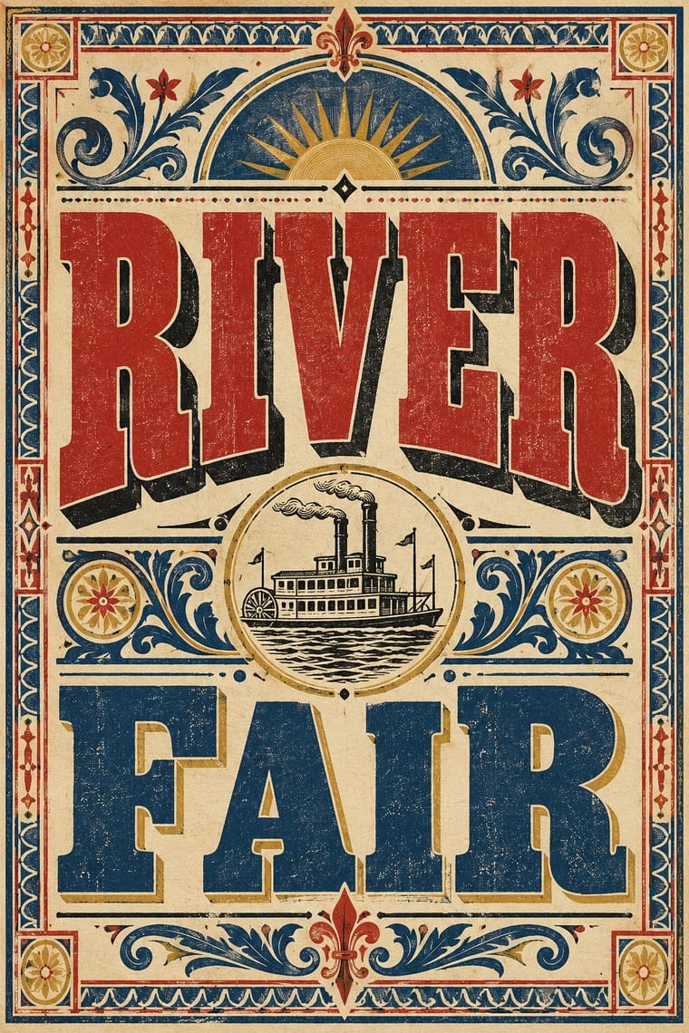
05
More combinations
With Onitsha Market Pamphlets
- Mexican Popular Graphics (Posada) Pairs well · Both are penny print for newly literate readers; share the sensational headline and moral tone, but let Onitsha supply photographs where Posada cut relief blocks.
- Literatura de Cordel Woodcut Pairs well · A sister market-pamphlet tradition from north-east Brazil; combine cordel's woodcut covers with Onitsha's found photographs for a cheap-print series identity.
- International Typographic Style Contrasts · Set the pamphlet's crowded captions and sermonising titles against Swiss neutrality and white space when a layout needs a deliberate clash of voices.
- Nollywood Video Jacket & Film Poster Pairs well · The same market print culture of eastern Nigeria, a literary rather than a visual ancestor: Okome hears the pamphlets' blurbs in Domitilla's jacket. Borrow the pamphlet's long moralising title and breathless blurb for the back of the jacket, not its letterpress look.
- Fotoromanzo (Italian Photo-Romance) Contrasts · Both are cheap popular romance print from 1947; the Onitsha pamphlets tell their stories in letterpress text with a recycled photograph only on the cover, while the fotoromanzo tells the whole story in staged photographs with balloons.
- Drum Magazine & Sophiatown Photojournalism Pairs well · Contemporary West African popular print for the same new urban readers; Onitsha's letterpress chapbook covers add a cheaper, home-made counterpart to Drum's hand-tinted cover girls.
With Victorian Letterpress
- Hand-Painted Signage & Vernacular Lettering Pairs well · Sign writers and type founders traded letterforms; add brushed shading and drop shadows to wood-type headlines for a street-made feel.
- Push Pin Style Pairs well · Push Pin revived Victorian display faces with irony; mix one wood-type headline with modern illustration for the same knowing nostalgia.
- International Typographic Style Contrasts · One face, flush left and white space against a centred clamour of faces: use the contrast to test whether hierarchy needs variety at all.
- Arts & Crafts Movement Contrasts · Morris reacted against exactly this commercial clutter; set the two side by side to show craft restraint versus jobbing exuberance.
- HfG Ulm Systematic Design Contrasts · A Victorian mixed-face handbill is the clutter Ulm's one-family rule was meant to cure; use it as a before-and-after foil.
- Victorian Colour Toy Books (Evans, Crane, Caldecott and Greenaway) Contrasts · Its black-letter-dense, type-and-ornament jobbing page is the opposite of a picture-led page; combine them by hanging a wood-type title over a flat colour picture.
- Dada Pairs well · Raid Victorian wood type and stock ornaments as the Dadaists did, but scatter them instead of centring them.
- American Four-Colour Comic Book (Golden to Bronze Age) Pairs well · Both are cheap letterpress print that shouts to passers-by; borrow the playbill's stacked display capitals, banners and rules for a comic cover's blurbs and price box, while keeping the comic's hand-drawn letters and keyline art.