Style combination · Pairs well
Literatura de Cordel Woodcut × Onitsha Market Pamphlets
A sister market-pamphlet tradition from north-east Brazil; combine cordel's woodcut covers with Onitsha's found photographs for a cheap-print series identity.
Mix them and make something Literatura de Cordel Woodcut Onitsha Market Pamphlets
01
What each style brings
Each part of the design comes from the style with the stronger say in it, and each style gives at least two.
Literatura de Cordel Woodcut Onitsha Market Pamphlets
- Type from Onitsha Market Pamphlets
-
Literatura de Cordel Woodcut avoids eclectic mixing: this is where the two pull against each other.
- Colour from Literatura de Cordel Woodcut
- Form from Literatura de Cordel Woodcut
- Composition from Onitsha Market Pamphlets
- Surface from Literatura de Cordel Woodcut
02
The type
Open fonts standing in for each style’s own type, which is often hand-drawn or commercial.
Display · Onitsha Market Pamphlets
Square
Inter Tight, standing in for Jobbing grotesque and gothic capitals for cover titles
Text · Literatura de Cordel Woodcut
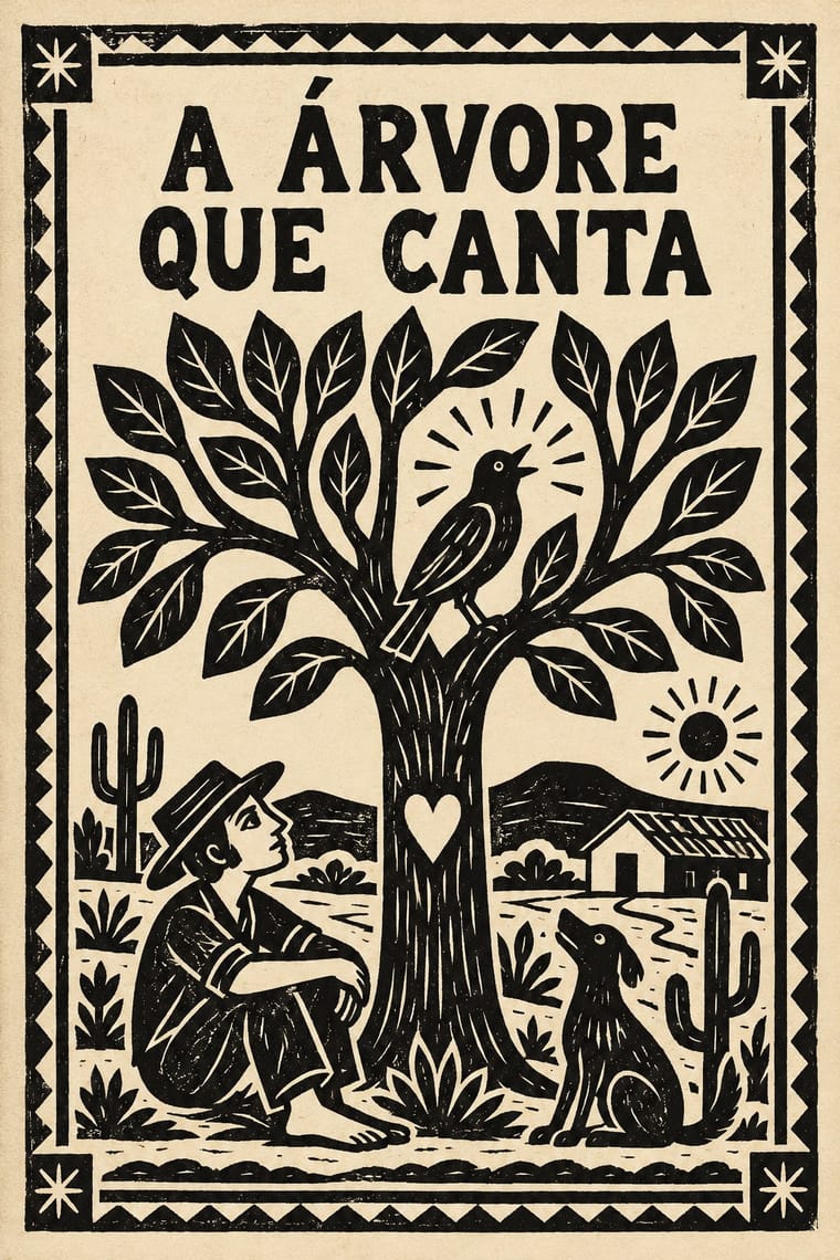
The cover art of Brazil's literatura de cordel, pocket chapbooks of verse whose single picture is a small woodcut cut in soft umburana wood and printed in black above a plain letterpress title. Woodcuts displaced worn zinc clichés of film-star photographs from the 1940s, led by José Bernardo da Silva's Tipografia São Francisco in Juazeiro do Norte. From the 1960s collectors and galleries turned the blocks into standalone prints by masters such as J. Borges.
Libre Caslon Text; Literatura de Cordel Woodcut used Jobbing letterpress types from the print shop's case, for titles and verse and Lettering carved into the woodblock
03
The colours
The ground and leading colours come from Literatura de Cordel Woodcut, with a counter-accent from Onitsha Market Pamphlets. The ink reads on the ground at 4.5:1 or more.
Literatura de Cordel Woodcut Onitsha Market Pamphlets
-
#ece4cfground · 36% -
#141414ink · 14% -
#e8c95aaccent · 18% -
#b8312faccent · 14% -
#e3a0a8accent · 10% -
#7fae8aaccent · 8%
As CSS
:root {
  --ground: #ece4cf;
  --ink: #141414;
  --accent-1: #e8c95a;
  --accent-2: #b8312f;
  --accent-3: #e3a0a8;
  --accent-4: #7fae8a;
  --font-display: "Inter Tight", sans-serif;
  --font-text: "Libre Caslon Text", serif;
}
04
The two styles
05
More combinations
With Literatura de Cordel Woodcut
- Risograph & Indie Print Culture Pairs well · Print a cordel-style woodcut on a riso in one ink on tinted stock to keep the pocket-chapbook economy for zines and poetry pamphlets.
- Brazilian Concrete Design Contrasts · Brazil's concrete designers worked in the same decades with grids and sans-serifs; set a cordel woodcut against concrete typography for a sharp sertão-versus-São Paulo tension.
- Taller de Gráfica Popular Pairs well · The TGP cut relief prints for protest, cordel for storytelling; combine their black-line language when a narrative needs political edge.
- Mexican Popular Graphics (Posada) Pairs well · Both put a single relief picture on cheap street print; borrow Posada's calavera satire but keep cordel's quiet, single-title cover.
- Tarot de Marseille Woodcut Cards Contrasts · Both cut stiff figures in wood with no perspective or modelling, but the cordel cover is printed in black only, with solid blacks and gouged white lines, above a plain letterpress title, while the tarot card colours an outline key through stencils and cuts its numeral and title into the same block; choose cordel for a stark one-colour cover, tarot for a coloured emblem in a numbered set.
- Lira Popular (Chilean Illustrated Verse Broadsheets) Pairs well · Brazil's cordel puts one woodcut on a folded booklet cover; combine it with the Chilean single sheet for a series of verse prints that share one set of cuts.
- Tropicália Graphic Design Pairs well · The cangaceiro hero of the north-eastern chapbook stands behind Duarte's Corisco; a cordel woodcut figure in a Tropicalist field of saturated colour keeps the popular and the Pop in one frame.
- Lubok Popular Print Pairs well · Brazilian cordel is another chapbook woodcut tradition; set rhymed verse and a single crude block together, as both do, for narrative print with a vernacular voice.
With Onitsha Market Pamphlets
- Mexican Popular Graphics (Posada) Pairs well · Both are penny print for newly literate readers; share the sensational headline and moral tone, but let Onitsha supply photographs where Posada cut relief blocks.
- International Typographic Style Contrasts · Set the pamphlet's crowded captions and sermonising titles against Swiss neutrality and white space when a layout needs a deliberate clash of voices.
- Victorian Letterpress & Wood Type Pairs well · Borrow the stepped, mixed-face centred title from the jobbing poster, then drop a captioned found photograph beneath it as the Onitsha printers did.
- Nollywood Video Jacket & Film Poster Pairs well · The same market print culture of eastern Nigeria, a literary rather than a visual ancestor: Okome hears the pamphlets' blurbs in Domitilla's jacket. Borrow the pamphlet's long moralising title and breathless blurb for the back of the jacket, not its letterpress look.
- Fotoromanzo (Italian Photo-Romance) Contrasts · Both are cheap popular romance print from 1947; the Onitsha pamphlets tell their stories in letterpress text with a recycled photograph only on the cover, while the fotoromanzo tells the whole story in staged photographs with balloons.
- Drum Magazine & Sophiatown Photojournalism Pairs well · Contemporary West African popular print for the same new urban readers; Onitsha's letterpress chapbook covers add a cheaper, home-made counterpart to Drum's hand-tinted cover girls.