Style combination · Contrasts
Nieuwe Kunst × Javanese Wayang Kulit
Toorop's long-limbed figures, whose silhouettes evoke Javanese shadow puppets, borrowed the outline under Dutch colonial rule without its code; compare them with a puppet whose every feature names a character.
Mix them and make something Nieuwe Kunst Javanese Wayang Kulit
01
What each style brings
Each part of the design comes from the style with the stronger say in it, and each style gives at least two.
Nieuwe Kunst (Dutch Art Nouveau) Javanese Wayang Kulit (Tatah Sungging)
- Type from Nieuwe Kunst
- Colour from Javanese Wayang Kulit
- Form from Nieuwe Kunst
- Composition from Nieuwe Kunst
- Surface from Javanese Wayang Kulit
02
The type
Open fonts standing in for each style’s own type, which is often hand-drawn or commercial.
Display · Nieuwe Kunst
Halo
Federant; Nieuwe Kunst used Hand-drawn titles lettered into the decoration of covers and posters, such as Theo Nieuwenhuis's lettering, recognisable enough that Leiden University Libraries attribute a 1908 parchment binding to him on the strength of its typography and Klaas van Leeuwen, Letterboek voor den teekenaar en ambachtsman (1907), a lettering model book, geometric in concept, from the theosophical circle of De Bazel and Lauweriks
Text · Javanese Wayang Kulit
The visual language of Javanese shadow puppets: flat figures cut from buffalo parchment, with head and legs in profile, shoulders turned to the front and long jointed arms worked by horn rods. Their insides are punched into filigree that draws costume and jewellery in light on the screen; both faces are painted in stepped colour gradations and gilded, for viewers on the puppeteer's side. Eyes, nose, head tilt, stance, size and face colour code each character as refined, strong, coarse or comic (the much-loved panakawan clowns); the leaf-shaped gunungan opens and closes the play.
Bodoni Moda; Javanese Wayang Kulit used Aksara Jawa (hanacaraka), the Javanese script of court manuscripts, whose illustrated narrative poems draw their figures in wayang style and Noto Sans Javanese (the Noto Javanese project, SIL Open Font License) for setting character names and captions in aksara Jawa
03
The colours
The ground and leading colours come from Javanese Wayang Kulit, with a counter-accent from Nieuwe Kunst. The ink reads on the ground at 4.5:1 or more.
Nieuwe Kunst (Dutch Art Nouveau) Javanese Wayang Kulit (Tatah Sungging)
-
#efe2bfground · 36% -
#1d1a16ink · 14% -
#b3361faccent · 18% -
#c49a3aaccent · 14% -
#6e4426accent · 10% -
#2f6e7aaccent · 8%
As CSS
:root {
  --ground: #efe2bf;
  --ink: #1d1a16;
  --accent-1: #b3361f;
  --accent-2: #c49a3a;
  --accent-3: #6e4426;
  --accent-4: #2f6e7a;
  --font-display: "Federant", sans-serif;
  --font-text: "Bodoni Moda", serif;
}
Use it with care
Nieuwe Kunst (Dutch Art Nouveau): Nieuwe Kunst took batik and the look of wayang shadow puppets from Java under Dutch colonial rule, largely without naming Javanese makers; when you borrow its batik surfaces or puppet-like figures, credit batik as an Indonesian craft (UNESCO-listed since 2009) whose motifs can carry meaning, and do not present printed batik-look as wax-resist work.
Javanese Wayang Kulit (Tatah Sungging): Wayang kulit is a living Javanese theatre and craft, on UNESCO's intangible heritage list (proclaimed 2003, inscribed 2008): its puppets are made by carvers and painters for working dalang, and some performances are rites, such as the ruwatan exorcism held for children born under unlucky circumstances. Every figure is a particular character whose eyes, nose, head tilt, stance, size and face colour carry meaning, so do not assemble invented characters from mixed features or use a puppet as generic 'exotic' decoration. Semar, father of the other panakawan, is said to be the god Sang Hyang Ismaya in human form and is held by some to be the most sacred figure of the set, so do not reduce him to a clown or mascot. Never use kasar features such as fangs, red faces and bulging eyes to caricature real people, ethnic or religious groups. Commission or credit Javanese carvers and dalang rather than tracing museum puppets, many of which left Java under colonial rule. Do not sell printed or machine-cut copies as hand-carved tatah sungging, and never present a generated figure as a real wayang character.
04
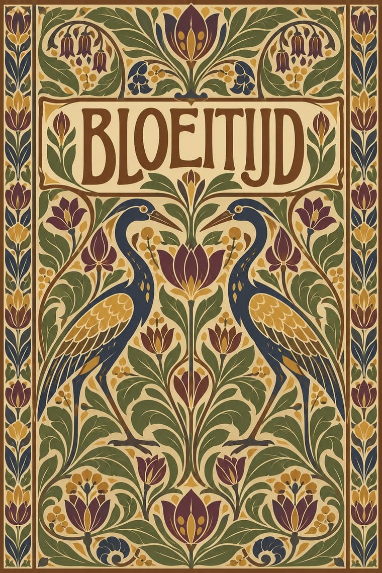
The two styles
05
More combinations
With Nieuwe Kunst
- Vienna Secession Pairs well · Both pulled Art Nouveau toward geometry, symmetry and strict repetition in the same years; add Vienna's black, white and gold and its white margins to the Dutch earth-colour repeat for a more open page.
- Batik Pattern Tradition Pairs well · Its direct source: Dutch designers used wax-resist dyeing for covers in cotton, velvet and parchment; pair a constructed Nieuwe Kunst repeat with real batik colour layering, and credit the Javanese craft.
- Total Design & Dutch Functionalism Contrasts · Dutch design's later ornament-free grid against its own ornamental past: a filled, symmetrical batik cover beside a Crouwel layout in sans-serif on white makes the choice between pattern and pure information explicit.
- Wendingen & Amsterdam School Typography Pairs well · Its Amsterdam successor kept the symmetry, the closed frame and the systematic construction (Lauweriks drew Wendingen's first cover) but traded plants and batik for heavy capitals built from brass rules; combine them for a vegetal pattern inside a monumental frame.
- Art Nouveau Contrasts · The same years and the same plants, but Mucha's whiplash and swelling figures move while the Dutch line is constructed on triangles and repeated flat; set one against the other to choose between a line that flows and a line that is built.
With Javanese Wayang Kulit
- Batik Pattern Tradition Pairs well · Both are court arts of Yogyakarta and Surakarta; set one coded figure against batik's all-over repeat to pair a single focus with a patterned field.
- Amar Chitra Katha Comics Contrasts · Both retell the Mahabharata and Ramayana with a fixed iconography, but Amar Chitra Katha draws idealised, near-naturalistic bodies in panels, while wayang codes character into impossible proportions.
- Chinese Paper-Cut (Jianzhi) Contrasts · Both draw with holes cut through a flat sheet, but paper-cuts are usually folded, symmetrical and one-coloured, while a wayang figure is in profile, painted and gilded on both faces, and made to move.
- Northwest Coast Formline Design Contrasts · Both identify beings by fixed diagnostic features, but formline splits and splays its creature symmetrically to fill the field, while wayang keeps the figure in profile and alone on an empty screen.