Style combination · Contrasts
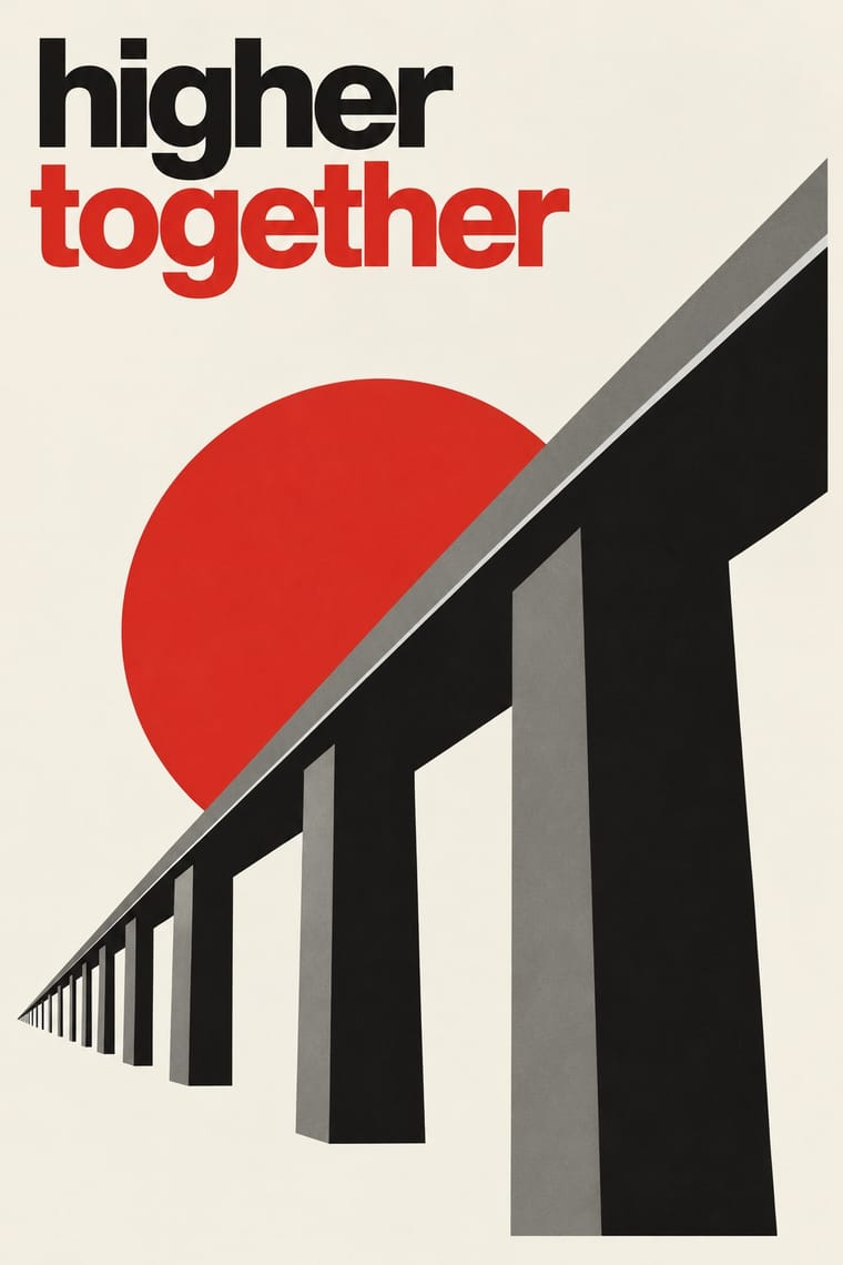
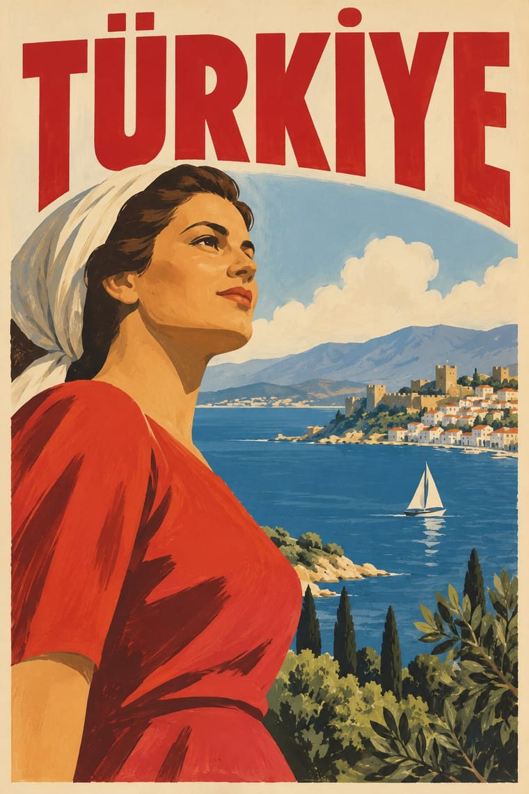
Die Neue Typographie × Early Turkish Republican Graphic Design
In the same years German modernists replaced illustration with sans-serif type and photography; Turkish Republican graphics kept Munich's pictorial poster and hand-drawn letters.
Mix them and make something Die Neue Typographie Early Turkish Republican Graphic Design
01
What each style brings
Each part of the design comes from the style with the stronger say in it, and each style gives at least two.
Die Neue Typographie Early Turkish Republican Graphic Design
- Type from Die Neue Typographie
- Colour from Die Neue Typographie
- Form from Early Turkish Republican Graphic Design
- Composition from Die Neue Typographie
- Surface from Early Turkish Republican Graphic Design
02
The type
Open fonts standing in for each style’s own type, which is often hand-drawn or commercial.
Text · Early Turkish Republican Graphic Design
The pictorial poster, label and ticket art of the young Turkish Republic, led by İhap Hulusi Görey after his Munich training in Ludwig Hohlwein's orbit, with Münif Fehim Özarman and, after 1943, Kenan Temizan. Lithographed figures modelled in crisp patches of light and shadow, sometimes in only one or two inks, giant numerals and letters, framed emblems and bold hand-drawn lettering in the Latin script adopted in 1928 advertised banks, the State Lottery, the state monopolies and tourism, and promoted the state's new alphabet.
Oswald; Early Turkish Republican Graphic Design used Hand-drawn Latin display capitals with Turkish diacritics (Ç, Ğ, İ, Ö, Ş, Ü) for brand and institution names and Shaded and extruded display letters and giant numerals
03
The colours
The ground and leading colours come from Die Neue Typographie, with a counter-accent from Early Turkish Republican Graphic Design. The ink reads on the ground at 4.5:1 or more.
Die Neue Typographie Early Turkish Republican Graphic Design
-
#f3efe4ground · 36% -
#141414ink · 14% -
#d32a1faccent · 18% -
#7d7a73accent · 14% -
#c89b3caccent · 10% -
#2c5a7aaccent · 8%
As CSS
:root {
  --ground: #f3efe4;
  --ink: #141414;
  --accent-1: #d32a1f;
  --accent-2: #7d7a73;
  --accent-3: #c89b3c;
  --accent-4: #2c5a7a;
  --font-display: "Jost", sans-serif;
  --font-text: "Oswald", sans-serif;
}
Use it with care
Early Turkish Republican Graphic Design: Atatürk's likeness, the Turkish flag and the star and crescent are living national symbols, and Turkey's Law No. 5816 (1951) criminalises insulting Atatürk's memory, so do not caricature, distort or trivialise them when borrowing this style. Much of this imagery was produced for a one-party state and its campaigns, and Kemalist iconography (the unveiled "modern" woman, the six arrows, Atatürk portraits) is still politically charged in Turkey, read differently by secularists, religious conservatives and minorities whom the nation-building imagery left out. Do not present the regime's modernising narrative as neutral, and do not reuse party emblems as decoration.
04
The two styles
05
More combinations
With Die Neue Typographie
- Risograph & Indie Print Culture Pairs well · Two-colour riso printing suits its black-plus-red restraint for low-budget editorial and posters.
- Cranbrook & Deconstructivist Typography Contrasts · Cranbrook dismantled exactly these rules; state one New Typography convention clearly, then break it on purpose.
- International Typographic Style Pairs well · Extend its asymmetric black-and-red onto a full modular grid for a seamless Swiss-era update.
- Renaissance Book Typography Contrasts · Tschichold himself returned to the centred classical page; set the two side by side to choose between symmetric tradition and asymmetric function.
- Mechano-Faktura & Polish Constructivist Advertising Pairs well · Pair the line-field image with asymmetric sans setting for an advertising layout.
- Post-Punk Record Sleeve (Stiff, Factory, 4AD) Pairs well · Saville's model: borrow Tschichold's asymmetric placement and small sans-serif capitals, then replace his photographs with one quoted image to get a cool, ordered sleeve.
- Brodovitch Editorial Design (Harper's Bazaar) Contrasts · Asymmetry without rules: improvised and photographic rather than systematic.
- German Book Art Movement (Buchkunstbewegung) Contrasts · From the mid-1920s the Bauhaus and the New Typography took over the avant-garde of the book; centred hand-press pages against asymmetric sans-serif layouts make a clear old-against-new tension.
With Early Turkish Republican Graphic Design
- WPA Silkscreen Posters Pairs well · Both are 1930s state-backed poster programmes for public institutions and tourism; combine WPA silkscreen flatness with Görey's modelled figures for civic campaigns.
- Urdu Katib Lithography Contrasts · Urdu print kept hand-written Arabic-script lithography for another century, while Turkey abolished Arabic letters in 1928; set the two side by side to show two answers to modern print.
- Contemporary Arabic & Dual-Script Type Design Contrasts · Turkey replaced Arabic letters with Latin in 1928, and Emin Barın carried calligraphic habits into the new script; contemporary dual-script type design keeps both scripts and matches them as equals. Compare the two to show replacement against coexistence.
- Egyptian Painted Film Poster Pairs well · Görey was born in Cairo and worked for Egyptian clients; Cairo's painted lithographic posters share his modelled faces and hand-lettered titles, in Arabic rather than Latin script.
- Mongol Bichig Calligraphy & Ugalz Ornament Contrasts · Both make the state's alphabet part of its official graphics, by opposite moves: Turkish Republican posters hand-letter the new Latin alphabet at display size to promote it, while Mongolia sets its revived old script beside Cyrillic on seals, signboards and letterheads as a national mark.
- Yeşilçam Film Poster (Turkish Hand-Painted Afiş) Pairs well · Both use hand-drawn Latin Turkish lettering; Republican graphics are calm and official, the film poster is crowded and emotional.
- Ottoman Tughra & Dîvânî Chancery Calligraphy Contrasts · The end of the sultanate in 1922 retired the tughra (its last on stamps that year), and the Republic replaced Arabic script with the Latin alphabet in 1928; its hand-lettered Latin posters are the deliberate opposite of the chancery's sultanic calligraphy.
- Australian Travel Poster (ANTA Era) Pairs well · A state-promoted lithographic school of the same years that also advertised tourism under bold drawn lettering. Görey's figures, from his Munich training in Hohlwein's orbit, stand in crisp patches of light on a light ground where ANTA opens a painted vista; borrow its framed emblem and giant letters for a tighter, flatter ANTA sheet.
All 12 combinations with Early Turkish Republican Graphic Design