Style combination · Pairs well
Risograph × Russian Futurist Book
Small-run riso artist's books on tinted stock, with handwritten text and a collaged cover, recreate the Futurist pamphlet's economy today.
01
What each style brings
Each part of the design comes from the style with the stronger say in it, and each style gives at least two.
Risograph & Indie Print Culture Russian Futurist Book
- Type from Russian Futurist Book
- Colour from Risograph
- Form from Russian Futurist Book
- Composition from Russian Futurist Book
- Surface from Risograph
02
The type
Open fonts standing in for each style’s own type, which is often hand-drawn or commercial.
Display · Russian Futurist Book
Pop
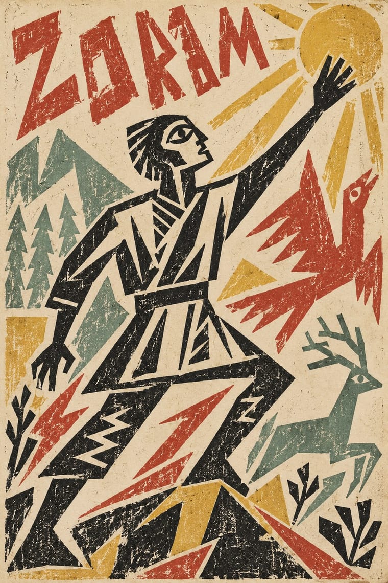
Caveat, standing in for The poets' own handwriting transferred to the lithographic stone (Rozanova and Kruchenykh's samopismo, 'self-writing')
Text · Risograph
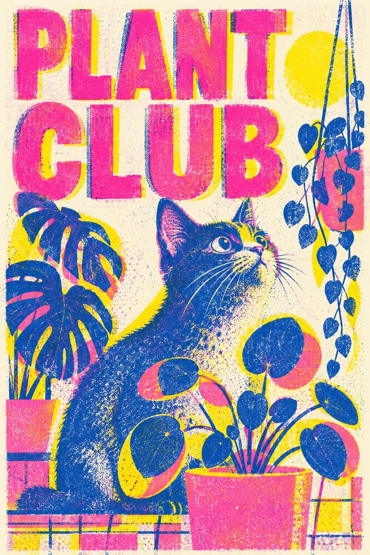
A contemporary culture of zines, art books, posters and prints made on Japanese Risograph stencil duplicators, whose soy-based spot inks (fluorescent pink, yellow, blue, teal) are laid down one drum at a time. Designers embrace the machine's limits: translucent overprints, slight misregistration, grainy coverage and coarse halftones give flat illustration and type a warm, handmade vibrancy at low cost.
Inter; Risograph used Neo-grotesques set large and Monospace and typewriter faces
03
The colours
The ground and leading colours come from Risograph, with a counter-accent from Russian Futurist Book. The ink reads on the ground at 4.5:1 or more.
Risograph & Indie Print Culture Russian Futurist Book
-
#f4f1eaground · 36% -
#3255a4ink · 14% -
#ff48b0accent · 18% -
#d6b44aaccent · 14% -
#f15060accent · 10% -
#b5463aaccent · 8%
As CSS
:root {
  --ground: #f4f1ea;
  --ink: #3255a4;
  --accent-1: #ff48b0;
  --accent-2: #d6b44a;
  --accent-3: #f15060;
  --accent-4: #b5463a;
  --font-display: "Caveat", cursive;
  --font-text: "Inter", sans-serif;
}
04
The two styles
05
More combinations
With Risograph
- Corporate Identity Modernism Contrasts · Exact Pantone-matched corporate colour is the opposite of riso's drifting inks; use the contrast to signal independence.
- Neo-Swiss Revival Pairs well · Print neo-Swiss grids in two fluorescent riso inks to soften their rigour with grain and overprint.
- Y2K Futurism Contrasts · Glossy chrome renders are everything a riso cannot print; set frictionless screen gloss against tactile grain for deliberate friction.
- WPA Silkscreen Posters Pairs well · WPA silkscreen's flat, separated colour translates directly to riso drums; borrow its layered spot-colour scenes.
- Literatura de Cordel Woodcut Pairs well · Print a cordel-style woodcut on a riso in one ink on tinted stock to keep the pocket-chapbook economy for zines and poetry pamphlets.
- Cubist Pictorial Space Pairs well · Print synthetic-Cubist planes as overlapping flat riso inks so the overprints do the faceting for you.
- Leningrad Avant-Garde Picture Book Pairs well · Today's riso picture books share the few flat inks, bare paper and speckled texture; print a Lebedev-style sequence of floating figures in two or three riso inks.
- Die Neue Typographie Pairs well · Two-colour riso printing suits its black-plus-red restraint for low-budget editorial and posters.
With Russian Futurist Book
- Suprematism Contrasts · Malevich went from drawing crude figures in these books to pure geometry on white; pick Suprematism for cosmic order and the Futurist book for crowded, earthy handwork.
- Punk & DIY Zine Pairs well · Both turn cheap reproduction into an anti-professional stance; swap the photocopier for hand lithography or riso to get a punk zine with an archaic, painterly voice.
- Lubok Popular Print Pairs well · The Futurists borrowed the lubok's crude contour and hand-cut lettering; pair them for folk-voiced print whose letters and figures are drawn by the same hand.
- Russian Constructivism Contrasts · Constructivism replaced this handwritten, primitivist page with grotesque type, rules and photomontage; set the two side by side to stage hand against machine.
- Leningrad Avant-Garde Picture Book Contrasts · The Futurist book crowds handwriting and crude drawing onto rough paper; the Leningrad picture book clears the page and lets a few flat planes float on it; choose between a dense handmade page and an airy, ordered one.
- Kultur-Lige & Yiddish Avant-Garde Book Design Contrasts · Its parent in method: artists drawing the whole page and printing it by lithography in small runs. The Futurist book is Cyrillic, mostly black and deliberately crude; the Kultur-Lige book is in Yiddish, earnest, and at its most ambitious in colour, and builds its pages from the Hebrew letter and synagogue ornament.
- Zenitism (Zenit Magazine Typography) Pairs well · Both treat the printed page as a manifesto in rough mixed type; combine them for a polemical artist's book.
- Mir iskusstva Book Art Contrasts · Both drew on the lubok, but the Futurists kept its crude cut, rough paper and handwriting while the World of Art refined it into a polished, bordered ensemble; choose between raw and ennobled folk sources.