Style combination · Contrasts
Mavo × Die Neue Typographie
Murayama quoted Moholy-Nagy, yet Mavo refused the objective, standardized type the New Typography preached; set a calm sans-serif page against one Mavo spread to stage order against hand-made revolt.
01
What each style brings
Each part of the design comes from the style with the stronger say in it, and each style gives at least two.
Mavo Die Neue Typographie
- Type from Mavo
- Colour from Die Neue Typographie
- Form from Mavo
- Composition from Die Neue Typographie
-
Mavo avoids generous white space: this is where the two pull against each other, which is the point of the contrast.
- Surface from Mavo
02
The type
Open fonts standing in for each style’s own type, which is often hand-drawn or commercial.
Text · Die Neue Typographie
The programme that turned avant-garde experiment into a functional typographic method, named by Moholy-Nagy in 1923 and codified in Jan Tschichold's 'elementare typographie' (1925) and Die neue Typographie (1928). It demanded asymmetric layouts, sans-serif type, standard paper formats, photography and active white space, all justified by clarity of communication, and spread through the Ring neue Werbegestalter and designers from Delft to Prague.
Jost; Die Neue Typographie used Futura and Akzidenz-Grotesk
03
The colours
The ground and leading colours come from Die Neue Typographie, with a counter-accent from Mavo. The ink reads on the ground at 4.5:1 or more.
Mavo Die Neue Typographie
-
#f3efe4ground · 36% -
#141414ink · 14% -
#d32a1faccent · 18% -
#7d7a73accent · 14% -
#dbb13aaccent · 10% -
#c9367faccent · 8%
As CSS
:root {
  --ground: #f3efe4;
  --ink: #141414;
  --accent-1: #d32a1f;
  --accent-2: #7d7a73;
  --accent-3: #dbb13a;
  --accent-4: #c9367f;
  --font-display: "Big Shoulders", sans-serif;
  --font-text: "Jost", sans-serif;
}
04
The two styles
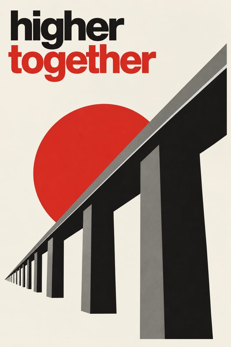
05
More combinations
With Mavo
- Russian Constructivism Pairs well · Borrow Constructivism's heavy bars and one red ink to steady a Mavo page, but keep Mavo's hand-drawn characters and abstract machine linocuts instead of a single clear slogan.
- Japanese Postwar Modernism Contrasts · Postwar Japanese modernism keeps one emblem in wide white space; Mavo fills every compartment, so choose between calm authority and a crowded, shouting page.
- Taishō Roman & Lyrical Illustration Contrasts · The same Taishō Tokyo in two moods: pastel lyrical illustration of modern girls against Mavo's black linocuts, newsprint and price tags.
- Punk & DIY Zine Pairs well · Both paste real ephemera into a cheap, self-published magazine; give a punk zine Mavo's black boxing rules, a hand-cut linocut and one line of text turned sideways.
- Angura Theatre Poster Pairs well · Two Tokyo undergrounds forty years apart: put Mavo's black-and-white newsprint collage and boxed text under Angura's flood of screenprinted colour for an anti-establishment poster with a longer memory.
With Die Neue Typographie
- Risograph & Indie Print Culture Pairs well · Two-colour riso printing suits its black-plus-red restraint for low-budget editorial and posters.
- Cranbrook & Deconstructivist Typography Contrasts · Cranbrook dismantled exactly these rules; state one New Typography convention clearly, then break it on purpose.
- International Typographic Style Pairs well · Extend its asymmetric black-and-red onto a full modular grid for a seamless Swiss-era update.
- Renaissance Book Typography Contrasts · Tschichold himself returned to the centred classical page; set the two side by side to choose between symmetric tradition and asymmetric function.
- Mechano-Faktura & Polish Constructivist Advertising Pairs well · Pair the line-field image with asymmetric sans setting for an advertising layout.
- Post-Punk Record Sleeve (Stiff, Factory, 4AD) Pairs well · Saville's model: borrow Tschichold's asymmetric placement and small sans-serif capitals, then replace his photographs with one quoted image to get a cool, ordered sleeve.
- Brodovitch Editorial Design (Harper's Bazaar) Contrasts · Asymmetry without rules: improvised and photographic rather than systematic.
- German Book Art Movement (Buchkunstbewegung) Contrasts · From the mid-1920s the Bauhaus and the New Typography took over the avant-garde of the book; centred hand-press pages against asymmetric sans-serif layouts make a clear old-against-new tension.