Style combination · Contrasts
Josef Frank and Svenskt Tenn Botanical Prints × Scandinavian Functionalism
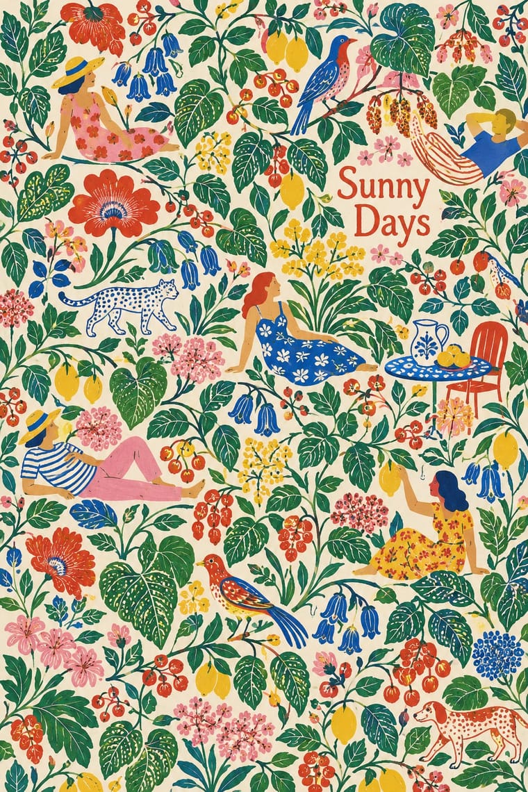
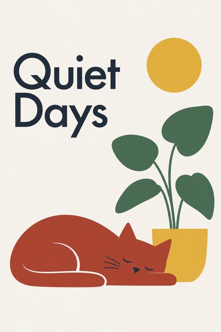
Frank's prints were his answer to functionalist austerity in the same Swedish rooms: use a calm functionalist layout and let one Frank-style print be its only ornament.
Mix them and make something Josef Frank and Svenskt Tenn Botanical Prints Scandinavian Functionalism
01
What each style brings
Each part of the design comes from the style with the stronger say in it, and each style gives at least two.
Josef Frank and Svenskt Tenn Botanical Prints Scandinavian Functionalism
- Type from Scandinavian Functionalism
- Colour from Scandinavian Functionalism
- Form from Josef Frank and Svenskt Tenn Botanical Prints
- Composition from Josef Frank and Svenskt Tenn Botanical Prints
-
Scandinavian Functionalism avoids horror vacui: this is where the two pull against each other, which is the point of the contrast.
- Surface from Josef Frank and Svenskt Tenn Botanical Prints
02
The type
Open fonts standing in for each style’s own type, which is often hand-drawn or commercial.
Text · Josef Frank and Svenskt Tenn Botanical Prints
The linens Josef Frank drew for Svenskt Tenn, which still prints them: invented trees, flowers, fruit and birds, even a map of Manhattan, packed edge to edge in long repeats and many clear colours, mostly on white or natural linen. The plants are outlined, stylised but recognisable, loose and asymmetric. Frank meant different patterns to be mixed in one room, against the cold purity of functionalism; his 1958 essay "Accidentism" later named the idea: rooms should look as if they had come about by chance. Unlike Marimekko's single enlarged motif, Frank keeps many small motifs and colours.
Schibsted Grotesk; Josef Frank and Svenskt Tenn Botanical Prints used Lettering drawn inside the repeat, such as the grey banners naming 'MANHATTAN' that run through the Manhattan print and The printed selvedge mark naming pattern, designer and maker, such as 'La Plata Komp. Av Josef Frank Svenskt Tenn Stockholm'
03
The colours
The ground and leading colours come from Scandinavian Functionalism, with a counter-accent from Josef Frank and Svenskt Tenn Botanical Prints. The ink reads on the ground at 4.5:1 or more.
Josef Frank and Svenskt Tenn Botanical Prints Scandinavian Functionalism
-
#f6f3ecground · 36% -
#1f2a37ink · 14% -
#e3b53aaccent · 18% -
#a63a2aaccent · 14% -
#3e6b50accent · 10% -
#d77a9aaccent · 8%
As CSS
:root {
  --ground: #f6f3ec;
  --ink: #1f2a37;
  --accent-1: #e3b53a;
  --accent-2: #a63a2a;
  --accent-3: #3e6b50;
  --accent-4: #d77a9a;
  --font-display: "Jost", sans-serif;
  --font-text: "Schibsted Grotesk", sans-serif;
}
04
The two styles
05
More combinations
With Josef Frank and Svenskt Tenn Botanical Prints
- Vienna Secession Contrasts · Frank came out of Vienna, but his loose, asymmetric plant repeats are the opposite of the Secession's geometric, symmetrical ornament; compare a Wiener Werkstätte grid pattern with his free-growing trees.
- Arts & Crafts Movement Pairs well · The parent tradition: both fill a repeat with plants on linen, but Morris is symmetrical, earthy and dense with dark grounds, Frank is looser, brighter and mostly light. Pair a Morris-style framed book page with Frank-style endpapers.
- Taiwan Floral Cloth (Huabu) Pairs well · Another dense, many-coloured floral cloth; Taiwan huabu is bolder, flatter and more nostalgic, Frank finer in line and more botanical.
- Finnish Bold Print (Marimekko Modernism) Contrasts · Marimekko enlarges one abstracted motif in two or three flat inks with plenty of white; set it beside Frank's many small, detailed, many-coloured plants to show how much each pattern holds.
- NK Textilkammare Geometric Print (Astrid Sampe, Signerad Textil) Contrasts · The other Stockholm house of printed linen in the same decades: Frank fills the cloth with many-coloured invented plants, NK's geometric prints with a few lines in black, white and one accent.
- 10-gruppen (Tiogruppen) Printed Textiles Contrasts · Frank fills a long repeat with many small botanical motifs; 10-gruppen uses one plain everyday motif in few flat colours, the cheerful answer to that richness.
With Scandinavian Functionalism
- Minimalist Graphic Design Pairs well · Add natural colour and rounded forms to minimalist reduction for calm, approachable consumer branding.
- Victorian Letterpress & Wood Type Contrasts · The crowded Victorian handbill is what funkis cleared away; quote one for a heritage-versus-modern contrast.
- Corporate Memphis Contrasts · Both aim for friendliness, but Corporate Memphis shouts; use Nordic restraint to get warmth from colour and space instead of rubbery figures.
- International Typographic Style Pairs well · Warm a Swiss grid with Nordic colour and one simple, friendly symbol to keep order without coldness.
- NK Textilkammare Geometric Print (Astrid Sampe, Signerad Textil) Pairs well · The parent language: a calm functionalist layout of type and white space with one band of NK-style striped cloth as its only ornament.
- DTC 'Blanding' / Millennial Minimalism Pairs well · Shares a warm, domestic restraint; borrow Nordic materials and craft photography to give a pastel system more texture and credibility.
- Moomin Graphics (Tove Jansson's Pen-Drawn World and its Licensed Afterlife) Pairs well · The Teema mug is the meeting point: a plain functional Nordic shape carrying one warm hand drawing.
- Finnish Bold Print (Marimekko Modernism) Pairs well · The same Nordic ideal of good everyday things, turned up loud; set one Marimekko-scale print against a calm funkis layout with a light ground and a plain sans so the pattern carries all the colour.