Style combination · Pairs well
Scandinavian Functionalism × International Typographic Style
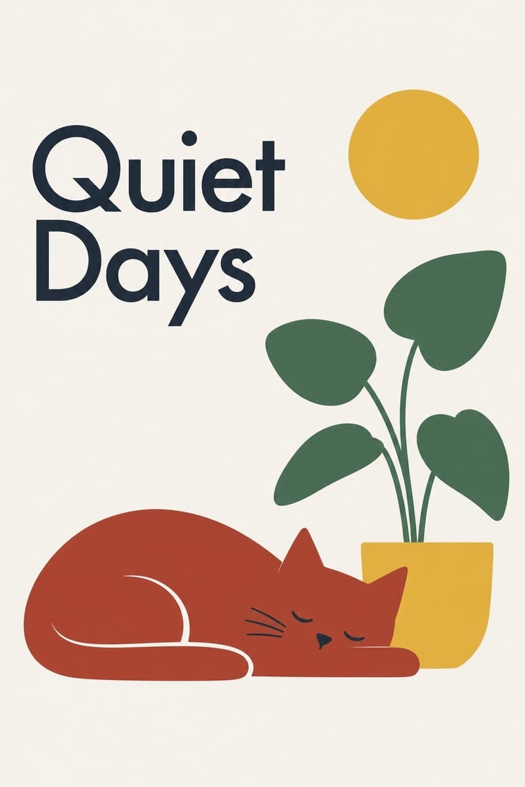
Warm a Swiss grid with Nordic colour and one simple, friendly symbol to keep order without coldness.
Mix them and make something Scandinavian Functionalism International Typographic Style
01
What each style brings
Each part of the design comes from the style with the stronger say in it, and each style gives at least two.
Scandinavian Functionalism International Typographic Style
- Type from International Typographic Style
- Colour from International Typographic Style
- Form from Scandinavian Functionalism
- Composition from International Typographic Style
- Surface from Scandinavian Functionalism
02
The type
Open fonts standing in for each style’s own type, which is often hand-drawn or commercial.
Text · Scandinavian Functionalism
Nordic functionalism (funkis) arrived in graphic form with Sigurd Lewerentz's posters and winged emblem for the 1930 Stockholm Exhibition. It adapted Bauhaus rationalism to a social-democratic ideal of beautiful everyday things for everyone. Its graphic language is modernism with warmth: clear sans-serif or humane serif type, generous space, friendly simplified symbols and colours taken from nature, applied to public services, consumer goods and national identities.
Jost; Scandinavian Functionalism used Futura and Berling Antikva
03
The colours
The ground and leading colours come from International Typographic Style, with a counter-accent from Scandinavian Functionalism. The ink reads on the ground at 4.5:1 or more.
Scandinavian Functionalism International Typographic Style
-
#f2f0e9ground · 36% -
#111111ink · 14% -
#e1251baccent · 18% -
#e3b53aaccent · 14% -
#1f4e9caccent · 10% -
#a63a2aaccent · 8%
As CSS
:root {
  --ground: #f2f0e9;
  --ink: #111111;
  --accent-1: #e1251b;
  --accent-2: #e3b53a;
  --accent-3: #1f4e9c;
  --accent-4: #a63a2a;
  --font-display: "Inter Tight", sans-serif;
  --font-text: "Jost", sans-serif;
}
04
The two styles

05
More combinations
With Scandinavian Functionalism
- Minimalist Graphic Design Pairs well · Add natural colour and rounded forms to minimalist reduction for calm, approachable consumer branding.
- Victorian Letterpress & Wood Type Contrasts · The crowded Victorian handbill is what funkis cleared away; quote one for a heritage-versus-modern contrast.
- Corporate Memphis Contrasts · Both aim for friendliness, but Corporate Memphis shouts; use Nordic restraint to get warmth from colour and space instead of rubbery figures.
- NK Textilkammare Geometric Print (Astrid Sampe, Signerad Textil) Pairs well · The parent language: a calm functionalist layout of type and white space with one band of NK-style striped cloth as its only ornament.
- DTC 'Blanding' / Millennial Minimalism Pairs well · Shares a warm, domestic restraint; borrow Nordic materials and craft photography to give a pastel system more texture and credibility.
- Moomin Graphics (Tove Jansson's Pen-Drawn World and its Licensed Afterlife) Pairs well · The Teema mug is the meeting point: a plain functional Nordic shape carrying one warm hand drawing.
- Finnish Bold Print (Marimekko Modernism) Pairs well · The same Nordic ideal of good everyday things, turned up loud; set one Marimekko-scale print against a calm funkis layout with a light ground and a plain sans so the pattern carries all the colour.
- Josef Frank and Svenskt Tenn Botanical Prints Contrasts · Frank's prints were his answer to functionalist austerity in the same Swedish rooms: use a calm functionalist layout and let one Frank-style print be its only ornament.
With International Typographic Style
- Art Nouveau Contrasts · Ornamental curves against an orthogonal grid make a strong deliberate tension.
- Brutalist Web Design Pairs well · Strip the grid to raw HTML defaults to get a rawer, contemporary take on Swiss honesty.
- Psychedelic Poster Contrasts · Its exact opposite on legibility; borrow one swirling element to break a too-cold Swiss layout.
- Japanese Postwar Modernism Pairs well · Add Japanese restraint and emblematic colour fields to the grid for warmth without losing order.
- American Traditional Tattoo Flash Contrasts · Rational grid and sans-serif against sentimental, hand-lettered emblems: one flash motif on a Swiss layout makes a sharp contrast.
- Graffiti & Hip-Hop Graphics Contrasts · Put a single tag or throw-up over a strict Swiss grid to stage the clash between institutional order and a street voice.
- Pop Art Graphics Contrasts · Set one loud appropriated Pop image inside a strict grid with a neutral grotesque so the irony reads as deliberate rather than chaotic.
- Italian Painted Film Poster (Rome Studios) Contrasts · Grid, restraint and photographic objectivity are the opposite of a crowded painted montage.