Style combination · Contrasts
Josef Frank and Svenskt Tenn Botanical Prints × 10-gruppen Printed Textiles
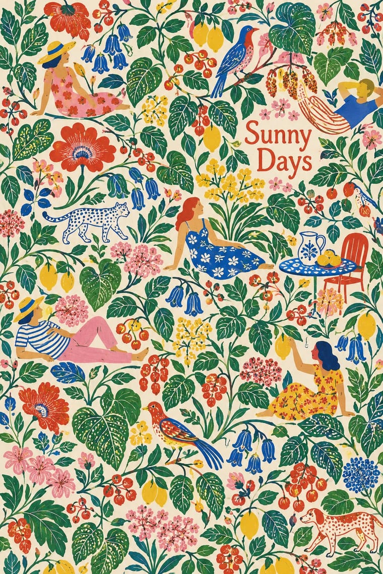
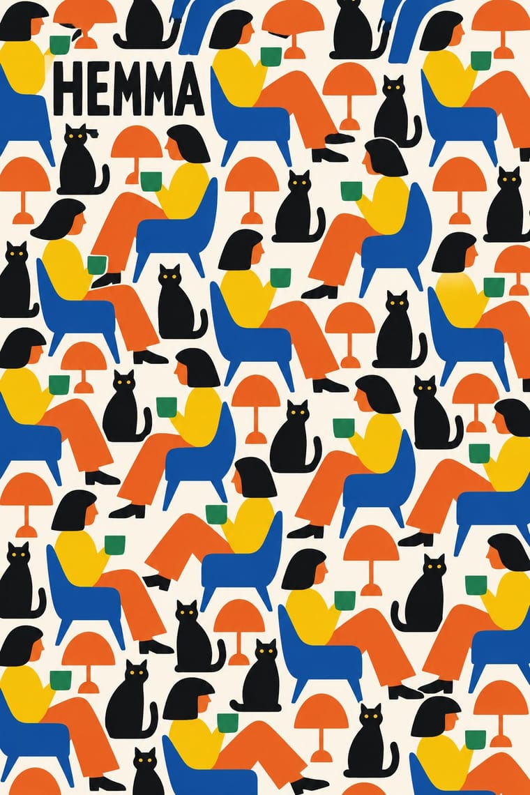
Frank fills a long repeat with many small botanical motifs; 10-gruppen uses one plain everyday motif in few flat colours, the cheerful answer to that richness.
Mix them and make something Josef Frank and Svenskt Tenn Botanical Prints 10-gruppen Printed Textiles
01
What each style brings
Each part of the design comes from the style with the stronger say in it, and each style gives at least two.
Josef Frank and Svenskt Tenn Botanical Prints 10-gruppen (Tiogruppen) Printed Textiles
- Type from Josef Frank and Svenskt Tenn Botanical Prints
-
- Colour from 10-gruppen Printed Textiles
-
Josef Frank and Svenskt Tenn Botanical Prints avoids limited spot colours: this is where the two pull against each other, which is the point of the contrast.
- Form from Josef Frank and Svenskt Tenn Botanical Prints
- Composition from 10-gruppen Printed Textiles
- Surface from Josef Frank and Svenskt Tenn Botanical Prints
02
The type
Open fonts standing in for each style’s own type, which is often hand-drawn or commercial.
Display · Josef Frank and Svenskt Tenn Botanical Prints
Pop
Londrina Solid; Josef Frank and Svenskt Tenn Botanical Prints used Lettering drawn inside the repeat, such as the grey banners naming 'MANHATTAN' that run through the Manhattan print and The printed selvedge mark naming pattern, designer and maker, such as 'La Plata Komp. Av Josef Frank Svenskt Tenn Stockholm'
Text · 10-gruppen Printed Textiles
The printed fabrics of 10-gruppen, a Stockholm collective of ten textile designers founded in 1970: bright, flat all-over repeats of stripes, checks, dripping drops and simple figurative motifs such as dogs, bananas and Stockholm landmarks, in a few saturated inks on cotton or linen. Against the discreet patterns then usual in Swedish textiles, they made cheap, cheerful pattern for everyday goods, sold by the metre at IKEA and on bags and trays in the group's own shop. Unlike Marimekko's large organic shapes, the repeats are mid-sized, cleanly drawn and often pictorial.
Nunito; 10-gruppen Printed Textiles used No lettering in the repeat and IKEA's capitalised Swedish product names (STRIX/STRAX, PLASK, SOLREGN, RANDIG BANAN, as IKEA Museum writes them), the form in which most buyers met the group's prints; this naming is IKEA's convention, not a choice of the group, and the only lettering tied to the prints in the sources
03
The colours
The ground and leading colours come from 10-gruppen Printed Textiles, with a counter-accent from Josef Frank and Svenskt Tenn Botanical Prints. The ink reads on the ground at 4.5:1 or more.
Josef Frank and Svenskt Tenn Botanical Prints 10-gruppen (Tiogruppen) Printed Textiles
-
#f4f1e8ground · 36% -
#161616ink · 14% -
#f6c800accent · 18% -
#e3a92baccent · 14% -
#e8641caccent · 10% -
#c8372daccent · 8%
As CSS
:root {
  --ground: #f4f1e8;
  --ink: #161616;
  --accent-1: #f6c800;
  --accent-2: #e3a92b;
  --accent-3: #e8641c;
  --accent-4: #c8372d;
  --font-display: "Londrina Solid", cursive;
  --font-text: "Nunito", sans-serif;
}
04
The two styles
05
More combinations
With Josef Frank and Svenskt Tenn Botanical Prints
- Vienna Secession Contrasts · Frank came out of Vienna, but his loose, asymmetric plant repeats are the opposite of the Secession's geometric, symmetrical ornament; compare a Wiener Werkstätte grid pattern with his free-growing trees.
- Arts & Crafts Movement Pairs well · The parent tradition: both fill a repeat with plants on linen, but Morris is symmetrical, earthy and dense with dark grounds, Frank is looser, brighter and mostly light. Pair a Morris-style framed book page with Frank-style endpapers.
- Scandinavian Functionalism Contrasts · Frank's prints were his answer to functionalist austerity in the same Swedish rooms: use a calm functionalist layout and let one Frank-style print be its only ornament.
- Taiwan Floral Cloth (Huabu) Pairs well · Another dense, many-coloured floral cloth; Taiwan huabu is bolder, flatter and more nostalgic, Frank finer in line and more botanical.
- Finnish Bold Print (Marimekko Modernism) Contrasts · Marimekko enlarges one abstracted motif in two or three flat inks with plenty of white; set it beside Frank's many small, detailed, many-coloured plants to show how much each pattern holds.
- NK Textilkammare Geometric Print (Astrid Sampe, Signerad Textil) Contrasts · The other Stockholm house of printed linen in the same decades: Frank fills the cloth with many-coloured invented plants, NK's geometric prints with a few lines in black, white and one accent.
With 10-gruppen Printed Textiles
- Finnish Bold Print (Marimekko Modernism) Pairs well · Mix a large organic Marimekko shape with a mid-sized pictorial 10-gruppen repeat for a Nordic interior that is bold at two scales.
- Op Art Graphics Contrasts · Both use stripes and repeats, but Op Art makes them vibrate; keep the stripes calm and add a figure to stay on the 10-gruppen side.
- Scandinavian Functionalism Pairs well · Set a bright repeat behind calm functionalist typography and white space: the pattern brings the colour, the layout keeps the order.