Style combination · Contrasts
Instagram Slideshow Activism × Internet Ugly
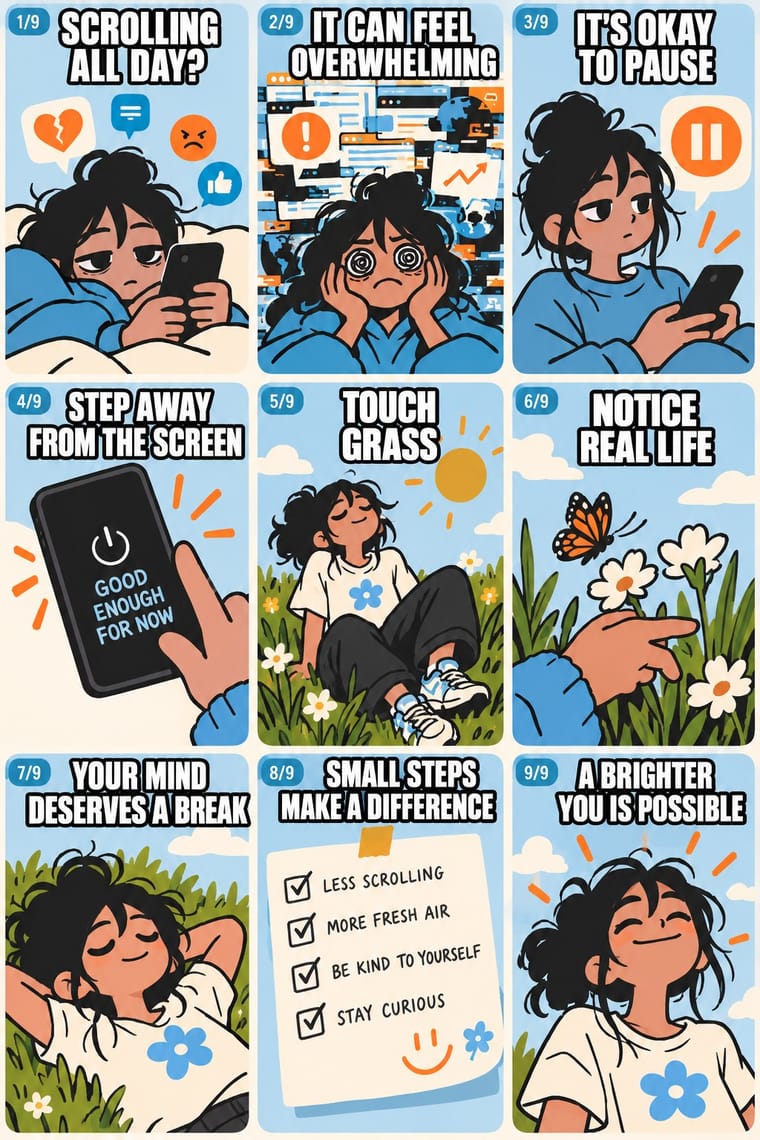
The meme vernacular is its ironic other and the language of its parodies: crude, found and knowing where the slideshow is polished and sincere.
Mix them and make something Instagram Slideshow Activism Internet Ugly
01
What each style brings
Each part of the design comes from the style with the stronger say in it, and each style gives at least two.
Instagram Slideshow Activism (Social-Justice Infographics) Internet Ugly & Meme Vernacular
- Type from Internet Ugly
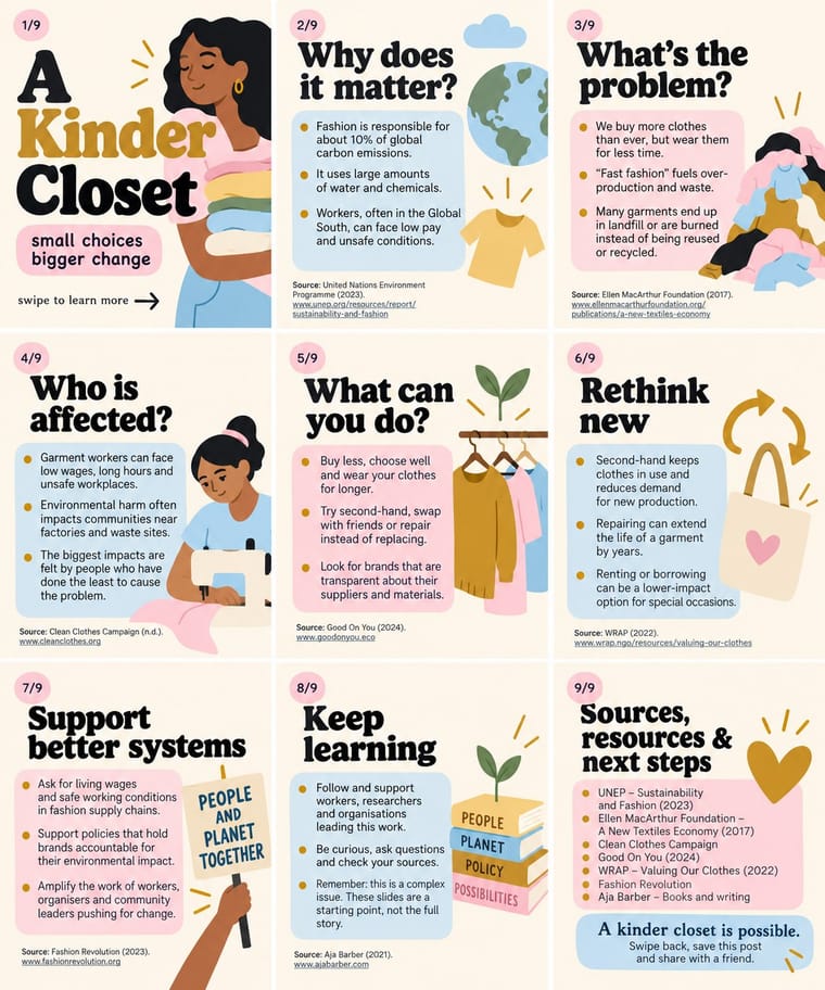
- Colour from Instagram Slideshow Activism
- Form from Internet Ugly
- Composition from Instagram Slideshow Activism
- Surface from Internet Ugly
-
Instagram Slideshow Activism avoids glitch: this is where the two pull against each other, which is the point of the contrast.
02
The type
Open fonts standing in for each style’s own type, which is often hand-drawn or commercial.
Display · Internet Ugly
Fiesta
Anton, standing in for Impact (Geoffrey Lee, Stephenson Blake, 1965), set white with a black outline
Text · Instagram Slideshow Activism
The text-led explainer slideshows that filled Instagram after George Floyd's murder in May 2020. Up to ten square or 4:5 slides in one carousel (twenty since August 2024) are read like a PowerPoint deck: a title card in big type with a swipe arrow, then bullet-point slides with sources and a call to action. Pastel pink, yellow and blue grounds, large serif or bubbly, wide sans headings, gradients and playful flat figures, often from Canva templates, borrow the look of millennial brands to reach apolitical readers.
Inter; Instagram Slideshow Activism used Large display serifs on the title card and Ovo (Nicole Fally, Sorkin Type, 2011), a medium-contrast serif with soft serifs and old-style letter widths
03
The colours
The ground and leading colours come from Instagram Slideshow Activism, with a counter-accent from Internet Ugly. The ink reads on the ground at 4.5:1 or more.
Instagram Slideshow Activism (Social-Justice Infographics) Internet Ugly & Meme Vernacular
-
#fdf6ecground · 36% -
#1e1e1eink · 14% -
#c9962caccent · 18% -
#00a2e8accent · 14% -
#b9d7eeaccent · 10% -
#ff7f27accent · 8%
As CSS
:root {
  --ground: #fdf6ec;
  --ink: #1e1e1e;
  --accent-1: #c9962c;
  --accent-2: #00a2e8;
  --accent-3: #b9d7ee;
  --accent-4: #ff7f27;
  --font-display: "Anton", sans-serif;
  --font-text: "Inter", sans-serif;
}
Use it with care
Instagram Slideshow Activism (Social-Justice Infographics): The look grew out of the 2020 Black Lives Matter protests, and critics such as the sociologist Eve Ewing warned that slides flatten complex problems and summarise the work of often Black authors without credit: name and link every source, credit the people whose work you condense, and check claims before posting. Do not turn the names and faces of people killed by police into decorative or shareable motifs; Vox quotes a warning that the look can 'commodify tragedy and obfuscate revolutionary messages' and notes that Breonna Taylor's death 'devolved into a meme'. Do not dress brand marketing in the look to perform allyship without action, and remember that its friendly packaging works for any message, including an army's messaging in an armed conflict (the IDF slideshow of May 2021) and misinformation, which text inside images makes hard to moderate. Write the slide text into the caption or alt text so screen-reader users can follow it.
Internet Ugly & Meme Vernacular: Most meme templates are photographs of real people, often children, or licensed stock. Success Kid is Laney Griner's son: the photo has been licensed to advertisers, and in January 2020 she sent a cease-and-desist letter to a congressman whose fundraising campaign used it without permission. Distracted Boyfriend is microstock, and its photographer says use without a proper licence is not allowed. License a template or make a new picture for commercial or political work. Check what a format means now: some characters that spread through 4chan were taken up as hate symbols (the ADL listed Pepe the Frog, Matt Furie's 2005 Boy's Club character, in 2016, while noting that most uses are not hateful). Reaction images of Black people posted by non-Black users and brands read as digital blackface (Lauren Michele Jackson, Teen Vogue, 2017), and deep-fried memes came out of Black Twitter, so credit where formats come from. When brands and campaigns borrow a format, its makers often protest or drop it (Douglas).
04
The two styles
05
More combinations
With Instagram Slideshow Activism
- ACT UP & Gran Fury AIDS Activist Graphics Contrasts · Its confrontational opposite: black grounds, hot pink and one blunt slogan, where the typical slideshow shuns 'blood red or black messaging' (Ría Thompson-Washington) and softens the message to stay comfortable.
- Punk & DIY Zine Pairs well · The New York Times called swipe-through guides the new zines; borrow cut-and-paste collage and hand lettering to break the template sameness and look made by a person, not a kit.
- Isotype Pictorial Statistics Pairs well · Turn a slide of bullet-point statistics into rows of counted pictograms so the numbers are shown, not just asserted, without losing the friendly flat look.
- Newsroom Data Graphics & Scrollytelling Contrasts · Sourced charts with a stated finding are the next step from a slide of bare bullet-point claims; the source line on every slide is common ground, since @soyouwanttotalkabout's maker said hers stood out for 'including sources at the bottom of every slide'.
- Latin American Feminist Protest Graphics (Ni Una Menos and the Green Wave) Contrasts · The hashtags #NiUnaMenos and #VivasNosQueremos also travelled on Facebook and Instagram, but their images point to a march, a wall or a scarf, whereas the slideshow lives and ends in the carousel in pastel templates.
With Internet Ugly
- Punk & DIY Zine Pairs well · Both make amateur, cheap reproduction a stance; combine ransom-note cut-ups with Impact captions and crude pasted photos for zine-style posters that still read as a joke.
- International Typographic Style Contrasts · Drop one rage face or Impact caption into a strict Swiss grid to show how much of design's authority comes from polish.
- Brutalist Web Design Pairs well · Put MS Paint drawings and image macros on a raw-HTML page of default fonts and blue links; both treat software defaults as honesty rather than lack of taste.
- Acid Graphics / New Ugly Contrasts · Acid Graphics' 'New Ugly' is rendered by professionals in chrome and 3D; Internet Ugly is ugly because it is quick and amateur. Decide which kind of ugly a brief needs before borrowing either.
- Corporate Memphis Contrasts · Brand-safe flat illustration is what meme makers mock; a brand that borrows meme templates risks the backlash Douglas describes, as communities drop co-opted formats.
- Indie Sleaze Pairs well · Both live on casual web platforms and refuse polish; Indie Sleaze takes the music-scene snapshot where Internet Ugly takes meme vernacular.
- 'Good Morning' Greeting Images (WhatsApp Forward Vernacular) Contrasts · The same forwarding networks with the opposite intent: borrow the meme's speed and template logic, and even its jokes, but keep the greeting affectionate rather than ironic.
- Forum Signature Art (Sig & C4D Render Graphics) Contrasts · The crude, ironic meme dialect of the same forums; sig art aims at the opposite, a slick and earnest technical finish.