Style combination · Contrasts
Hipster Artisanal Revival × Natural Wine Label Art
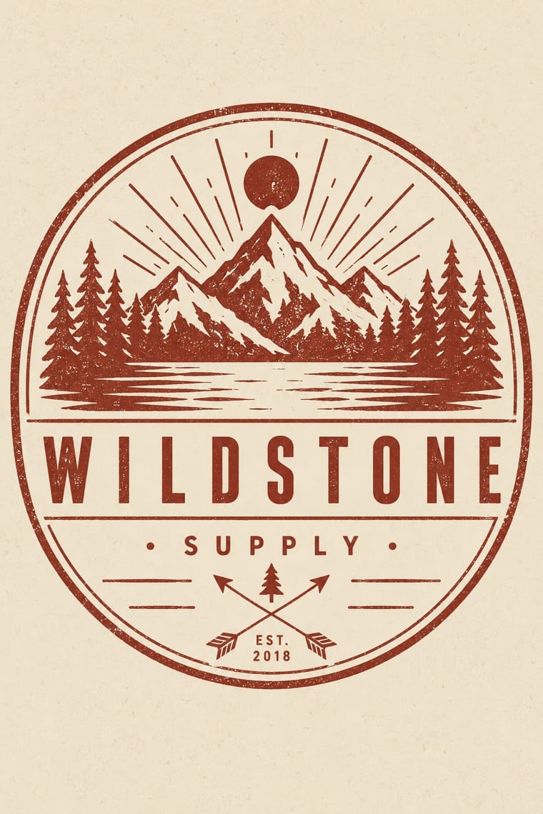
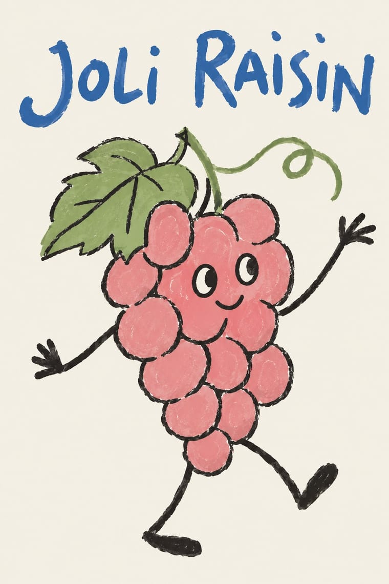
The craft boom's centred one-ink badge with an 'Est.' date borrows exactly the heritage authority natural wine turns down; set a crayon animal against a stamped roundel to choose between a new firm dressed as an old one and a grower who signs with a drawing.
Mix them and make something Hipster Artisanal Revival Natural Wine Label Art
01
What each style brings
Each part of the design comes from the style with the stronger say in it, and each style gives at least two.
Hipster Artisanal Revival Natural Wine Label Art
- Type from Natural Wine Label Art
- Colour from Hipster Artisanal Revival
- Form from Hipster Artisanal Revival
-
Natural Wine Label Art avoids emblems & badges: this is where the two pull against each other, which is the point of the contrast.
- Composition from Natural Wine Label Art
- Surface from Hipster Artisanal Revival
02
The type
Open fonts standing in for each style’s own type, which is often hand-drawn or commercial.
Display · Natural Wine Label Art
Kin
Caveat, standing in for Hand-scrawled cuvée names in felt pen, crayon or pencil, written by the same hand as the picture (the 'grocery store list doodles' AIGA Eye on Design describes)
Text · Hipster Artisanal Revival
The trade-mark look of the 2007–2018 craft boom, which dressed new coffee roasters, breweries and stationers as nineteenth- and early-twentieth-century firms. A centred one-ink badge holds a line-drawn icon, crossed arrows or an X with words in its quadrants, a triangle and an 'Est.' date for a firm a year old, in tracked sans capitals and a flowing script on kraft, cream or chalkboard. Stock 'Hipster Badges' made it a template; by 2012–13 trend reports and parodies called it overdone, and by 2018 it had matured into colourless, detailed monoline badges that left the arrows and scripts behind.
Jost; Hipster Artisanal Revival used Wisdom Script (James T. Edmondson, Lost Type, 2011), originally drawn for the 'Woods of Wisdom' poster series and Brothers (John Downer, Emigre, 1999), after a turn-of-the-century chromolithographed Cole Brothers circus letterhead
03
The colours
The ground and leading colours come from Hipster Artisanal Revival, with a counter-accent from Natural Wine Label Art. The ink reads on the ground at 4.5:1 or more.
Hipster Artisanal Revival Natural Wine Label Art
-
#f1e8d6ground · 36% -
#1e1c1aink · 14% -
#8e2f25accent · 18% -
#f08a3caccent · 14% -
#c4a27aaccent · 10% -
#3f6db3accent · 8%
As CSS
:root {
  --ground: #f1e8d6;
  --ink: #1e1c1a;
  --accent-1: #8e2f25;
  --accent-2: #f08a3c;
  --accent-3: #c4a27a;
  --accent-4: #3f6db3;
  --font-display: "Caveat", cursive;
  --font-text: "Jost", sans-serif;
}
Use it with care
Hipster Artisanal Revival: The hipster fashion and branding of the same years also borrowed pseudo-Native 'tribal' dress: Adrienne Keene's Native Appropriations (2010) answered the fashion for 'hipster headdresses' by noting that eagle feathers 'have to be earned', and in 2012 the Navajo Nation sued Urban Outfitters over goods sold under the 'Navajo' name. Keep to arrows, triangles and trade-mark devices; do not add feathered headdresses, war bonnets or 'tribal' and 'Navajo' patterns as a heritage shorthand.
Natural Wine Label Art: Gut Oggau's family of faces, Jaime Hayón's drawings for it, Jauma's Tikka the Cosmic Cat and Michel Tolmer's characters are owned artwork: invent your own character, do not prompt an image model for a named illustrator's hand, and never present a generated image as a real grower's label. 'Natural' has no legal definition for wine, and French rules even forbid tying the words 'nature' or 'naturel' directly to 'vin'; the Vin Méthode Nature logo is a private mark for growers who sign its charter (validated by the DGCCRF in March 2020), so do not put it on a design for a wine that is not certified. Keeping the legal mentions quiet must not mean leaving out the label's mandatory particulars.
04
The two styles
05
More combinations
With Hipster Artisanal Revival
- DTC 'Blanding' / Millennial Minimalism Contrasts · Where this dressed new firms as old ones, blanding dressed them as frictionless and new, with lowercase geometric sans, pastels and white space; set the two side by side to place a brand between heritage and novelty.
- Victorian Letterpress & Wood Type Pairs well · Go back to the source: swap the stock badge parts for real jobbing type, printers' rules and stock borders to turn pastiche into the trade print it quotes.
- Risograph & Indie Print Culture Pairs well · The same small-batch maker economy; print the badge in one riso ink on uncoated stock to get real ink grain instead of a distress overlay.
- Flat Design Contrasts · Its contemporary on screen was textureless and many-coloured where this was single-ink and worn; one stamped badge inside a flat interface marks a product as hand-made.
- Hand-Painted Signage & Vernacular Lettering Pairs well · Sign painting revived alongside it; paint the badge on the shop window or chalkboard so the lettering is made by hand instead of aged with a texture filter.
- Phototype Expressive Typography (Lubalin & U&lc) Contrasts · Both pair a script with a geometric sans, but the craft badge tracks its capitals wide in a centred one-ink frame, while Lubalin kerns the same pairing until the letters touch and join. Set one against the other to decide whether the letters should breathe or fuse.
- Cottagecore Contrasts · Shares handmade, small-batch values, but swap its black-and-white urban badges for soft colour and florals to get cottagecore.
- European Heraldry Contrasts · The craft badge borrows heraldry's air of lineage with an 'Est.' date and crossed arrows on kraft paper, while a real coat of arms is a granted or inherited, blazoned identity in strong tinctures; set the two side by side to show the difference between quoting heritage and holding it.
With Natural Wine Label Art
- Punk & DIY Zine Pairs well · Alice Feiring calls the earlier natural-wine scene punk rock: of Gut Oggau she says 'This is where things grow up and stop being so punk rock' (Punch, 2021). Take punk's refusal of professional polish but drop the collage and the anger: one felt-pen picture on a white label carries the same do-it-yourself stance in a friendlier voice.
- DTC 'Blanding' / Millennial Minimalism Contrasts · Blanding sells a frictionless, agency-made brand in lowercase geometric sans and pastels; the natural wine label sells a person through an untrained drawing. Use the contrast to decide whether a product should feel designed or made.
- Risograph & Indie Print Culture Pairs well · Both come from the same small-batch maker economy and share a naive drawn idiom; print a short-run cuvée label in two riso inks to add overprint and grain to a felt-pen drawing.
- European Heraldry Contrasts · The crest is the device of the classic château label that natural wine replaced with a face or an animal; put one heraldic charge beside a doodle to show which side of the wine world a bottle stands on.
- French Post-War Visual-Gag Poster (Savignac, Villemot, Morvan) Pairs well · Both put one cartoon figure on a plain ground with the name drawn into the picture; the gag poster is a professional's single punchline at hoarding scale, the wine label an amateur's picture at bottle scale. Borrow Savignac's one-image-one-idea discipline to keep a naive label from turning into a scrapbook.
- Yuru-chara (Japanese Local Mascot Design) Pairs well · Super Glou's drunken-cat mascot and Jauma's cosmic cat work like local mascots; borrow the yuru-chara habit of one soft, recurring character who appears in a new scene for each product.