Style combination · Contrasts
Hipster Artisanal Revival × Indie Sleaze
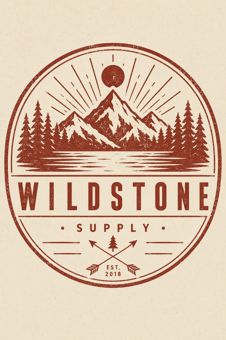
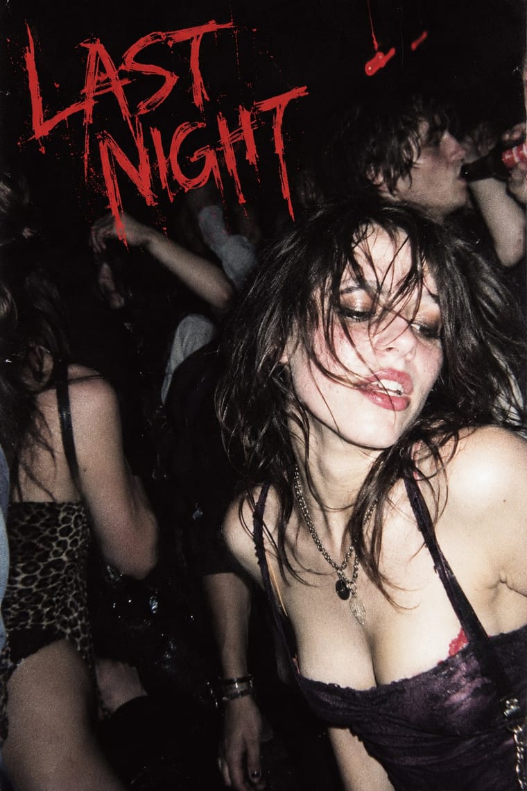
Near relative (the look was itself called hipster style in the 2000s), but craft, heritage badges and warm vintage stand against dirty, nocturnal flash photography.
Mix them and make something Hipster Artisanal Revival Indie Sleaze
01
What each style brings
Each part of the design comes from the style with the stronger say in it, and each style gives at least two.
Hipster Artisanal Revival Indie Sleaze
- Type from Hipster Artisanal Revival
- Colour from Indie Sleaze
- Form from Hipster Artisanal Revival
- Composition from Hipster Artisanal Revival
-
Indie Sleaze avoids central symmetry: this is where the two pull against each other, which is the point of the contrast.
- Surface from Indie Sleaze
02
The type
Open fonts standing in for each style’s own type, which is often hand-drawn or commercial.
Display · Hipster Artisanal Revival
Okay
Jost, standing in for Futura (Paul Renner, Bauer, 1927), as on the Field Notes cover
Text · Indie Sleaze
Mainly a fashion and music-scene label applied in retrospect to the late-2000s indie and blog-rock crowd (skinny jeans, band tees, smudged eyeliner). Its graphic expression is mostly photographic and platform-based, not a designed system: amateur direct-flash party snapshots posted as an unedited stream to MySpace and early Tumblr, overexposed, noisy and dark-roomed. Its distinctness lies in that pairing of flash snapshot and blog stream.
Space Grotesk; Indie Sleaze used Default blog and profile-page sans-serif captions and The MySpace and Tumblr interface type around the photographs
03
The colours
The ground and leading colours come from Indie Sleaze, with a counter-accent from Hipster Artisanal Revival. The ink reads on the ground at 4.5:1 or more.
Hipster Artisanal Revival Indie Sleaze
-
#0d0b0eground · 36% -
#e6e1eaink · 14% -
#c8322daccent · 18% -
#8e2f25accent · 14% -
#5a3a63accent · 10% -
#c4a27aaccent · 8%
As CSS
:root {
  --ground: #0d0b0e;
  --ink: #e6e1ea;
  --accent-1: #c8322d;
  --accent-2: #8e2f25;
  --accent-3: #5a3a63;
  --accent-4: #c4a27a;
  --font-display: "Jost", sans-serif;
  --font-text: "Space Grotesk", sans-serif;
}
Use it with care
Hipster Artisanal Revival: The hipster fashion and branding of the same years also borrowed pseudo-Native 'tribal' dress: Adrienne Keene's Native Appropriations (2010) answered the fashion for 'hipster headdresses' by noting that eagle feathers 'have to be earned', and in 2012 the Navajo Nation sued Urban Outfitters over goods sold under the 'Navajo' name. Keep to arrows, triangles and trade-mark devices; do not add feathered headdresses, war bonnets or 'tribal' and 'Navajo' patterns as a heritage shorthand.
Indie Sleaze: The look was built on photographing real people, often drunk or intoxicated, in nightlife, and posting the pictures publicly without their ongoing consent; the Cobrasnake archive and the Tumblr and MySpace posts are of identifiable individuals. Terry Richardson, whom Wikipedia lists among the mid-2000s photographers who embraced the style, has been accused by multiple models of sexual misconduct and exploitation (he says the allegations are false) and Condé Nast stopped commissioning him in 2017; he is deliberately left out of the exemplars and his work is not a model to follow. The revival raises the same consent and privacy questions: get consent from anyone identifiable, and do not reuse old nightlife photographs of real people as stock for a retro look.
04
The two styles
05
More combinations
With Hipster Artisanal Revival
- DTC 'Blanding' / Millennial Minimalism Contrasts · Where this dressed new firms as old ones, blanding dressed them as frictionless and new, with lowercase geometric sans, pastels and white space; set the two side by side to place a brand between heritage and novelty.
- Victorian Letterpress & Wood Type Pairs well · Go back to the source: swap the stock badge parts for real jobbing type, printers' rules and stock borders to turn pastiche into the trade print it quotes.
- Risograph & Indie Print Culture Pairs well · The same small-batch maker economy; print the badge in one riso ink on uncoated stock to get real ink grain instead of a distress overlay.
- Flat Design Contrasts · Its contemporary on screen was textureless and many-coloured where this was single-ink and worn; one stamped badge inside a flat interface marks a product as hand-made.
- Hand-Painted Signage & Vernacular Lettering Pairs well · Sign painting revived alongside it; paint the badge on the shop window or chalkboard so the lettering is made by hand instead of aged with a texture filter.
- Phototype Expressive Typography (Lubalin & U&lc) Contrasts · Both pair a script with a geometric sans, but the craft badge tracks its capitals wide in a centred one-ink frame, while Lubalin kerns the same pairing until the letters touch and join. Set one against the other to decide whether the letters should breathe or fuse.
- Cottagecore Contrasts · Shares handmade, small-batch values, but swap its black-and-white urban badges for soft colour and florals to get cottagecore.
- European Heraldry Contrasts · The craft badge borrows heraldry's air of lineage with an 'Est.' date and crossed arrows on kraft paper, while a real coat of arms is a granted or inherited, blazoned identity in strong tinctures; set the two side by side to show the difference between quoting heritage and holding it.
With Indie Sleaze
- Internet Ugly & Meme Vernacular Pairs well · Both live on casual web platforms and refuse polish; Indie Sleaze takes the music-scene snapshot where Internet Ugly takes meme vernacular.
- Grunge Typography Pairs well · Wikipedia describes the look as combining 1970s and 1980s fashion with grunge fashion, 'grubby' and 'performatively vintage'.
- Brutalist Web Design Contrasts · Deliberate raw web structure against an unplanned blog stream of photographs.