Style combination · Pairs well
French Post-War Visual-Gag Poster × Push Pin Style
Borrow Push Pin's invented display lettering and period quotation to give a gag poster an editorial voice, but keep the single joke and the empty ground.
Mix them and make something French Post-War Visual-Gag Poster Push Pin Style
01
What each style brings
Each part of the design comes from the style with the stronger say in it, and each style gives at least two.
French Post-War Visual-Gag Poster (Savignac, Villemot, Morvan) Push Pin Style
- Type from Push Pin Style
- Colour from Push Pin Style
- Form from French Post-War Visual-Gag Poster
- Composition from French Post-War Visual-Gag Poster
- Surface from French Post-War Visual-Gag Poster
02
The type
Open fonts standing in for each style’s own type, which is often hand-drawn or commercial.
Text · French Post-War Visual-Gag Poster
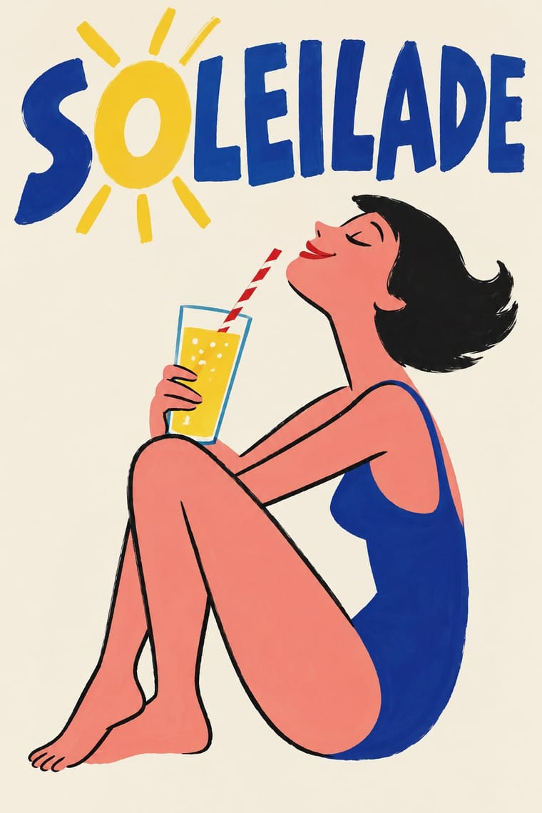
The humorous street poster of post-war Paris, which took off in 1949 when Raymond Savignac and Bernard Villemot showed their rejected projects together and Savignac's Monsavon cow, its udder filling a bar of soap, went up on the walls. With Hervé Morvan they reduced each advertisement to one cartoon gag whose punchline is the product: a stylised figure brushed in a few bright colours on a plain ground, the brand name drawn into the picture and almost no other copy, printed as large colour lithographs until agency photography pushed it aside in the 1970s.
Archivo; French Post-War Visual-Gag Poster used Brand name painted by the artist into the picture, often in bold sans capitals on the product itself and Roman capitals over a lowercase italic line, lettered on the product
03
The colours
The ground and leading colours come from Push Pin Style, with a counter-accent from French Post-War Visual-Gag Poster. The ink reads on the ground at 4.5:1 or more.
French Post-War Visual-Gag Poster (Savignac, Villemot, Morvan) Push Pin Style
-
#f4e9cfground · 36% -
#1b1b1bink · 14% -
#f2b632accent · 18% -
#d8291faccent · 14% -
#2e86abaccent · 10% -
#9b4f96accent · 8%
As CSS
:root {
  --ground: #f4e9cf;
  --ink: #1b1b1b;
  --accent-1: #f2b632;
  --accent-2: #d8291f;
  --accent-3: #2e86ab;
  --accent-4: #9b4f96;
  --font-display: "Righteous", sans-serif;
  --font-text: "Archivo", sans-serif;
}
Use it with care
French Post-War Visual-Gag Poster (Savignac, Villemot, Morvan): Savignac, Villemot, Morvan and Carlu are in copyright (Adagp, Paris), and some of their images are still brand property: Savignac's Bic boy is part of the BIC logo, and Orangina reissued Villemot's zest parasol on its bottles in 2011. Invent your own gag for your own product rather than redrawing the Monsavon cow, the Maggi ox or the Bic boy, do not prompt an image model for a named affichiste's hand, and never present a generated image as a vintage affiche.
04
The two styles
05
More combinations
With French Post-War Visual-Gag Poster
- International Typographic Style Contrasts · The grid, neutral sans and photography of the same decades are its opposite in tone; one hand-drawn gag dropped into a Swiss layout makes a deliberate, disarming tension.
- UPA & Cartoon Modern Pairs well · UPA's flat, slipped colour and deadpan caricature carry the same good-natured wit into motion; use it to animate a gag poster for screens.
- Basel Object Poster (Swiss Sachplakat) Contrasts · Its Swiss contemporary paints the product as a modelled, larger-than-life icon; choose between wit by cartoon drawing and wit by illusion, or set one against the other.
- Atelier Populaire (May '68 Screenprint Poster) Contrasts · The same Paris walls twenty years apart: the gag poster sells a product with one good-natured colour-lithograph joke, while the 1968 students' one-colour screenprints turn the same single image and hand-lettered slogan to agitation.
- Illustrated Rom-Com Book Cover (Cartoon Couple Cover) Pairs well · Savignac's and Villemot's one-figure, one-prop sight gags on a flat ground are the model for a strong premise image; borrow the single visual pun to sharpen a cover that has drifted into two figures simply standing side by side.
- Natural Wine Label Art Pairs well · Both put one cartoon figure on a plain ground with the name drawn into the picture; the gag poster is a professional's single punchline at hoarding scale, the wine label an amateur's picture at bottle scale. Borrow Savignac's one-image-one-idea discipline to keep a naive label from turning into a scrapbook.
- West German Conceptual Film & Culture Poster (Hillmann and Rambow) Contrasts · Savignac's visual gag is drawn and painted to make people smile at a product; the Kassel poster finds its pun in photographs and silhouettes, and its humour is darker and aimed at a film's or play's subject.
With Push Pin Style
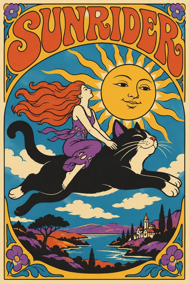
- Psychedelic Poster Pairs well · Both revive Art Nouveau lettering; add Push Pin's clean contour and wit to tame psychedelic excess into readable posters.
- International Typographic Style Contrasts · Push Pin defined itself against Helvetica neutrality; pit a bespoke illustrated letterform against a Swiss grid to dramatise personality versus system.
- Corporate Memphis Contrasts · Generic, faceless corporate figures are the opposite of Push Pin's authored characters; use Push Pin to restore a distinct illustrative voice.
- Belle Époque Lithographic Poster Pairs well · Borrow Chéret's dancing figures alongside Push Pin's revived display faces for exuberant entertainment graphics.
- Phototype Expressive Typography (Lubalin & U&lc) Pairs well · Push Pin revives old styles through drawn figures and Lubalin through the letters themselves; pair a Push Pin illustration with a swash, tightly kerned Lubalin headline for full 1970s New York warmth.
- UPA & Cartoon Modern Contrasts · Its New York contemporary shared UPA's comic, distorted figures and irony but went the opposite way on ornament: Push Pin piled on revived Victorian and Art Nouveau lettering, borders and ornament, while UPA stripped the picture to a figure, a line and a flat field.
- Angura Theatre Poster Pairs well · Yokoo started from Push Pin's illustrated eclecticism; pair Push Pin's period-pastiche lettering with angura's crowded Japanese ephemera.
- Ligne Claire (Franco-Belgian Clear Line) Contrasts · Push Pin also draws in outline and flat colour, but mixes revived Victorian and Art Nouveau display faces, ornament and distortion; switch to ligne claire for one disciplined line, no ornament and evenly legible scenes.