Style combination · Contrasts
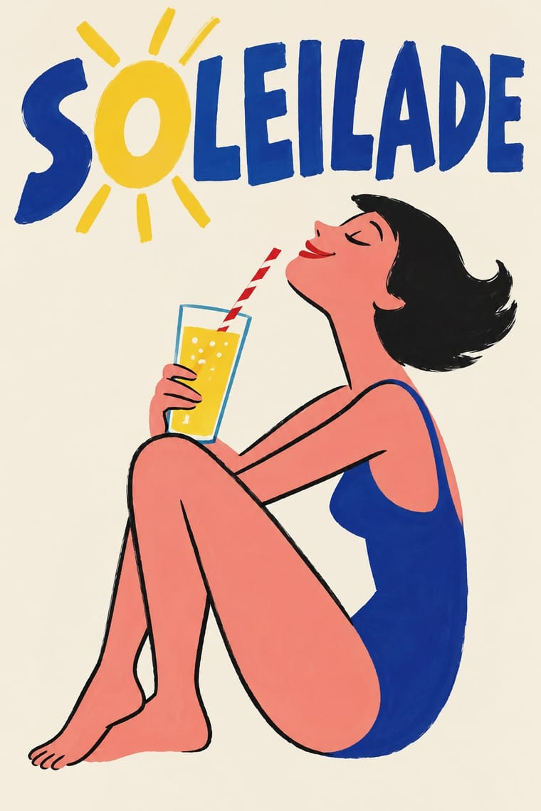
Atelier Populaire × French Post-War Visual-Gag Poster
The same Paris walls twenty years apart: the gag poster sells a product with one good-natured colour-lithograph joke, while the 1968 students' one-colour screenprints turn the same single image and hand-lettered slogan to agitation.
Mix them and make something Atelier Populaire French Post-War Visual-Gag Poster
01
What each style brings
Each part of the design comes from the style with the stronger say in it, and each style gives at least two.
Atelier Populaire (May '68 Screenprint Poster) French Post-War Visual-Gag Poster (Savignac, Villemot, Morvan)
- Type from French Post-War Visual-Gag Poster
- Colour from Atelier Populaire
- Form from French Post-War Visual-Gag Poster
- Composition from Atelier Populaire
- Surface from Atelier Populaire
02
The type
Open fonts standing in for each style’s own type, which is often hand-drawn or commercial.
Display · French Post-War Visual-Gag Poster
Hello
Londrina Solid; French Post-War Visual-Gag Poster used Brand name painted by the artist into the picture, often in bold sans capitals on the product itself and Roman capitals over a lowercase italic line, lettered on the product
Text · Atelier Populaire
The posters of the Atelier populaire, set up when students, teachers and artists occupied the École des Beaux-Arts in Paris on 14 May 1968, until police cleared the school on 27 June. Designs were voted on at evening assemblies, left unsigned and pulled on improvised silkscreens: one flat ink on cheap or donated paper, a single brushed silhouette (a riot policeman, de Gaulle, a factory) and a short punning slogan in rough capitals, pasted up across Paris overnight.
Oswald; Atelier Populaire used Brushed letters, left open on the silk while gum arabic is painted around them to block the screen, so the edges stay ragged and uneven and Wall-slogan handwriting of May '68, lifted from graffiti and marches
03
The colours
The ground and leading colours come from Atelier Populaire, with a counter-accent from French Post-War Visual-Gag Poster. The ink reads on the ground at 4.5:1 or more.
Atelier Populaire (May '68 Screenprint Poster) French Post-War Visual-Gag Poster (Savignac, Villemot, Morvan)
-
#f2eee3ground · 36% -
#141414ink · 14% -
#cf2027accent · 18% -
#23408eaccent · 14% -
#f3c63aaccent · 10% -
#b4875aaccent · 8%
As CSS
:root {
  --ground: #f2eee3;
  --ink: #141414;
  --accent-1: #cf2027;
  --accent-2: #23408e;
  --accent-3: #f3c63a;
  --accent-4: #b4875a;
  --font-display: "Londrina Solid", cursive;
  --font-text: "Oswald", sans-serif;
}
Use it with care
Atelier Populaire (May '68 Screenprint Poster): The posters were made anonymously and given away, and some equate the police or de Gaulle with the Nazis (the SS on a riot policeman's shield, popularly 'CRS SS'; Hitler holding a de Gaulle mask); do not attribute them to individual designers, sell pastiches as May '68 originals, or aim those Nazi comparisons at real people today without that history in view. 'Nous sommes tous des Juifs allemands' answered antisemitic attacks on Cohn-Bendit's origins (the far-right press smeared him as a Marxist German Jew, and Georges Marchais wrote in L'Humanité of 'the German anarchist'); do not reuse it, or the 'indésirables' poster, as a generic 'we are all X' template without that history.
French Post-War Visual-Gag Poster (Savignac, Villemot, Morvan): Savignac, Villemot, Morvan and Carlu are in copyright (Adagp, Paris), and some of their images are still brand property: Savignac's Bic boy is part of the BIC logo, and Orangina reissued Villemot's zest parasol on its bottles in 2011. Invent your own gag for your own product rather than redrawing the Monsavon cow, the Maggi ox or the Bic boy, do not prompt an image model for a named affichiste's hand, and never present a generated image as a vintage affiche.
04
The two styles
05
More combinations
With Atelier Populaire
- South African Resistance Poster Pairs well · Both chose hand-made silkscreen because it was cheap, quick and teachable to non-artists; borrow the struggle posters' organisation emblems and second ink when a campaign must stay recognisable beyond one day's slogan.
- Cuban Revolutionary Poster (OSPAAAL & ICAIC) Contrasts · Same decade, opposite means: ICAIC's silkscreened film posters and OSPAAAL's mostly offset solidarity posters were polished, many-coloured and made to last, while the Atelier's one anonymous ink was pulled overnight for the next morning's wall; decide which of the two the brief needs.
- Polish Poster School Contrasts · Polish posters are signed painterly metaphors by named authors, while the Atelier stripped away signature and painterly finish; a recognisable individual hand breaks its collective voice.
- ROSTA Windows Pairs well · Like the ROSTA windows, each sheet answers the day's news by hand with a stark figure and a caption; run single posters as a numbered sequence when one image cannot tell the whole story.
- Punk & DIY Zine Pairs well · The House of European History traces a line from these posters to Jamie Reid's Sex Pistols graphics; set one brushed slogan in a single ink against xerox cut-up for a flyer with the same anti-authority bite.
- See Red Women's Workshop Feminist Screenprints Contrasts · Both are collective, unsigned screenprints, but May '68 shouts one emblem and a strike slogan, while See Red tells a small domestic story with a wry caption.
- Grapus (French Militant Graphic Collective) Contrasts · The founders came out of the 1968 workshops, but the Beaux-Arts atelier pulled one flat ink, one brushed silhouette and a slogan in rough capitals; Grapus layers photographs, paint and coloured handwriting, mostly on white. Use the first for overnight urgency, Grapus for a warmer, longer campaign.
- ACT UP & Gran Fury AIDS Activist Graphics Contrasts · Both answered a crisis with overnight slogans on the street, but the May '68 posters were brushed by hand and pulled in one ink, while most ACT UP and Gran Fury posters were professionally printed in offset and modelled on advertising; choose rough urgency or seductive polish before mixing them.
With French Post-War Visual-Gag Poster
- International Typographic Style Contrasts · The grid, neutral sans and photography of the same decades are its opposite in tone; one hand-drawn gag dropped into a Swiss layout makes a deliberate, disarming tension.
- UPA & Cartoon Modern Pairs well · UPA's flat, slipped colour and deadpan caricature carry the same good-natured wit into motion; use it to animate a gag poster for screens.
- Basel Object Poster (Swiss Sachplakat) Contrasts · Its Swiss contemporary paints the product as a modelled, larger-than-life icon; choose between wit by cartoon drawing and wit by illusion, or set one against the other.
- Push Pin Style Pairs well · Borrow Push Pin's invented display lettering and period quotation to give a gag poster an editorial voice, but keep the single joke and the empty ground.
- Illustrated Rom-Com Book Cover (Cartoon Couple Cover) Pairs well · Savignac's and Villemot's one-figure, one-prop sight gags on a flat ground are the model for a strong premise image; borrow the single visual pun to sharpen a cover that has drifted into two figures simply standing side by side.
- Natural Wine Label Art Pairs well · Both put one cartoon figure on a plain ground with the name drawn into the picture; the gag poster is a professional's single punchline at hoarding scale, the wine label an amateur's picture at bottle scale. Borrow Savignac's one-image-one-idea discipline to keep a naive label from turning into a scrapbook.
- West German Conceptual Film & Culture Poster (Hillmann and Rambow) Contrasts · Savignac's visual gag is drawn and painted to make people smile at a product; the Kassel poster finds its pun in photographs and silhouettes, and its humour is darker and aimed at a film's or play's subject.