Style combination · Contrasts
Flash-Era Web Design × Frutiger Aero
The glossy era that followed swapped the dark gunmetal console for light, glossy, rounded interfaces.
Mix them and make something Flash-Era Web Design Frutiger Aero
01
What each style brings
Each part of the design comes from the style with the stronger say in it, and each style gives at least two.
Flash-Era Web Design (Flash Portfolio Sites) Frutiger Aero
- Type from Flash-Era Web Design
- Colour from Frutiger Aero
- Form from Flash-Era Web Design
- Composition from Flash-Era Web Design
- Surface from Frutiger Aero
02
The type
Open fonts standing in for each style’s own type, which is often hand-drawn or commercial.
Display · Flash-Era Web Design
Future
Silkscreen, standing in for Silkscreen (Jason Kottke), a free pixel face for 'extremely small graphical display type', meant for nav bars, menus and captions at 8 pt multiples with anti-aliasing off
Text · Frutiger Aero
The glossy, optimistic look of consumer technology from the mid-2000s to the early 2010s, retrospectively named in 2017 by the Consumer Aesthetics Research Institute after Windows Vista's Aero interface and Adrian Frutiger's humanist sans. Translucent glass panels, glossy orbs and buttons, water droplets, bubbles, auroras, green fields and blue skies fused technology with clean nature, set in airy humanist sans-serifs.
Fira Sans; Frutiger Aero used Frutiger and Segoe UI
03
The colours
The ground and leading colours come from Frutiger Aero, with a counter-accent from Flash-Era Web Design. The ink reads on the ground at 4.5:1 or more.
Flash-Era Web Design (Flash Portfolio Sites) Frutiger Aero
-
#f5fbffground · 36% -
#0b5fa5ink · 14% -
#22c3c9accent · 18% -
#ff6a00accent · 14% -
#4fb3e8accent · 10% -
#9bd31caccent · 8%
As CSS
:root {
  --ground: #f5fbff;
  --ink: #0b5fa5;
  --accent-1: #22c3c9;
  --accent-2: #ff6a00;
  --accent-3: #4fb3e8;
  --accent-4: #9bd31c;
  --font-display: "Silkscreen", monospace;
  --font-text: "Fira Sans", sans-serif;
}
04
The two styles
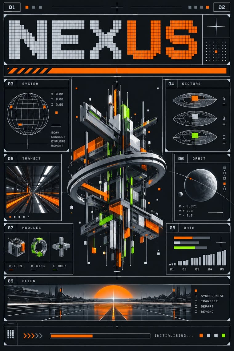
05
More combinations
With Flash-Era Web Design
- Fantasy User Interface (FUI) & Sci-Fi HUD Pairs well · The film HUD shares its hairlines and tracked caps on black; borrow its radial readouts for a Flash-style console, but keep the stage navigable.
- Flash Vector Cartoon (Newgrounds-Era Web Animation) Contrasts · Made in the same tool at the same time, but the cartoon is bright, loose and character-led, where the portfolio site is dark, gridded and abstract.
- Brutalist Web Design Contrasts · Raw, static HTML defaults against the fully art-directed animated stage.
- Media-Player & Desktop Skins (Winamp-Era Skinning) Pairs well · The skinned player shares the era's chrome bevels, pixel-font readouts and dark consoles; its LCD panels sit naturally on a Flash stage.
- Early Web Vernacular Contrasts · The amateur HTML page with default fonts and tiled clutter is what the controlled, one-piece Flash stage set out to replace.
- International Typographic Style Pairs well · Manovich called the Flash generation a new modernism of pixel-thin grids; a strict Swiss grid steadies the panels and readouts.
With Frutiger Aero
- Vaporwave Pairs well · Both trade on mid-2000s tech nostalgia; mix Aero bubbles and skies with vaporwave's pastel 3D for retro-internet campaigns.
- Brutalist Web Design Contrasts · Raw HTML against bubbly gloss is a sharp foil for ironic or nostalgic web projects.
- Glassmorphism Pairs well · Glassmorphism is its flatter heir; reintroduce a touch of Aero gloss and nature photography to warm up frosted-glass UI.
- Flat Design Contrasts · Flat design was the reaction that ended it; toggle gloss against flat to signal ‘then and now’ in retro tech work.
- Forum Signature Art (Sig & C4D Render Graphics) Contrasts · The same years' glossy, light and airy interface look against the sig's dark, smudged depth.
- Skeuomorphic UI Pairs well · Share gloss and depth; combine Aero's glass and nature with skeuomorphic objects for convincing 2000s-nostalgia interfaces.
- Punk & DIY Zine Contrasts · Glossy optimism is everything punk rejects; one torn xerox fragment on an aero gradient reads as instant sabotage.
- Solarpunk Contrasts · Both pair green nature with optimistic technology, but Aero renders it as glossy stock photography, bubbles and glass for a product; choose solarpunk for painted, handmade, lived-in places and shared infrastructure.