Style combination · Contrasts
Finnish Bold Print × Taiwan Floral Cloth
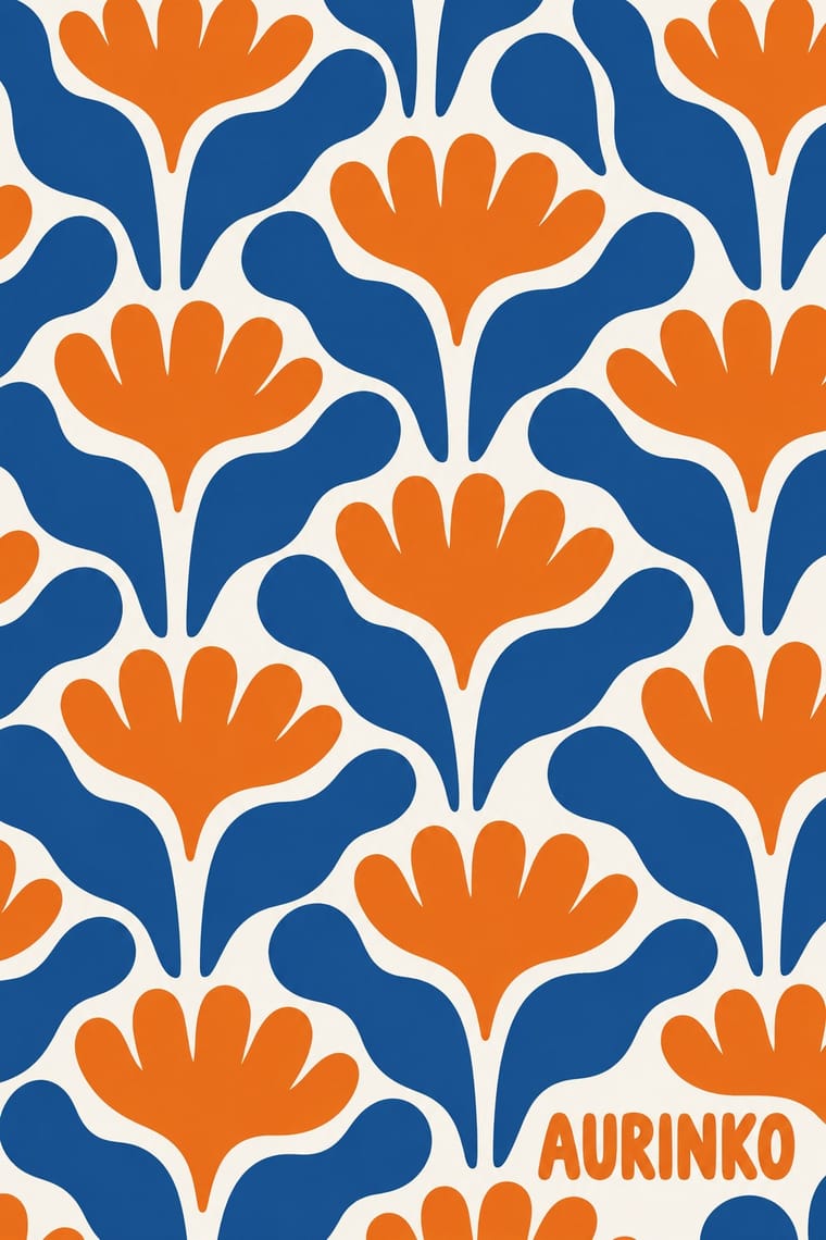
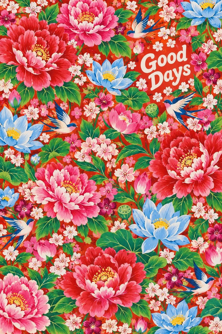
Marimekko's Unikko enlarges one flat poppy on open white in a few inks; Taiwan floral cloth packs many shaded peonies onto a saturated ground. Choose between modernist reduction and abundant, auspicious excess.
Mix them and make something Finnish Bold Print Taiwan Floral Cloth
01
What each style brings
Each part of the design comes from the style with the stronger say in it, and each style gives at least two.
Finnish Bold Print (Marimekko Modernism) Taiwan Floral Cloth (Huabu)
- Type from Finnish Bold Print
-
- Colour from Finnish Bold Print
-
Taiwan Floral Cloth avoids limited spot colours: this is where the two pull against each other, which is the point of the contrast.
- Form from Taiwan Floral Cloth
- Composition from Taiwan Floral Cloth
-
Finnish Bold Print avoids horror vacui: this is where the two pull against each other, which is the point of the contrast.
- Surface from Finnish Bold Print
02
The type
Open fonts standing in for each style’s own type, which is often hand-drawn or commercial.
Display · Finnish Bold Print
Together
Inter Tight; Finnish Bold Print used The Marimekko wordmark (in use since 1954) and Selvedge inscriptions repeated along the edge of the cloth, naming designer, pattern, maker, country and year
Text · Taiwan Floral Cloth
Cheap printed cotton covered edge to edge in large, full-blown peonies with lotuses, phoenixes, dragons, mandarin ducks, small florets and auspicious emblems on saturated vermilion, bright pink or sky-blue grounds. Mass-produced from the 1950s–60s, by Far Eastern Textile among others, for quilts, curtains, wrapping cloths and clothing, it was dismissed as gaudy after the 1970s, taken up by designers and artists such as Michael Lin in the 1980s and 1990s, and revived from the 2000s as a Hakka and Taiwanese emblem on interiors, festivals and cultural-creative goods.
Shippori Mincho; Taiwan Floral Cloth used None on the cloth itself; when words accompany it, kaishu (regular brush script) for auspicious words and titles on a plain panel beside the pattern and Traditional Chinese Songti / Mingti (Ming-style) text type for labels, tags and book covers set against the cloth
03
The colours
The ground and leading colours come from Finnish Bold Print, with a counter-accent from Taiwan Floral Cloth. The ink reads on the ground at 4.5:1 or more.
Finnish Bold Print (Marimekko Modernism) Taiwan Floral Cloth (Huabu)
-
#f7f5f0ground · 36% -
#141414ink · 14% -
#ef7d1aaccent · 18% -
#d42a20accent · 14% -
#e8468caccent · 10% -
#1d4f91accent · 8%
As CSS
:root {
  --ground: #f7f5f0;
  --ink: #141414;
  --accent-1: #ef7d1a;
  --accent-2: #d42a20;
  --accent-3: #e8468c;
  --accent-4: #1d4f91;
  --font-display: "Inter Tight", sans-serif;
  --font-text: "Shippori Mincho", serif;
}
Use it with care
Finnish Bold Print (Marimekko Modernism): Many of the best-known patterns, Unikko and Kivet among them, are still produced by Marimekko and remain protected designs, so work in the manner rather than copying them. Folk sources carry two further, separate risks. Anonymous folk ornament can be living devotional material: the käspaikka, the Karelian linen towel named in Isola's 1959 print, is still used to dress icons in Orthodox churches and homes, so abstract such ornament rather than quote it, and keep it out of contexts that trivialise it. A named folk artist's work is authored, not a shared tradition: in 2013 Kristina Isola admitted that her 'Metsänväki' (2007), by then painted on a Finnair aircraft, copied elements of Maria Prymachenko's 1963 painting 'Rat on a Journey'; Finnair undertook to repaint the plane and Marimekko ended its collaboration with Kristina Isola in September 2013.
Taiwan Floral Cloth (Huabu): The cloth is shared Taiwanese popular culture, but its names and meanings are contested: 'Hakka floral cloth' is the most common label in Taiwan though Minnan, Indigenous and mainlander households all used it, so do not present it as exclusively Hakka, nor as generic 'Chinese' pattern. Northeast China has a red-and-green peony quilt cotton of its own (东北大花), revived in Harbin's 2023–24 tourist boom; describe the Taiwanese cloth by its own Japanese-era roots, Taiwanese mills and markets rather than treating the two as one. Recent prints also borrow motifs from Taiwan's Indigenous peoples, which belong to those communities and should not be reused without their involvement. Many current patterns are the protected designs of mills and designers, and Michael Lin's paintings are authored works, so work in the manner rather than copying a specific print.
04
The two styles
05
More combinations
With Finnish Bold Print
- African Wax & Fancy Print Contrasts · Both are industrially printed cotton that dresses bodies and rooms, but wax print crowds the cloth with misregistered emblems that traders and wearers name after proverbs and events, while Marimekko enlarges one shape on open white under a title its designer gives; compare them when a pattern must speak or simply be bold.
- Japanese Postwar Modernism Pairs well · Japanese postwar emblematic colour fields share the reduction of nature to a few flat silhouettes, and two of Marimekko's leading designers, Katsuji Wakisaka and Fujiwo Ishimoto, came from Japan; pair one Japanese-style emblem with a Marimekko-scale repeat for a calm, nature-led identity.
- Op Art Graphics Contrasts · Both fill a field edge to edge with one repeated module in the 1960s, but op art's ruled precision makes the eye vibrate while Finnish bold print keeps hand-cut edges and calm flat shapes; choose between perceptual shock and relaxed joy.
- Scandinavian Functionalism Pairs well · The same Nordic ideal of good everyday things, turned up loud; set one Marimekko-scale print against a calm funkis layout with a light ground and a plain sans so the pattern carries all the colour.
- Pop Art Graphics Pairs well · Contemporaries in saturated flat colour at a giant scale; borrow pop's isolated, enlarged object for a poster, but drop its halftone and irony to keep Marimekko's sincerity.
- Norwegian and Finnish National Romantic Graphics (Munthe & Karelianism) Contrasts · Later Finnish flat printing abstracts into large repeat patterns what this style still draws as myth figures; put a Kalevala frieze against a bold abstract field to show the shift.
- NK Textilkammare Geometric Print (Astrid Sampe, Signerad Textil) Contrasts · Marimekko enlarges one hand-cut or brushed motif to a huge repeat with a deliberately wobbly edge; NK's geometric strand keeps small, ruled units on a black-and-white base. Set one against the other to show scale against restraint.
- Book Blob (Abstract Colour-Blob Literary Fiction Cover) Pairs well · Marimekko's big organic shapes in flat, saturated colour, printed edge to edge, are a crisp, hard-edged cousin of the blob's soft fields. Borrow their scale and confident cut edges when blurred blobs feel too vague.
With Taiwan Floral Cloth
- African Wax & Fancy Print Contrasts · Both are cheap industrial cotton that became a people's emblem, but wax print enlarges named emblems in an indigo key with offset colour, while Taiwan floral cloth crowds lush, nearly real peonies on a vermilion or sky-blue ground and carries nostalgia rather than proverbs.
- Nianhua & Chinese Folk Print Pairs well · Both use saturated red, pink and green and the same auspicious peony, phoenix and treasure vocabulary; set a nianhua-style figure or couplet on a plain panel over a floral-cloth ground for festive New Year packaging.
- Newtro (Korean New-Retro) Pairs well · Both turn a postwar household look into nostalgia for young buyers; pair a reissued retro label or mascot with a floral-cloth band for packaging that recalls a grandmother's home.
- Batik Pattern Tradition Contrasts · Both fill cotton edge to edge with an all-over repeat, but batik is drawn or stamped wax-resist, in court work kept to indigo, soga brown and cream on diagonal parang and kawung repeats, while Taiwan floral cloth is mass-printed with lush peonies on vermilion, pink or sky blue; choose batik for a calm, earthy field and floral cloth for loud, festive nostalgia.
- Minimalist Graphic Design Contrasts · Wrap one object, a box, a chair or a single wall, in floral cloth inside an otherwise empty white layout, as Michael Lin did when he slip-covered two Le Corbusier chairs, so that ornament and modernism confront each other.
- Josef Frank and Svenskt Tenn Botanical Prints Pairs well · Another dense, many-coloured floral cloth; Taiwan huabu is bolder, flatter and more nostalgic, Frank finer in line and more botanical.