Style combination · Pairs well
Drum Magazine × South African Vernacular Design
Post-apartheid Ijusi collages the street lettering of the townships Drum photographed; pair Drum's documentary pictures with Ijusi's vernacular type for a South African layout across both eras.
Mix them and make something Drum Magazine South African Vernacular Design
01
What each style brings
Each part of the design comes from the style with the stronger say in it, and each style gives at least two.
Drum Magazine & Sophiatown Photojournalism South African Vernacular Design (Ijusi)
- Type from South African Vernacular Design
- Colour from South African Vernacular Design
- Form from Drum Magazine
- Composition from Drum Magazine
- Surface from Drum Magazine
02
The type
Open fonts standing in for each style’s own type, which is often hand-drawn or commercial.
Display · South African Vernacular Design
Together
Sedgwick Ave Display, standing in for Son of Sam (Garth Walker, 2003–04), the Constitutional Court's unicase display face, named after the cell graffiti 'son of sam now son of hope' and built from prison-cell graffiti, a judge's handwriting and site lettering, with numerals after the stencilled cell numbers
Text · Drum Magazine
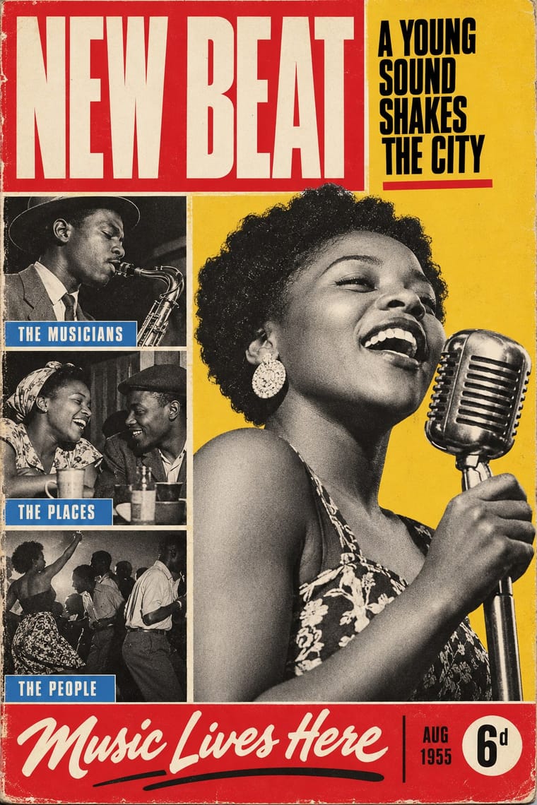
The picture magazine of Black urban Africa in the 1950s. Drum adapted the Life and Picture Post formula to Johannesburg: Jürgen Schadeberg, its photographer and layout artist, and the Black photographers he trained filled it with close, candid black-and-white pictures of jazz, boxing, shebeens, defiance and undercover exposés, behind covers of hand-tinted stars and cover girls framed by a red-box masthead and boxed cover lines. By 1959 it distributed 240,000 copies a month across Africa.
Archivo; Drum Magazine used Condensed gothic capitals and Swash italic and brush script
03
The colours
The ground and leading colours come from South African Vernacular Design, with a counter-accent from Drum Magazine. The ink reads on the ground at 4.5:1 or more.
Drum Magazine & Sophiatown Photojournalism South African Vernacular Design (Ijusi)
-
#ece4d2ground · 36% -
#141414ink · 14% -
#ffb612accent · 18% -
#f26c28accent · 14% -
#d42a2faccent · 10% -
#002395accent · 8%
As CSS
:root {
  --ground: #ece4d2;
  --ink: #141414;
  --accent-1: #ffb612;
  --accent-2: #f26c28;
  --accent-3: #d42a2f;
  --accent-4: #002395;
  --font-display: "Sedgwick Ave Display", cursive;
  --font-text: "Archivo", sans-serif;
}
Use it with care
Drum Magazine & Sophiatown Photojournalism: Drum's photographs show real, named people, among them prisoners, farm labourers and protesters exposed to humiliation or danger under apartheid, and women cast as pin-ups by a magazine owned and edited by men. Many of the photographs are still under copyright in Bailey's African History Archive (BAHA), and the Drum name and masthead are owned by Media24. Borrow the system (candid black-and-white picture features, hand-tinted cover portraits, boxed punchy cover lines), never a particular photograph, the Drum name or masthead, or a real person's likeness. Do not fabricate 'documentary' scenes of real events or of apartheid-era suffering, and never present a generated image as a Drum photograph or a historical record. Photograph or license your own named subjects; in a generated image, show the subject the brief supplies, dressed and posed with dignity, never an anonymous sexualised pin-up or generic 'township' Black people as retro decor. Drum's glamour sat beside full-page skin-lightener advertisements and sponsored beauty contests: do not lighten skin tones in hand-tinting or revive that beauty ideal.
South African Vernacular Design (Ijusi): Ijusi's raw material is the work of living people: township sign painters, hair-salon and funeral-parlour sign makers, Zulu beadworkers and wire crafters. The Constitutional Court's typeface also quotes cell graffiti from the Old Fort, whose prisons held activists such as Mandela and Sobukwe and scores of ordinary Black South Africans jailed under the pass laws. Eye's reviewer, who judged Walker's efforts sincere, warned that anyone expecting Black design in i-jusi would find 'very little of it'. Credit and pay the makers whose lettering and craft you quote, commission them where you can, and do not reduce township design to a 'gritty African' texture for a brand with no stake in those streets. The comics issues featured Bitterkomix co-founder Anton Kannemeyer, criticised for 'offensive, racist imagery' in satires such as Pappa in Afrika, which recasts Hergé's Tintin as a white African; do not generate racial caricature outside that authorship and context. Son of Sam was commissioned for the Court's exclusive use.
04
The two styles
05
More combinations
With Drum Magazine
- Blue Note Jazz Sleeve Modernism Pairs well · Two 1950s ways of picturing jazz musicians in black-and-white photographs with condensed capitals; take Blue Note's single giant word and one tint for a calmer, more modernist Drum page.
- South African Resistance Poster Contrasts · The later South African struggle poster argues with screenprinted slogans, emblems and drawn figures; Drum argued through candid photography and urban glamour inside a commercial magazine.
- International Typographic Style Contrasts · The same decade's neutral grid and objective photography against Drum's punchy cover lines, hand-tinted pin-ups and crowded boxes.
- Onitsha Market Pamphlets Pairs well · Contemporary West African popular print for the same new urban readers; Onitsha's letterpress chapbook covers add a cheaper, home-made counterpart to Drum's hand-tinted cover girls.
- Fotoromanzo (Italian Photo-Romance) Contrasts · Drum's photographs report real township life under condensed headlines; the fotoromanzo stages fiction for the camera and runs it as a grid of stills with balloons.
With South African Vernacular Design
- Emigre & Early Digital Type Contrasts · Ijusi's Typografika issues answered the 1990s experimental-font culture (Walker's Red Mercury pays tribute to Jonathan Barnbrook, whose early faces Emigre released), but drew their letters from Durban's shopfront hoardings, funeral parlours, beadwork and wire craft rather than from the screen; use Emigre for the digital edge and Ijusi for a sense of place.
- Cranbrook & Deconstructivist Typography Contrasts · Both layer vernacular lettering into experimental pages, but Cranbrook starts from literary theory and Ijusi from Durban's streets and the politics of a new democracy; choose by whether the brief is about reading or about place.
- International Typographic Style Contrasts · Ijusi was made against the clean, orderly corporate European look; one strict Swiss column can steady a crowded vernacular spread.
- South African Resistance Poster Contrasts · The struggle posters spoke with one voice in two or three inks; Ijusi, after 1994, mixes many voices, languages and colours. Quote the stencilled slogans as history, not as decoration.
- West African Barbershop & Hair Salon Signs Pairs well · Hair-salon boards were among Ijusi's sources; pair a painted grid of named hairstyles with a many-typeface layout and found photographs.
- Hand-Painted Signage & Vernacular Lettering Pairs well · Ijusi quotes the sign writer's drop-shadowed capitals; commission a working sign painter for the headline and collage it with photographs instead of faking the brush in vector.
- Ghanaian Funeral Poster & Banner Pairs well · Both work in the street-level commercial vernacular of outlined lettering, badges and many typefaces at once, but Ijusi collages township signage as a designer's quotation while the funeral poster is that vernacular in use; pair the funeral poster's photographic portrait and ranked lists with Ijusi's collage for a layered, local announcement.