Style combination · Pairs well
West African Barbershop × South African Vernacular Design
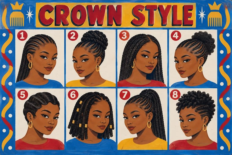
Hair-salon boards were among Ijusi's sources; pair a painted grid of named hairstyles with a many-typeface layout and found photographs.
Mix them and make something West African Barbershop South African Vernacular Design
01
What each style brings
Each part of the design comes from the style with the stronger say in it, and each style gives at least two.
West African Barbershop & Hair Salon Signs South African Vernacular Design (Ijusi)
- Type from South African Vernacular Design
- Colour from West African Barbershop
- Form from West African Barbershop
- Composition from West African Barbershop
-
South African Vernacular Design avoids modular grid: this is where the two pull against each other.
- Surface from South African Vernacular Design
02
The type
Open fonts standing in for each style’s own type, which is often hand-drawn or commercial.
Display · South African Vernacular Design
Square
Sedgwick Ave Display, standing in for Son of Sam (Garth Walker, 2003–04), the Constitutional Court's unicase display face, named after the cell graffiti 'son of sam now son of hope' and built from prison-cell graffiti, a judge's handwriting and site lettering, with numerals after the stencilled cell numbers
Text · West African Barbershop
Hand-painted boards advertising barbershops and braiding salons across West and Central Africa, made by self-taught, often anonymous sign painters since the mid-20th century. Unlike lettering-led shop fascias they work as a picture menu: rows of naive, frontal heads, each modelling one named hairstyle, are laid out like a specimen chart under the shop name and boasts such as 'Extra O' (extraordinary).
Oswald; West African Barbershop used Outlined, drop-shadowed block capitals by sign painters and Brush-painted style names and numbers as captions
03
The colours
The ground and leading colours come from West African Barbershop, with a counter-accent from South African Vernacular Design. The ink reads on the ground at 4.5:1 or more.
West African Barbershop & Hair Salon Signs South African Vernacular Design (Ijusi)
-
#f4efe6ground · 36% -
#151515ink · 14% -
#f2c230accent · 18% -
#c8232caccent · 14% -
#f26c28accent · 10% -
#2f7fc1accent · 8%
As CSS
:root {
  --ground: #f4efe6;
  --ink: #151515;
  --accent-1: #f2c230;
  --accent-2: #c8232c;
  --accent-3: #f26c28;
  --accent-4: #2f7fc1;
  --font-display: "Sedgwick Ave Display", cursive;
  --font-text: "Oswald", sans-serif;
}
Use it with care
South African Vernacular Design (Ijusi): Ijusi's raw material is the work of living people: township sign painters, hair-salon and funeral-parlour sign makers, Zulu beadworkers and wire crafters. The Constitutional Court's typeface also quotes cell graffiti from the Old Fort, whose prisons held activists such as Mandela and Sobukwe and scores of ordinary Black South Africans jailed under the pass laws. Eye's reviewer, who judged Walker's efforts sincere, warned that anyone expecting Black design in i-jusi would find 'very little of it'. Credit and pay the makers whose lettering and craft you quote, commission them where you can, and do not reduce township design to a 'gritty African' texture for a brand with no stake in those streets. The comics issues featured Bitterkomix co-founder Anton Kannemeyer, criticised for 'offensive, racist imagery' in satires such as Pappa in Afrika, which recasts Hergé's Tintin as a white African; do not generate racial caricature outside that authorship and context. Son of Sam was commissioned for the Court's exclusive use.
04
The two styles
05
More combinations
With West African Barbershop
- Isotype Pictorial Statistics Pairs well · Treat the hairstyle board as a humane pictogram chart: one consistent figure per cell, labelled, for comparison at a glance.
- Hand-Painted Signage & Vernacular Lettering Pairs well · Use the sign writer's shaded capitals for the shop band and the barbershop grid of painted heads below it, as the boards themselves do.
- Pop Art Graphics Pairs well · Both repeat one head in a grid with small variations; pair Warhol's serial portraits with painted, named hairstyles for a warmer, hand-made take on repetition.
- Ghanaian Movie Poster Contrasts · Same painters' media and cities but opposite temperament; set the calm, catalogue-like heads against the lurid, distorted drama of the movie posters.
- Lotería Card Imagery (Mexican Lotería) Contrasts · Both lay out named, numbered pictures in rows and columns, but a barbershop sign is one hand-painted menu of heads that differ only in their hairstyle, under the shop's boast, while a lotería tabla is a printed board of unrelated emblems, one of a set of boards that each hold a different selection from the same deck.
- Matatu & Nganya Art Pairs well · Another African street commission built on painted heads; pair the barbershop board's frontal, stylised faces with the matatu's airbrushed, foreshortened star portraits for a Nairobi street layout.
- Tingatinga Painting Pairs well · Both are hand-painted enamel on board for a street market; borrow the sign painter's outlined capitals to give Tingatinga figures a title or shop name.
With South African Vernacular Design
- Emigre & Early Digital Type Contrasts · Ijusi's Typografika issues answered the 1990s experimental-font culture (Walker's Red Mercury pays tribute to Jonathan Barnbrook, whose early faces Emigre released), but drew their letters from Durban's shopfront hoardings, funeral parlours, beadwork and wire craft rather than from the screen; use Emigre for the digital edge and Ijusi for a sense of place.
- Cranbrook & Deconstructivist Typography Contrasts · Both layer vernacular lettering into experimental pages, but Cranbrook starts from literary theory and Ijusi from Durban's streets and the politics of a new democracy; choose by whether the brief is about reading or about place.
- International Typographic Style Contrasts · Ijusi was made against the clean, orderly corporate European look; one strict Swiss column can steady a crowded vernacular spread.
- South African Resistance Poster Contrasts · The struggle posters spoke with one voice in two or three inks; Ijusi, after 1994, mixes many voices, languages and colours. Quote the stencilled slogans as history, not as decoration.
- Hand-Painted Signage & Vernacular Lettering Pairs well · Ijusi quotes the sign writer's drop-shadowed capitals; commission a working sign painter for the headline and collage it with photographs instead of faking the brush in vector.
- Drum Magazine & Sophiatown Photojournalism Pairs well · Post-apartheid Ijusi collages the street lettering of the townships Drum photographed; pair Drum's documentary pictures with Ijusi's vernacular type for a South African layout across both eras.
- Ghanaian Funeral Poster & Banner Pairs well · Both work in the street-level commercial vernacular of outlined lettering, badges and many typefaces at once, but Ijusi collages township signage as a designer's quotation while the funeral poster is that vernacular in use; pair the funeral poster's photographic portrait and ranked lists with Ijusi's collage for a layered, local announcement.