Style combination · Contrasts
Dazibao × Socialist Realist Propaganda Poster
The official painted poster and the crowd's handwritten one hung on the same walls; compare state polish with amateur urgency.
Mix them and make something Dazibao Socialist Realist Propaganda Poster
01
What each style brings
Each part of the design comes from the style with the stronger say in it, and each style gives at least two.
Dazibao (Big-Character Posters) Socialist Realist Propaganda Poster
- Type from Dazibao
- Colour from Socialist Realist Propaganda Poster
-
Dazibao avoids full polychrome and gradients: this is where the two pull against each other, which is the point of the contrast.
- Form from Socialist Realist Propaganda Poster
-
Dazibao avoids naturalistic depiction: this is where the two pull against each other, which is the point of the contrast.
- Composition from Dazibao
- Surface from Dazibao
02
The type
Open fonts standing in for each style’s own type, which is often hand-drawn or commercial.
Display · Dazibao
Wake
Shippori Mincho, standing in for Freehand brush kaishu and xingshu (regular and running script)
Text · Socialist Realist Propaganda Poster
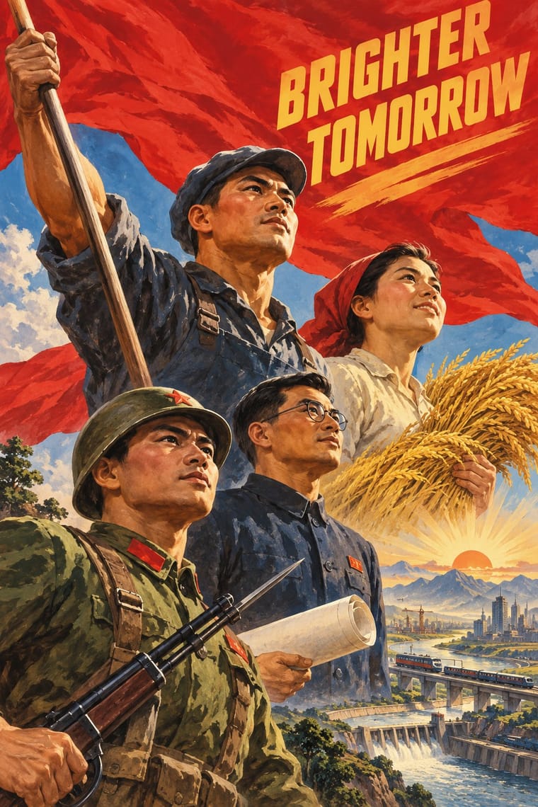
The official art doctrine of the Soviet Union from 1932, later exported across the socialist world, which replaced avant-garde experiment with legible, heroic realism 'national in form, socialist in content'. Its posters show idealised workers, soldiers and leaders on rising diagonals and low horizons, bathed in red, with bold slogans promising a radiant future; in China they merged with New Year print and calendar-poster conventions.
Zen Kaku Gothic New; Socialist Realist Propaganda Poster used Hand-drawn Cyrillic poster capitals in condensed grotesque and slab forms and Songti and Heiti display characters
03
The colours
The ground and leading colours come from Socialist Realist Propaganda Poster, with a counter-accent from Dazibao. The ink reads on the ground at 4.5:1 or more.
Dazibao (Big-Character Posters) Socialist Realist Propaganda Poster
-
#f3e8d2ground · 36% -
#1d1d1bink · 14% -
#f2c230accent · 18% -
#c3272baccent · 14% -
#e3cf72accent · 10% -
#b5651daccent · 8%
As CSS
:root {
  --ground: #f3e8d2;
  --ink: #1d1d1b;
  --accent-1: #f2c230;
  --accent-2: #c3272b;
  --accent-3: #e3cf72;
  --accent-4: #b5651d;
  --font-display: "Shippori Mincho", serif;
  --font-text: "Zen Kaku Gothic New", sans-serif;
}
Use it with care
Dazibao (Big-Character Posters): Dazibao were instruments of denunciation: in the Anti-Rightist campaign and the Cultural Revolution they named, humiliated and incited violence against real people, many of whom were persecuted or died. Do not use the look as playful 'Chinese protest' decoration or for mock denunciations of real individuals, have any Chinese text written or checked by a fluent writer, and treat surviving posters and photographs as testimony.
04
The two styles
05
More combinations
With Dazibao
- ROSTA Windows Pairs well · Both are improvised agitational wall media made faster than print allows; pair their urgency for time-critical campaigns.
- Hand-Painted Signage & Vernacular Lettering Contrasts · Trained sign writers fit letters to a panel with care; dazibao writers fill sheets in haste, so set them together to weigh craft against urgency.
- Punk & DIY Zine Pairs well · Both are cheap, fast, unprofessional paste-ups; their raw handmade text walls suit zines and protest installations.
- Song–Ming Woodblock Book Typography (Songti / Mincho) Contrasts · The big-character poster is the hand-brushed, crowded, personal opposite of the quiet official printed page; set one against the other to weigh public urgency against canonical calm.
- Kanga (Swahili Message Cloth) Contrasts · Both make a short sentence public, but the big-character poster pastes it on a wall in brush characters as the whole design, while the kanga prints it small in a box and lets the wearer carry it from house to house.
- Urdu Katib Lithography Pairs well · Both are handwritten public text pages; use their crowded, hand-ruled columns and enlarged brush headlines for an editorial or protest broadsheet.
- Guochao (China-Chic National Trend) Contrasts · Both make huge characters the whole message; compare the handwritten political urgency of the big-character poster with guochao's polished commercial heritage.
With Socialist Realist Propaganda Poster
- Cuban Revolutionary Poster (OSPAAAL & ICAIC) Contrasts · Cuban designers rejected Soviet realism for pop and op graphics; compare them to decide whether a cause needs heroes or wit.
- Taller de Gráfica Popular Pairs well · TGP shared the social commitment with a carved linocut line; borrow its grit to make heroic imagery feel grassroots.
- WPA Silkscreen Posters Pairs well · Both mobilised a 1930s public; combine WPA flat silkscreen colour with heroic low-angle diagonals for civic campaigns.
- Russian Constructivism Contrasts · Same revolution, opposite means: set Constructivist abstraction beside heroic realism to show the 1932 turn from experiment to doctrine.
- Shanghai Modern & Yuefenpai Contrasts · After 1949 the same painters and rubbed-watercolour technique served propaganda; compare how one rendering style sells glamour versus ideology.
- Chinese National-Style Animation (Shanghai Animation Film Studio) Contrasts · Made in the same state and decades, and like it an official art: the national style was pursued with state backing and its fables carried lessons. But where socialist realism pictured idealised heroes in legible, illusionistic realism, the studio found its forms in ink painting, cut paper, opera and murals; set one against the other to separate a painted, traditional idiom from heroic realism.
- ROSTA Windows Contrasts · The heroic, naturalistic painting that displaced it in the 1930s is the exact opposite of its crude, satirical shorthand.
- Minjung Woodcut Graphics (Korean People's Art) Contrasts · State posters paint polished heroes from above; Minjung prints cut rough, grieving and dancing people from below.
All 32 combinations with Socialist Realist Propaganda Poster