Style combination · Contrasts
Dazibao × Hand-Painted Signage
Trained sign writers fit letters to a panel with care; dazibao writers fill sheets in haste, so set them together to weigh craft against urgency.
01
What each style brings
Each part of the design comes from the style with the stronger say in it, and each style gives at least two.
Dazibao (Big-Character Posters) Hand-Painted Signage & Vernacular Lettering
- Type from Hand-Painted Signage
- Colour from Dazibao
- Form from Hand-Painted Signage
- Composition from Dazibao
- Surface from Dazibao
02
The type
Open fonts standing in for each style’s own type, which is often hand-drawn or commercial.
Text · Dazibao
Handwritten wall posters in large brush characters that turned the walls of Mao-era China into a public forum for criticism, denunciation and, at the Democracy Wall, dissent. Written by anyone, in black or red ink on white or red paper, without printed type or pictures, they were pasted edge to edge and over each other until walls, mat screens and corridors became one dense, ever-changing field of text. The right to write them was struck from the constitution in 1980.
Shippori Mincho; Dazibao used Freehand brush kaishu and xingshu and Imitations of Mao Zedong's cursive calligraphy for headings
03
The colours
The ground and leading colours come from Dazibao, with a counter-accent from Hand-Painted Signage. The ink reads on the ground at 4.5:1 or more.
Dazibao (Big-Character Posters) Hand-Painted Signage & Vernacular Lettering
-
#f2eee3ground · 36% -
#111111ink · 14% -
#c3272baccent · 18% -
#c99a2eaccent · 14% -
#e3cf72accent · 10% -
#e9b9b5accent · 8%
As CSS
:root {
  --ground: #f2eee3;
  --ink: #111111;
  --accent-1: #c3272b;
  --accent-2: #c99a2e;
  --accent-3: #e3cf72;
  --accent-4: #e9b9b5;
  --font-display: "Yellowtail", cursive;
  --font-text: "Shippori Mincho", serif;
}
Use it with care
Dazibao (Big-Character Posters): Dazibao were instruments of denunciation: in the Anti-Rightist campaign and the Cultural Revolution they named, humiliated and incited violence against real people, many of whom were persecuted or died. Do not use the look as playful 'Chinese protest' decoration or for mock denunciations of real individuals, have any Chinese text written or checked by a fluent writer, and treat surviving posters and photographs as testimony.
04
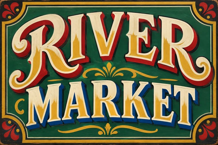
The two styles
05
More combinations
With Dazibao
- ROSTA Windows Pairs well · Both are improvised agitational wall media made faster than print allows; pair their urgency for time-critical campaigns.
- Socialist Realist Propaganda Poster Contrasts · The official painted poster and the crowd's handwritten one hung on the same walls; compare state polish with amateur urgency.
- Punk & DIY Zine Pairs well · Both are cheap, fast, unprofessional paste-ups; their raw handmade text walls suit zines and protest installations.
- Song–Ming Woodblock Book Typography (Songti / Mincho) Contrasts · The big-character poster is the hand-brushed, crowded, personal opposite of the quiet official printed page; set one against the other to weigh public urgency against canonical calm.
- Kanga (Swahili Message Cloth) Contrasts · Both make a short sentence public, but the big-character poster pastes it on a wall in brush characters as the whole design, while the kanga prints it small in a box and lets the wearer carry it from house to house.
- Urdu Katib Lithography Pairs well · Both are handwritten public text pages; use their crowded, hand-ruled columns and enlarged brush headlines for an editorial or protest broadsheet.
- Guochao (China-Chic National Trend) Contrasts · Both make huge characters the whole message; compare the handwritten political urgency of the big-character poster with guochao's polished commercial heritage.
With Hand-Painted Signage
- Victorian Letterpress & Wood Type Pairs well · Sign writers and type founders traded letterforms; set a wood-type headline and finish it with painted shadows and outlines.
- West African Barbershop & Hair Salon Signs Pairs well · West African barbershop boards are the sign writer's catalogue genre; pair a painted name panel with a grid of numbered hairstyle portraits for a shop menu that reads from the street.
- Graffiti & Hip-Hop Graphics Pairs well · Graffiti writers inherited the sign painter's outlines and drop shadows; pair a disciplined sign alphabet with a wildstyle tag for contrast of control.
- Flat Design Contrasts · Against flat, machine-perfect UI, one hand-painted wordmark signals human craft; keep everything else flat so it stands out.
- Fileteado Porteño Pairs well · Add filete scrolls and bevelled shading to plain painted lettering for a richer, Buenos Aires-style sign.
- Roman-like Thai Typography (modern loopless Thai) Contrasts · A hand-painted shopfront sign, in looped letters or broad-nib Naris, beside a flat loopless headline shows the shift from the letterer's hand to dry transfer and digital type that Manop Srisomporn himself made.
- Generative & Dynamic Identities Contrasts · Hand-painted lettering's one-off irregularity is the human counterpart to algorithmic variation; mix the two only with clear intent.
- Italian Painted Film Poster (Rome Studios) Pairs well · Shares the painted-on-site lettering craft; borrow its bold hand-lettering for the title block.