Style combination · Contrasts
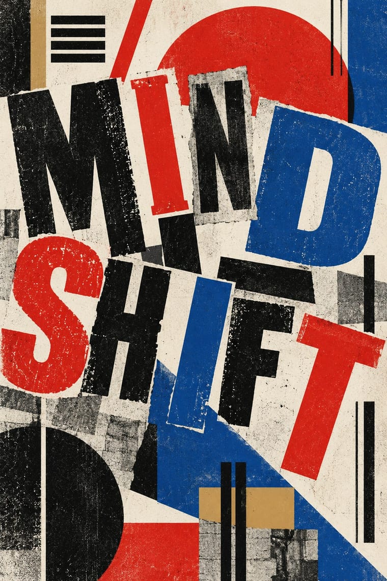
Dada × International Typographic Style
The polar opposite of grid order; let one Dada collision break into a Swiss layout to crack its composure.
Mix them and make something Dada International Typographic Style
01
What each style brings
Each part of the design comes from the style with the stronger say in it, and each style gives at least two.
Dada International Typographic Style
- Type from Dada
-
International Typographic Style avoids eclectic mixing: this is where the two pull against each other, which is the point of the contrast.
- Colour from International Typographic Style
- Form from International Typographic Style
- Composition from Dada
- Surface from Dada
02
The type
Open fonts standing in for each style’s own type, which is often hand-drawn or commercial.
Display · Dada
Form
Alfa Slab One; Dada used Found wood poster type and Mixed grotesques, Egyptians and Fraktur from the jobbing printer's case
Text · International Typographic Style
A post-war refinement of the New Typography in which the mathematical grid, objective photography and neo-grotesque sans-serifs were used to communicate with clarity and neutrality. Taught at the Basel and Zurich schools, it became the default language of international corporate and institutional communication.
Inter; International Typographic Style used Akzidenz-Grotesk and Helvetica
03
The colours
The ground and leading colours come from International Typographic Style, with a counter-accent from Dada. The ink reads on the ground at 4.5:1 or more.
Dada International Typographic Style
-
#f2f0e9ground · 36% -
#111111ink · 14% -
#e1251baccent · 18% -
#1f4e9caccent · 14% -
#c7a76aaccent · 10% -
#7a7a7aaccent · 8%
As CSS
:root {
  --ground: #f2f0e9;
  --ink: #111111;
  --accent-1: #e1251b;
  --accent-2: #1f4e9c;
  --accent-3: #c7a76a;
  --accent-4: #7a7a7a;
  --font-display: "Alfa Slab One", serif;
  --font-text: "Inter", sans-serif;
}
04
The two styles

05
More combinations
With Dada
- Victorian Letterpress & Wood Type Pairs well · Raid Victorian wood type and stock ornaments as the Dadaists did, but scatter them instead of centring them.
- Surrealist Graphics Pairs well · Use Dada's random collage as raw material and Surrealist dream logic to give the absurdity a narrative thread.
- Punk & DIY Zine Pairs well · Punk zines rediscovered Dada cut-and-paste; combine them for ransom-note type with a sharper political edge.
- HfG Ulm Systematic Design Contrasts · Dada's chance operations expose what Ulm's method suppresses; one deliberately random element can humanise an over-engineered system.
- Simplicissimus Satirical Style (Munich) Contrasts · George Grosz drew for Simplicissimus but in Berlin Dada turned satire into photomontage and typographic chaos; choose Simplicissimus for a drawn, legible joke, Dada for a cut-up assault.
- Stenberg Brothers Constructivist Film Poster Pairs well · Dada's montage supplies the method; the Stenbergs discipline it into a diagonal composition with a clear product to sell.
With International Typographic Style
- Art Nouveau Contrasts · Ornamental curves against an orthogonal grid make a strong deliberate tension.
- Brutalist Web Design Pairs well · Strip the grid to raw HTML defaults to get a rawer, contemporary take on Swiss honesty.
- Psychedelic Poster Contrasts · Its exact opposite on legibility; borrow one swirling element to break a too-cold Swiss layout.
- Japanese Postwar Modernism Pairs well · Add Japanese restraint and emblematic colour fields to the grid for warmth without losing order.
- American Traditional Tattoo Flash Contrasts · Rational grid and sans-serif against sentimental, hand-lettered emblems: one flash motif on a Swiss layout makes a sharp contrast.
- Graffiti & Hip-Hop Graphics Contrasts · Put a single tag or throw-up over a strict Swiss grid to stage the clash between institutional order and a street voice.
- Pop Art Graphics Contrasts · Set one loud appropriated Pop image inside a strict grid with a neutral grotesque so the irony reads as deliberate rather than chaotic.
- Italian Painted Film Poster (Rome Studios) Contrasts · Grid, restraint and photographic objectivity are the opposite of a crowded painted montage.