Style combination · Pairs well
Literatura de Cordel Woodcut × Taller de Gráfica Popular
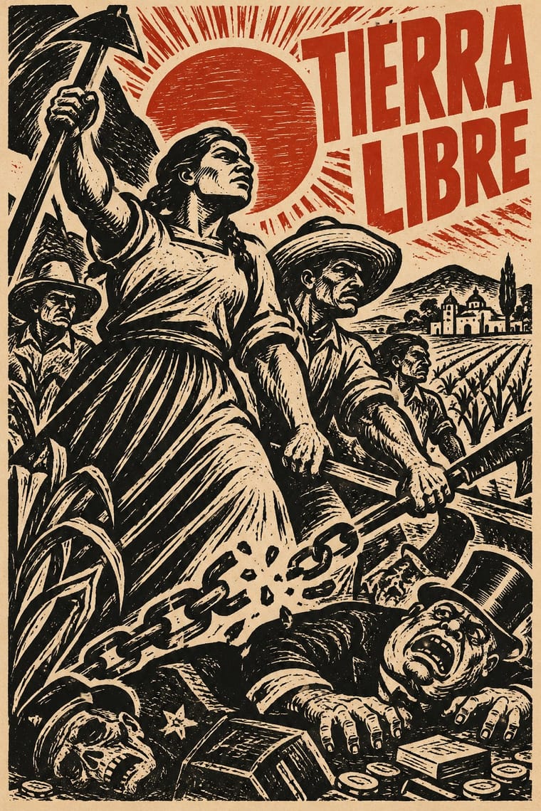
The TGP cut relief prints for protest, cordel for storytelling; combine their black-line language when a narrative needs political edge.
Mix them and make something Literatura de Cordel Woodcut Taller de Gráfica Popular
01
What each style brings
Each part of the design comes from the style with the stronger say in it, and each style gives at least two.
Literatura de Cordel Woodcut Taller de Gráfica Popular
- Type from Taller de Gráfica Popular
- Colour from Taller de Gráfica Popular
- Form from Literatura de Cordel Woodcut
- Composition from Literatura de Cordel Woodcut
- Surface from Literatura de Cordel Woodcut
02
The type
Open fonts standing in for each style’s own type, which is often hand-drawn or commercial.
Display · Taller de Gráfica Popular
Fiesta
Inter Tight, standing in for Letterpress grotesque and slab-serif captions
Text · Literatura de Cordel Woodcut
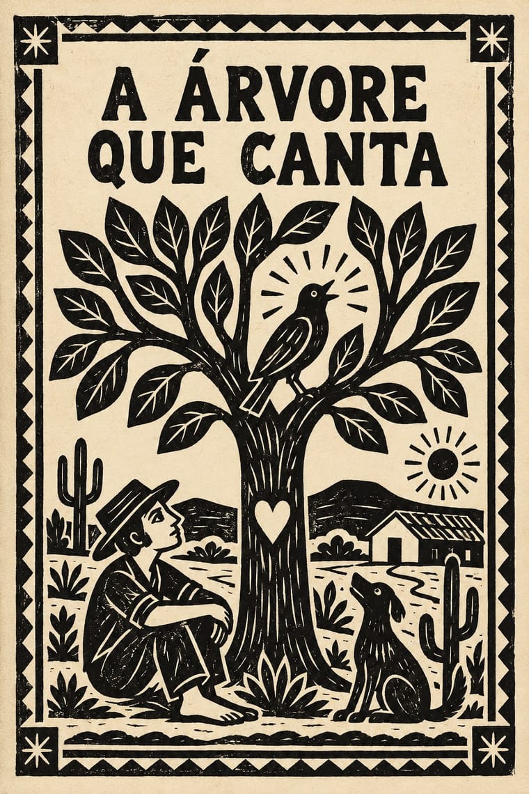
The cover art of Brazil's literatura de cordel, pocket chapbooks of verse whose single picture is a small woodcut cut in soft umburana wood and printed in black above a plain letterpress title. Woodcuts displaced worn zinc clichés of film-star photographs from the 1940s, led by José Bernardo da Silva's Tipografia São Francisco in Juazeiro do Norte. From the 1960s collectors and galleries turned the blocks into standalone prints by masters such as J. Borges.
Libre Caslon Text; Literatura de Cordel Woodcut used Jobbing letterpress types from the print shop's case, for titles and verse and Lettering carved into the woodblock
03
The colours
The ground and leading colours come from Taller de Gráfica Popular, with a counter-accent from Literatura de Cordel Woodcut. The ink reads on the ground at 4.5:1 or more.
Literatura de Cordel Woodcut Taller de Gráfica Popular
-
#f0e8d6ground · 36% -
#151515ink · 14% -
#c0392baccent · 18% -
#e8c95aaccent · 14% -
#d9c39aaccent · 10% -
#8a6e4baccent · 8%
As CSS
:root {
  --ground: #f0e8d6;
  --ink: #151515;
  --accent-1: #c0392b;
  --accent-2: #e8c95a;
  --accent-3: #d9c39a;
  --accent-4: #8a6e4b;
  --font-display: "Inter Tight", sans-serif;
  --font-text: "Libre Caslon Text", serif;
}
04
The two styles
05
More combinations
With Literatura de Cordel Woodcut
- Risograph & Indie Print Culture Pairs well · Print a cordel-style woodcut on a riso in one ink on tinted stock to keep the pocket-chapbook economy for zines and poetry pamphlets.
- Brazilian Concrete Design Contrasts · Brazil's concrete designers worked in the same decades with grids and sans-serifs; set a cordel woodcut against concrete typography for a sharp sertão-versus-São Paulo tension.
- Mexican Popular Graphics (Posada) Pairs well · Both put a single relief picture on cheap street print; borrow Posada's calavera satire but keep cordel's quiet, single-title cover.
- Tarot de Marseille Woodcut Cards Contrasts · Both cut stiff figures in wood with no perspective or modelling, but the cordel cover is printed in black only, with solid blacks and gouged white lines, above a plain letterpress title, while the tarot card colours an outline key through stencils and cuts its numeral and title into the same block; choose cordel for a stark one-colour cover, tarot for a coloured emblem in a numbered set.
- Lira Popular (Chilean Illustrated Verse Broadsheets) Pairs well · Brazil's cordel puts one woodcut on a folded booklet cover; combine it with the Chilean single sheet for a series of verse prints that share one set of cuts.
- Tropicália Graphic Design Pairs well · The cangaceiro hero of the north-eastern chapbook stands behind Duarte's Corisco; a cordel woodcut figure in a Tropicalist field of saturated colour keeps the popular and the Pop in one frame.
- Lubok Popular Print Pairs well · Brazilian cordel is another chapbook woodcut tradition; set rhymed verse and a single crude block together, as both do, for narrative print with a vernacular voice.
- Onitsha Market Pamphlets Pairs well · A sister market-pamphlet tradition from north-east Brazil; combine cordel's woodcut covers with Onitsha's found photographs for a cheap-print series identity.
With Taller de Gráfica Popular
- Punk & DIY Zine Pairs well · Both favour cheap, direct, monochrome reproduction; a linocut figure with photocopied type gives protest graphics hand-made urgency.
- Cuban Revolutionary Poster (OSPAAAL & ICAIC) Pairs well · Combine TGP's black linocut figures with Cuban flat colour for politically engaged posters with a hand-made Latin American lineage.
- Art Deco Contrasts · Glossy Deco glamour versus gouged, populist black and white: use the contrast to separate luxury from solidarity.
- Chinese Modern Woodcut Movement Pairs well · China's 1930s–40s woodcut movement ran in parallel with the TGP; combine the two black-line traditions for prints about labour and resistance across continents.
- Minjung Woodcut Graphics (Korean People's Art) Contrasts · Nearest in the atlas, and the closest Mexican print lineage to the Mexican Muralism that MMCA names as a source: both cut black-line people's prints for movements, but TGP sets condensed Latin capitals and lithographs, while Minjung prints carry short Hangul slogans and dancing, ritual-derived figures, and are scaled up to geolgae banners.
- Brazilian Concrete Design Contrasts · Mexico's figurative, militant linocuts are Latin America's other modernism; contrast them to choose between abstraction and narrative.
- Vicente Rojo & Mexican Editorial Modernism Pairs well · Rojo set Leopoldo Méndez's engravings in the Revista de la Universidad de México (no. 3, 1971); a black linocut framed by fine rules on a white page joins Mexico City's militant print culture to its editorial modernism.
- Mexican Popular Graphics (Posada) Pairs well · The TGP took Posada as its ancestor; combine his calavera satire with linocut political posters for socially engaged print.