Style combination · Contrasts
Cel-Shaded Game Graphics × Claymorphism
Soft gradients and blurred shadows on inflated forms against hard-edged light bands and ink lines.
Mix them and make something Cel-Shaded Game Graphics Claymorphism
01
What each style brings
Each part of the design comes from the style with the stronger say in it, and each style gives at least two.
Cel-Shaded Game Graphics (Toon-Shaded Real-Time 3D) Claymorphism & Soft 3D
- Type from Cel-Shaded Game Graphics
- Colour from Cel-Shaded Game Graphics
- Form from Claymorphism
- Composition from Claymorphism
- Surface from Cel-Shaded Game Graphics
-
Claymorphism avoids hard offset shadow and flat: this is where the two pull against each other, which is the point of the contrast.
02
The type
Open fonts standing in for each style’s own type, which is often hand-drawn or commercial.
Display · Cel-Shaded Game Graphics
Pop
Sedgwick Ave Display, standing in for Graffiti handstyles and hand-drawn logo lettering (Jet Set Radio's logo by the graffiti artist Eric Haze, with tags sprayed across the 3D city)
Text · Claymorphism
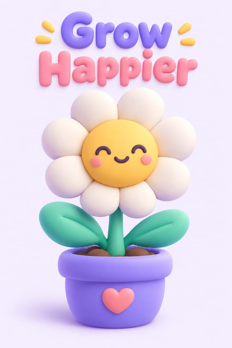
A soft, toy-like 3D look from product design around 2020, given the name 'claymorphism' in a December 2021 article by Michał Malewicz. Icons, emoji, avatars and interface cards are modelled as fat, rounded volumes, as if made of clay or inflated vinyl, softly lit and floated alone on pale grounds in candy and pastel colours. Open 3D sets such as 3dicons and Microsoft's 3D Fluent Emoji carry the same look; in interfaces it is faked with two inner shadows and one large drop shadow.
Jost; Claymorphism used Geometric sans-serifs such as Poppins (Indian Type Foundry, 2014), kept to a few weights; Malewicz (quoted by Smashing Magazine) and LogRocket both advise minimal, restrained typography beside the clay forms, to counter their childlike feel and Rounded sans-serifs with soft terminals, such as Nunito (Vernon Adams) or VAG Rounded, only for the most childlike or playful products
03
The colours
The ground and leading colours come from Cel-Shaded Game Graphics, with a counter-accent from Claymorphism. The ink reads on the ground at 4.5:1 or more.
Cel-Shaded Game Graphics (Toon-Shaded Real-Time 3D) Claymorphism & Soft 3D
-
#f4e9d0ground · 36% -
#111111ink · 14% -
#e8402aaccent · 18% -
#8b7cf6accent · 14% -
#1e88d8accent · 10% -
#ff9fb6accent · 8%
As CSS
:root {
  --ground: #f4e9d0;
  --ink: #111111;
  --accent-1: #e8402a;
  --accent-2: #8b7cf6;
  --accent-3: #1e88d8;
  --accent-4: #ff9fb6;
  --font-display: "Sedgwick Ave Display", cursive;
  --font-text: "Jost", sans-serif;
}
Use it with care
Cel-Shaded Game Graphics (Toon-Shaded Real-Time 3D): The characters, worlds and logos of these games (Link and The Wind Waker, Okami's Amaterasu, Borderlands, Guilty Gear, Eric Haze's Jet Set Radio logo) are owned by their publishers and artists, and Okami's gods and brush art draw on Shinto myth and Japanese ink painting: draw original characters, logos and tags in the shared idiom, never ask an image model for a named game, character or artist, and never present a generated picture as studio key art.
04
The two styles
05
More combinations
With Cel-Shaded Game Graphics
- Ukiyo-e Woodblock Prints Pairs well · Borrow woodblock outline, flat colour and paper tone to push the bands towards the painted register of Okami.
- American Four-Colour Comic Book (Golden to Bronze Age) Pairs well · Add panel insets, sound-effect lettering and halftone to make the 3D frame read as a comic page.
- Low Poly Illustration Contrasts · Both stylise real-time 3D, but low poly shows faceted polygons with no outlines; contrast inked silhouettes with bare facets.
- Graffiti & Hip-Hop Graphics Pairs well · Spray tags and wildstyle pieces onto toon-shaded walls for the street register that Jet Set Radio set.
With Claymorphism
- Neumorphism Contrasts · Neumorphism presses monochrome controls out of a same-coloured surface with paired outer shadows; claymorphism inflates them into separately coloured objects that cast one drop shadow, so switch to it when soft relief loses contrast and every control starts to look like a button.
- Kawaii Design Pairs well · Kawaii's oversized heads, minimal faces and scattered sparkles translate directly into clay volumes; use its character rules for mascots and emoji so the 3D figures stay simple and readable at small sizes.
- Corporate Memphis Contrasts · It does the same friendly job in tech marketing with flat vectors; render the figures as volumes to escape the over-familiar flat look, or go back to flat when 3D production is too slow or icons must work at tiny sizes.
- Glassmorphism Pairs well · Set opaque clay icons on or behind frosted glass panes: the blur gives the toys a layered backdrop, and the solid objects anchor translucent cards that would otherwise drift.
- Y2K Futurism Contrasts · Both float rounded 3D renders on pale grounds, but Y2K is chrome, liquid metal and translucent candy plastic sold as the future; keep claymorphism opaque, soft and cute, with satin or matte surfaces and at most a soft highlight, and borrow chrome only for a retro-tech joke.
- Neo-Brutalism Contrasts · Neo-brutalism's black outlines and hard, unblurred offset shadows are the crisp counterpart to clay's soft blurred ones; borrow a solid outline for focus states when the inflated cards need sharper edges.
- Low Poly Illustration Contrasts · Both float one rendered object on a pale ground, but clay is inflated, rounded and softly shaded while low poly is cut into hard facets with stepped tones; choose clay for warmth and touch, low poly for crispness and a constructed, mineral feel.
- Biobrand (Organic Biotech CGI) Contrasts · Both float soft 3D forms on pale grounds, but clay is opaque, cute and interface-bound, while the biobrand is translucent, intricate and biological; use clay for friendlier app icons.