Style combination · Pairs well
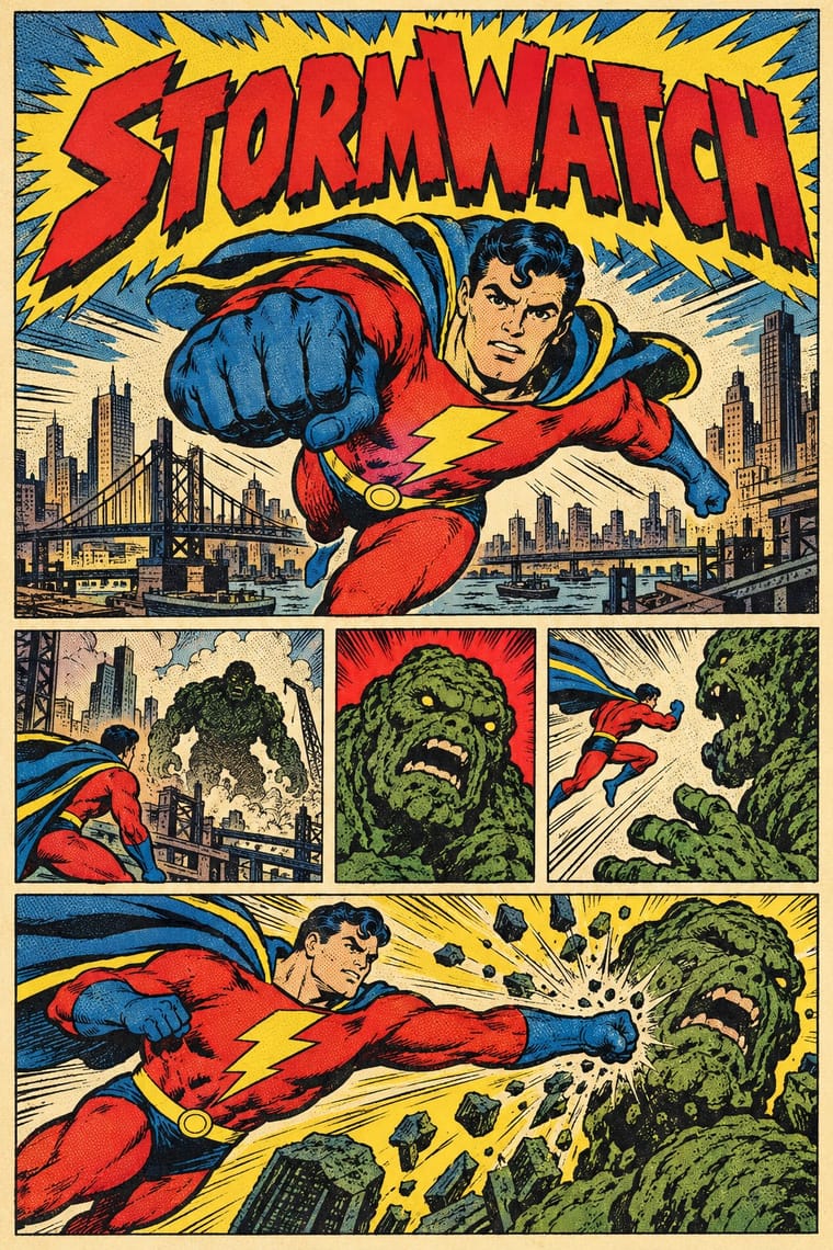
American Four-Colour Comic Book × Cel-Shaded Game Graphics
Add panel insets, sound-effect lettering and halftone to make the 3D frame read as a comic page.
Mix them and make something American Four-Colour Comic Book Cel-Shaded Game Graphics
01
What each style brings
Each part of the design comes from the style with the stronger say in it, and each style gives at least two.
American Four-Colour Comic Book (Golden to Bronze Age) Cel-Shaded Game Graphics (Toon-Shaded Real-Time 3D)
- Type from American Four-Colour Comic Book
- Colour from Cel-Shaded Game Graphics
- Form from Cel-Shaded Game Graphics
- Composition from American Four-Colour Comic Book
- Surface from American Four-Colour Comic Book
02
The type
Open fonts standing in for each style’s own type, which is often hand-drawn or commercial.
Display · American Four-Colour Comic Book
Pop
Bangers, standing in for Pen-lettered comic-book capitals (balloons and captions drawn with pen or brush and a lettering guide, traditionally all in upper case: Sam Rosen, Ben Oda, Artie Simek, John Costanza, Gaspar Saladino)
Text · Cel-Shaded Game Graphics
A look for real-time 3D video games in which normally lit models are quantised into two or three hard bands of flat, saturated colour and ringed with ink outlines, so a freely moving 3D world reads as a moving cartoon, anime cel or comic panel. Each game pairs the rendering with one borrowed graphic idiom: graffiti in Jet Set Radio, comic balloons in XIII, sumi-e brush and parchment in Okami, hand-drawn comic textures in Borderlands. It carries into key art, box art and logos.
Zen Maru Gothic; Cel-Shaded Game Graphics used Graffiti handstyles and hand-drawn logo lettering and Comic-book onomatopoeia lettered in bubbles, popping up over the 3D scene
03
The colours
The ground and leading colours come from Cel-Shaded Game Graphics, with a counter-accent from American Four-Colour Comic Book. The ink reads on the ground at 4.5:1 or more.
American Four-Colour Comic Book (Golden to Bronze Age) Cel-Shaded Game Graphics (Toon-Shaded Real-Time 3D)
-
#f4e9d0ground · 36% -
#111111ink · 14% -
#e8402aaccent · 18% -
#1e88d8accent · 14% -
#2160adaccent · 10% -
#3fae49accent · 8%
As CSS
:root {
  --ground: #f4e9d0;
  --ink: #111111;
  --accent-1: #e8402a;
  --accent-2: #1e88d8;
  --accent-3: #2160ad;
  --accent-4: #3fae49;
  --font-display: "Bangers", sans-serif;
  --font-text: "Zen Maru Gothic", sans-serif;
}
Use it with care
American Four-Colour Comic Book (Golden to Bronze Age): The characters and logos of this tradition (Superman, Batman, Captain America, Spider-Man, the Fantastic Four) are still in copyright and trademarked by their publishers: draw your own heroes, logos and seals in the shared idiom, never ask an image model for these characters or for named artists such as Kirby, Ditko or Eisner, and never present a generated picture as a vintage comic. The period also traded in racial caricature, such as Ebony White in Will Eisner's The Spirit, whose blackface features Eisner later admitted were a conscious stereotype, and its wartime issues drew Japanese people as 'powerful monsters or incompetent subhumans' and, at the Writers' War Board's urging late in the war, Germans as a people who embraced aggression and violence. Give every character, enemies and foreigners included, the same anatomy, dignity and drawing care as the hero; never use skin tint, teeth, eyes or dress as ethnic markers, and do not revive the war cover's enemy caricature in a pastiche.
Cel-Shaded Game Graphics (Toon-Shaded Real-Time 3D): The characters, worlds and logos of these games (Link and The Wind Waker, Okami's Amaterasu, Borderlands, Guilty Gear, Eric Haze's Jet Set Radio logo) are owned by their publishers and artists, and Okami's gods and brush art draw on Shinto myth and Japanese ink painting: draw original characters, logos and tags in the shared idiom, never ask an image model for a named game, character or artist, and never present a generated picture as studio key art.
04
The two styles
05
More combinations
With American Four-Colour Comic Book
- Victorian Letterpress & Wood Type Pairs well · Both are cheap letterpress print that shouts to passers-by; borrow the playbill's stacked display capitals, banners and rules for a comic cover's blurbs and price box, while keeping the comic's hand-drawn letters and keyline art.
- Risograph & Indie Print Culture Pairs well · Riso's few flat inks, grain and overprint suit a small-press homage to four-colour comics; keep the black keyline, panel grid and hand lettering, and let riso's misregistration stand in for newsprint's.
- Pop Art Graphics Contrasts · Roy Lichtenstein enlarged the comic book's Ben-Day dots and single panels into ironic gallery icons; choose the comic book itself when the picture must tell a story across a page of panels at printed size, sincerely, with the dots as small colour tints rather than the subject.
- Push Pin Style Contrasts · Push Pin also drew outlined figures in flat colour in New York, but as single illustrations with revived Victorian and Art Nouveau display faces and witty ornament; switch to the comic book for sequential panels, balloon lettering and dot-screen tints on newsprint.
- Googie & Atomic Age Pairs well · Silver Age artists drew in the same postwar key: Arlen Schumer calls Carmine Infantino's Flash as sleek and streamlined as Detroit's tail fins; add Googie's boomerangs, starbursts and atomic motifs to a science-fiction cover or splash page.
- Lianhuanhua Picture-Story Books Contrasts · Both tell stories in inked drawings; lianhuanhua gives each pocket-sized page one framed monochrome picture with a caption beneath, while the American comic book packs a page with ruled panels, balloons, sound effects and flat four-colour tints.
- Ligne Claire (Franco-Belgian Clear Line) Contrasts · Both tell stories in ruled panels with balloon lettering and flat colour; ligne claire closes every form with a clear contour and no hatching, and keeps its colour free of dot screens and misregistration, while the American comic book models with feathered brush blacks and prints dot tints slightly off register on newsprint.
- Korean Webtoon Graphics Contrasts · Webtoon's single vertical phone-scroll strip, open gutters and digital gradients belong to the era that replaced hand separations; return to the newsstand comic for a dense page grid of panels, dot tints on newsprint and no gradients.
With Cel-Shaded Game Graphics
- Ukiyo-e Woodblock Prints Pairs well · Borrow woodblock outline, flat colour and paper tone to push the bands towards the painted register of Okami.
- Low Poly Illustration Contrasts · Both stylise real-time 3D, but low poly shows faceted polygons with no outlines; contrast inked silhouettes with bare facets.
- Claymorphism & Soft 3D Contrasts · Soft gradients and blurred shadows on inflated forms against hard-edged light bands and ink lines.
- Graffiti & Hip-Hop Graphics Pairs well · Spray tags and wildstyle pieces onto toon-shaded walls for the street register that Jet Set Radio set.