Style combination · Contrasts
Bonelli Fumetto × Fotoromanzo
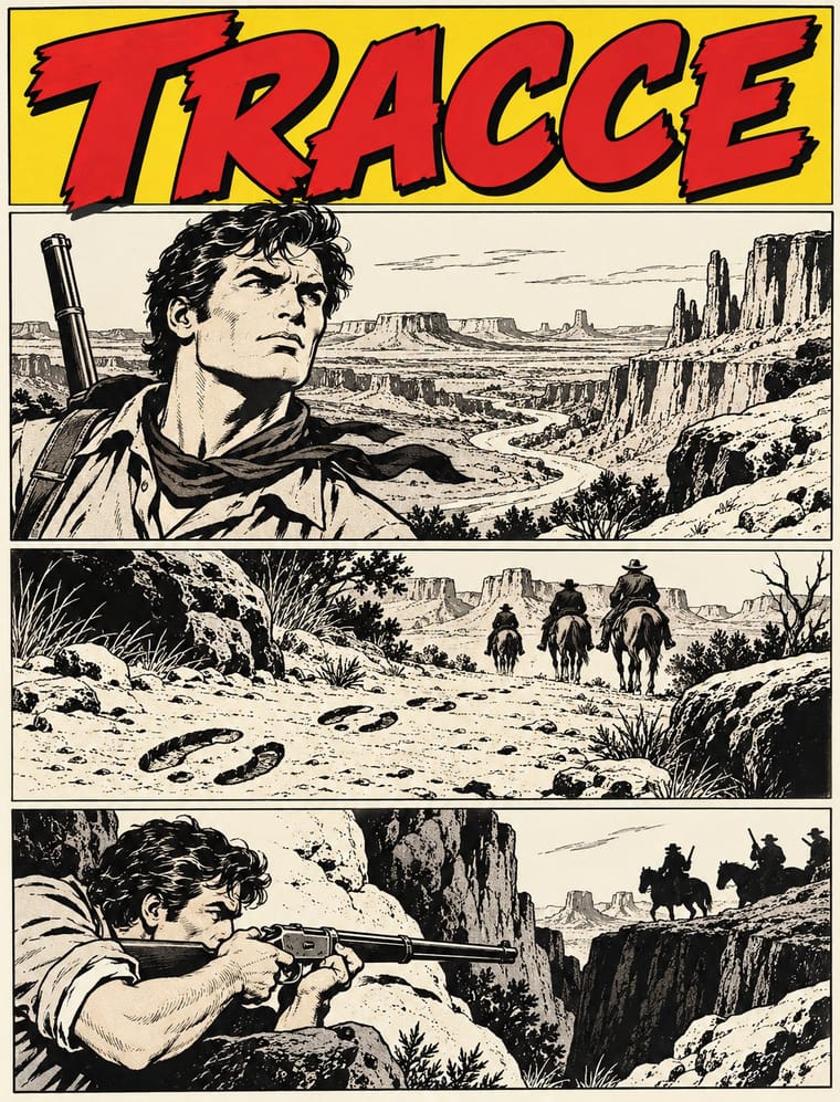
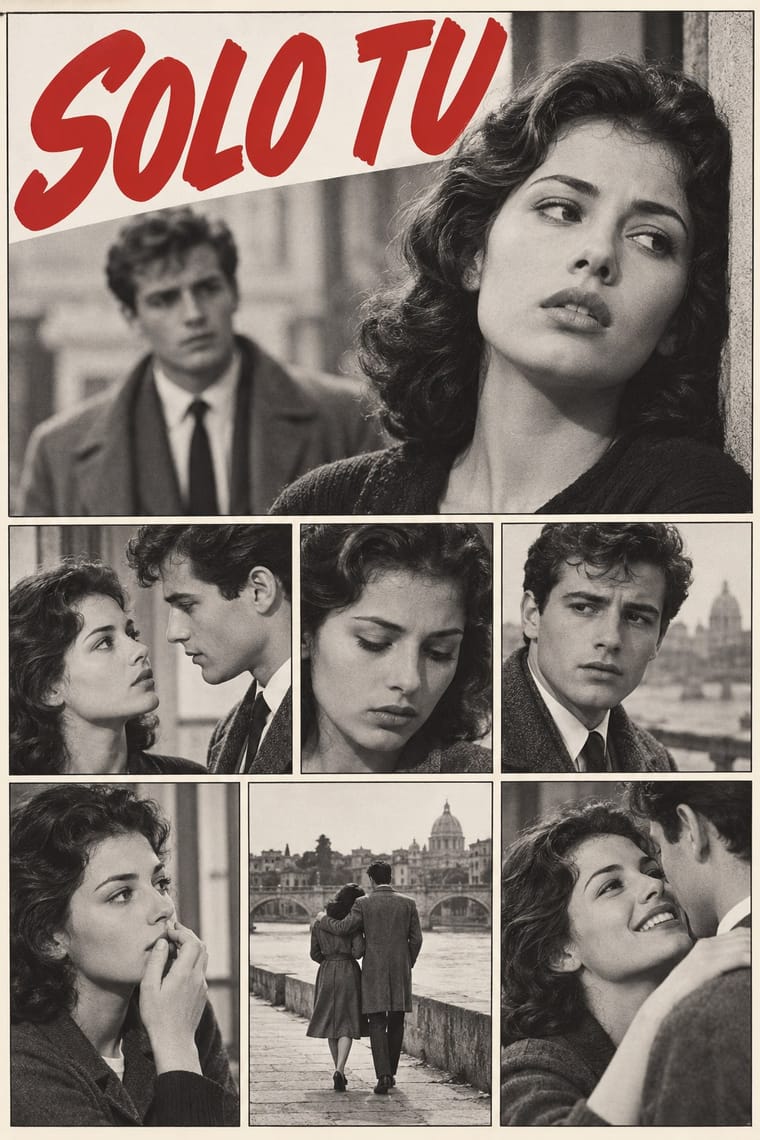
Italy's other newsstand serial of the late 1940s, also told in a plain grid of ruled frames with balloons. Choose the fotoromanzo for staged photographs and melodrama; choose Bonelli for pen-and-ink westerns, horror, mystery and science fiction.
01
What each style brings
Each part of the design comes from the style with the stronger say in it, and each style gives at least two.
Bonelli Fumetto (Italian Popular Adventure Comics) Fotoromanzo (Italian Photo-Romance)
- Type from Bonelli Fumetto
- Colour from Fotoromanzo
- Form from Bonelli Fumetto
- Composition from Bonelli Fumetto
- Surface from Fotoromanzo
02
The type
Open fonts standing in for each style’s own type, which is often hand-drawn or commercial.
Display · Bonelli Fumetto
Ours
Londrina Solid, standing in for Typeset capitals, not hand lettering, for the episode title on a band at the foot of the cover and for straplines: heavy sans reversed out of black for I VAMPIRI (Dylan Dog no. 62) and AGENTE SPECIALE ALFA (Nathan Never no. 1), beside the price in a roundel (L. 2300); serif for CON LA CODA DELL'OCCHIO and the straplines I GRANDI ENIGMI DI and DETECTIVE DELL'IMPOSSIBILE (Martin Mystère no. 315)
Text · Fotoromanzo
The photo-romance of the Italian women's weeklies: a melodrama told in staged photographs, first printed by Il mio sogno and Bolero Film in May 1947 and copied from France to Brazil. Actors pose on modest sets or in familiar places, and the stills sit in a plain grid of ruled frames, often two or three to a row. Dialogue in balloons and boxes, lettered by hand or typeset, is pasted over the pictures, and close-ups of faces carry the drama. The weeklies printed the stories in black and white until colour took over in the mid-1970s; covers sold each issue with a photograph of the stars.
Comic Neue; Fotoromanzo used Hand-lettered capitals for narration and balloons and Typeset sans in later work
03
The colours
The ground and leading colours come from Fotoromanzo, with a counter-accent from Bonelli Fumetto. The ink reads on the ground at 4.5:1 or more.
Bonelli Fumetto (Italian Popular Adventure Comics) Fotoromanzo (Italian Photo-Romance)
-
#f3f0e8ground · 36% -
#151515ink · 14% -
#c62a2faccent · 18% -
#f2cf1daccent · 14% -
#2b5ba6accent · 10% -
#e3a888accent · 8%
As CSS
:root {
  --ground: #f3f0e8;
  --ink: #151515;
  --accent-1: #c62a2f;
  --accent-2: #f2cf1d;
  --accent-3: #2b5ba6;
  --accent-4: #e3a888;
  --font-display: "Londrina Solid", cursive;
  --font-text: "Comic Neue", cursive;
}
Use it with care
Bonelli Fumetto (Italian Popular Adventure Comics): Tex, Zagor, Dylan Dog, Nathan Never, Julia and their mastheads belong to Sergio Bonelli Editore and are still published and licensed: draw your own hero, masthead and cover bands in the shared format, never ask an image model for these characters or for a named artist's hand (Galep, Ferri, Villa, Stano), nor for a real person's likeness (Dylan Dog was drawn after Rupert Everett, Julia after Audrey Hepburn), and label generated pages as AI-made, never as vintage Bonelli issues. Tex is 'supreme chief of all the Navajo tribes' under the name Aquila della Notte, and his blood brother Tiger Jack is a Navajo warrior: these are an Italian western's inventions, not Diné culture. The Diné (Navajo) are a living nation; do not borrow their ceremonial imagery, sandpaintings or weaving designs as western decor, and do not dress a page's generic 'Indians' as Diné.
Fotoromanzo (Italian Photo-Romance): Photo-romances starred real actors, some later famous (Gina Lollobrigida, Sophia Loren), and their photographs belong to publishers' archives such as the Fondazione Arnoldo e Alberto Mondadori: cast your own models, never ask an image model for a real star's likeness, and never present a generated still as a vintage photo-romance.
04
The two styles
05
More combinations
With Bonelli Fumetto
- Ligne Claire (Franco-Belgian Clear Line) Contrasts · Both stage figures in researched, realistic settings in ruled panels with hand-lettered balloons. Choose ligne claire for one even, unhatched contour and flat colour in a hardback album; choose Bonelli for hatched, spotted-black ink without colour in a cheap monthly paperback.
- Amar Chitra Katha Comics Contrasts · Both lay out regular tiers of ruled panels with white gutters and hand-lettered capitals. Amar Chitra Katha fills every page with flat colour and teaches myth and history in about 32 pages in an authoritative voice; a Bonelli issue keeps about a hundred interior pages in black ink and tells a serial hero's adventure for entertainment.
- Story Manga (Postwar Japanese Comics) Contrasts · Both are long black-and-white serials born in the late 1940s. Story manga slants, enlarges and bleeds its panels and gets its greys from screentone; Bonelli keeps every panel rectangular inside three strips and puts no tone on the page.
- Penguin Paperback Design (Three Bands to the Marber Grid) Pairs well · Both design the series rather than the single book: a fixed cover template in which only the title and the picture change. Borrow Penguin's genre colour code and fixed type positions for a set of Bonelli-style covers, keeping the outlined masthead and the black title band.
- Filipino Komiks Contrasts · The nearest style by genome: both are black-and-white newsstand comics drawn in naturalistic brush and pen, with colour kept for the cover. Komiks pack short instalments of about four pages into anthology magazines; Bonelli gives one hero a book-length episode in a constant three-strip cage, under the same cover trade dress every month.
- American Four-Colour Comic Book (Golden to Bronze Age) Contrasts · Bonelli's artists learned from American adventure cartoonists (Ferri named Phil Davis, Hal Foster and Alex Raymond). Choose the American comic book for flat four-colour dot tints over the keyline and figures that burst the panel border; choose Bonelli for an uncoloured ink page in a fixed grid of three strips.
- Argentine Adventure Historieta (Oesterheld–Breccia) Contrasts · Both are black-and-white newsstand adventure serials born in 1948 and drawn in pen and brush ink; Bonelli keeps a fixed cage of three strips of one or two panels on a small upright page and an even naturalistic line, while the historieta's 1950s weeklies run three tiers of two to six panels each across an oblong page, sink them in solid black, light faces from one side and, with Breccia, let the drawing break into expressionist texture.
- Giallo Mondadori Covers (I Libri Gialli) Pairs well · Milan's other newsstand serial: Bonelli's constant masthead and single dramatic cover scene sit well beside the yellow-and-circle trade dress in a set of popular-fiction covers.
With Fotoromanzo
- American Four-Colour Comic Book (Golden to Bronze Age) Contrasts · Both read as ruled panels with speech balloons; choose the fotoromanzo when the cast should be real people posed in black-and-white photographs and the text may run long, and the comic book when drawn heroes, sound effects and flat colour tints should carry the action.
- Drum Magazine & Sophiatown Photojournalism Contrasts · Drum's photographs report real township life under condensed headlines; the fotoromanzo stages fiction for the camera and runs it as a grid of stills with balloons.
- Pop Art Graphics Pairs well · Blow up a single photo-romance frame with its balloon to poster size for a Pop-style quotation of mass romance, as Lichtenstein did with drawn romance comics. Rewriting the balloons is a different precedent: Hara-Kiri's parodies and the Situationists' détournements of Nous Deux, not Pop.
- Onitsha Market Pamphlets Contrasts · Both are cheap popular romance print from 1947; the Onitsha pamphlets tell their stories in letterpress text with a recycled photograph only on the cover, while the fotoromanzo tells the whole story in staged photographs with balloons.
- International Typographic Style Pairs well · Set the photo-story on an exact modular grid with a neutral grotesque in the dialogue boxes, so the melodrama sits in a clean editorial frame.
- Lianhuanhua Picture-Story Books Contrasts · Both are cheap picture stories read by millions in monochrome; lianhuanhua draws one framed picture per pocket-sized page with a caption beneath, while the fotoromanzo photographs actors and sets several frames to a magazine page with balloons.
- Situationist Détournement Graphics Pairs well · The photo-romance was a raw material René Viénet named in Internationale situationniste no. 11 (1967), calling for photo-romances to be détourned by adding or altering their speech bubbles: keep the photographed lovers and the grid of frames untouched and change only the balloons, so that the melodrama speaks against itself.
- Illustrated Rom-Com Book Cover (Cartoon Couple Cover) Contrasts · The postwar photo-romance sold love stories with photographed couples in close-up; the illustrated cover gives up the photograph so that readers can picture themselves in the role and the cover tells nothing of the heat level.