Style combination · Pairs well
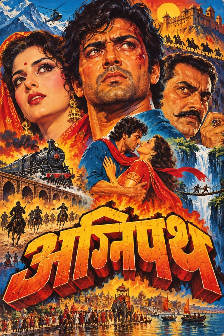
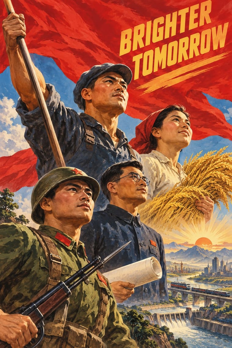
Hand-Painted Bollywood Poster × Socialist Realist Propaganda Poster
Borrow its heroic low-angle faces and saturated reds to give portrait montages even more monumentality.
Mix them and make something Hand-Painted Bollywood Poster Socialist Realist Propaganda Poster
01
What each style brings
Each part of the design comes from the style with the stronger say in it, and each style gives at least two.
Hand-Painted Bollywood Poster Socialist Realist Propaganda Poster
- Type from Hand-Painted Bollywood Poster
- Colour from Hand-Painted Bollywood Poster
- Form from Socialist Realist Propaganda Poster
- Composition from Hand-Painted Bollywood Poster
- Surface from Socialist Realist Propaganda Poster
02
The type
Open fonts standing in for each style’s own type, which is often hand-drawn or commercial.
Display · Hand-Painted Bollywood Poster
Square
Yatra One; Hand-Painted Bollywood Poster used Hand-drawn 3D title logos and Extruded and drop-shadowed display capitals
Text · Socialist Realist Propaganda Poster
The official art doctrine of the Soviet Union from 1932, later exported across the socialist world, which replaced avant-garde experiment with legible, heroic realism 'national in form, socialist in content'. Its posters show idealised workers, soldiers and leaders on rising diagonals and low horizons, bathed in red, with bold slogans promising a radiant future; in China they merged with New Year print and calendar-poster conventions.
Zen Kaku Gothic New; Socialist Realist Propaganda Poster used Hand-drawn Cyrillic poster capitals in condensed grotesque and slab forms and Songti and Heiti display characters
03
The colours
The ground and leading colours come from Hand-Painted Bollywood Poster, with a counter-accent from Socialist Realist Propaganda Poster. The ink reads on the ground at 4.5:1 or more.
Hand-Painted Bollywood Poster Socialist Realist Propaganda Poster
-
#1a1418ground · 36% -
#ffd23fink · 14% -
#f28c1caccent · 18% -
#c8102eaccent · 14% -
#b5651daccent · 10% -
#1b6fa8accent · 8%
As CSS
:root {
  --ground: #1a1418;
  --ink: #ffd23f;
  --accent-1: #f28c1c;
  --accent-2: #c8102e;
  --accent-3: #b5651d;
  --accent-4: #1b6fa8;
  --font-display: "Yatra One", cursive;
  --font-text: "Zen Kaku Gothic New", sans-serif;
}
04
The two styles
05
More combinations
With Hand-Painted Bollywood Poster
- Psychedelic Poster Pairs well · 1970s Hindi film titles already flirted with psychedelic lettering; fuse the two for swirling, glowing title logos.
- Ghanaian Movie Poster Pairs well · Set Ghana's lurid invention beside Bollywood's glossy star heads for a film-festival or film-club identity built on painted publicity.
- International Typographic Style Contrasts · Photographic objectivity and white space throw painted melodrama into relief; place a single painted head inside a strict grid.
- Egyptian Painted Film Poster Pairs well · Cairo's painted film posters share the floating star heads and hand-drawn titles; borrow their calligraphic title logotypes, which act out the story, for a stronger film wordmark.
- Nollywood Video Jacket & Film Poster Pairs well · Both float star heads in a melodramatic montage; borrow Bombay's hand-drawn 3D title logo to give the photographic collage a stronger centre.
- Matatu & Nganya Art Contrasts · The atlas's nearest genome: both are built on painted, glossy star portraits at a huge scale, but the Bollywood poster is a printed and hoarding-painted montage that sells one film, while the nganya is one commissioned vehicle that mixes global pop, sport and politics with hip-hop slang, lights and sound.
- Indian Institutional Modernism (NID) Contrasts · Set a hand-painted film poster's melodrama beside a reductive public-sector mark to contrast popular and institutional India.
- Indian Pop-Kitsch Design (Desi Kitsch) Pairs well · Old film posters and dialogues are a staple of the style; borrow the painted star heads and drawn title logos of the hand-painted posters for a film-club or café identity, then flatten them into kitsch's vector colour for the merchandise.
With Socialist Realist Propaganda Poster
- Cuban Revolutionary Poster (OSPAAAL & ICAIC) Contrasts · Cuban designers rejected Soviet realism for pop and op graphics; compare them to decide whether a cause needs heroes or wit.
- Taller de Gráfica Popular Pairs well · TGP shared the social commitment with a carved linocut line; borrow its grit to make heroic imagery feel grassroots.
- WPA Silkscreen Posters Pairs well · Both mobilised a 1930s public; combine WPA flat silkscreen colour with heroic low-angle diagonals for civic campaigns.
- Russian Constructivism Contrasts · Same revolution, opposite means: set Constructivist abstraction beside heroic realism to show the 1932 turn from experiment to doctrine.
- Shanghai Modern & Yuefenpai Contrasts · After 1949 the same painters and rubbed-watercolour technique served propaganda; compare how one rendering style sells glamour versus ideology.
- Chinese National-Style Animation (Shanghai Animation Film Studio) Contrasts · Made in the same state and decades, and like it an official art: the national style was pursued with state backing and its fables carried lessons. But where socialist realism pictured idealised heroes in legible, illusionistic realism, the studio found its forms in ink painting, cut paper, opera and murals; set one against the other to separate a painted, traditional idiom from heroic realism.
- ROSTA Windows Contrasts · The heroic, naturalistic painting that displaced it in the 1930s is the exact opposite of its crude, satirical shorthand.
- Minjung Woodcut Graphics (Korean People's Art) Contrasts · State posters paint polished heroes from above; Minjung prints cut rough, grieving and dancing people from below.
All 32 combinations with Socialist Realist Propaganda Poster