Style combination · Contrasts
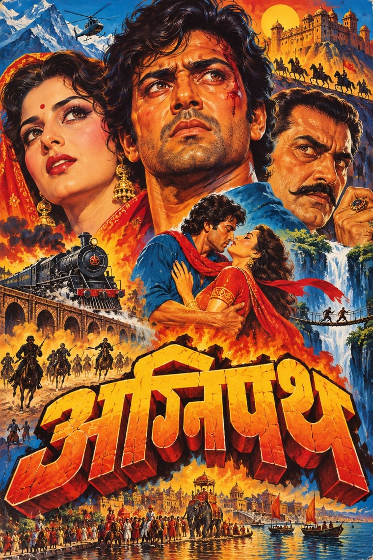
Hand-Painted Bollywood Poster × International Typographic Style
Photographic objectivity and white space throw painted melodrama into relief; place a single painted head inside a strict grid.
Mix them and make something Hand-Painted Bollywood Poster International Typographic Style
01
What each style brings
Each part of the design comes from the style with the stronger say in it, and each style gives at least two.
Hand-Painted Bollywood Poster International Typographic Style
- Type from Hand-Painted Bollywood Poster
-
International Typographic Style avoids ornamented display: this is where the two pull against each other, which is the point of the contrast.
- Colour from International Typographic Style
- Form from International Typographic Style
- Composition from Hand-Painted Bollywood Poster
- Surface from Hand-Painted Bollywood Poster
02
The type
Open fonts standing in for each style’s own type, which is often hand-drawn or commercial.
Display · Hand-Painted Bollywood Poster
Index
Yatra One; Hand-Painted Bollywood Poster used Hand-drawn 3D title logos and Extruded and drop-shadowed display capitals
Text · International Typographic Style
A post-war refinement of the New Typography in which the mathematical grid, objective photography and neo-grotesque sans-serifs were used to communicate with clarity and neutrality. Taught at the Basel and Zurich schools, it became the default language of international corporate and institutional communication.
Inter; International Typographic Style used Akzidenz-Grotesk and Helvetica
03
The colours
The ground and leading colours come from International Typographic Style, with a counter-accent from Hand-Painted Bollywood Poster. The ink reads on the ground at 4.5:1 or more.
Hand-Painted Bollywood Poster International Typographic Style
-
#f2f0e9ground · 36% -
#111111ink · 14% -
#e1251baccent · 18% -
#f28c1caccent · 14% -
#1f4e9caccent · 10% -
#b3121baccent · 8%
As CSS
:root {
  --ground: #f2f0e9;
  --ink: #111111;
  --accent-1: #e1251b;
  --accent-2: #f28c1c;
  --accent-3: #1f4e9c;
  --accent-4: #b3121b;
  --font-display: "Yatra One", cursive;
  --font-text: "Inter", sans-serif;
}
04
The two styles

05
More combinations
With Hand-Painted Bollywood Poster
- Psychedelic Poster Pairs well · 1970s Hindi film titles already flirted with psychedelic lettering; fuse the two for swirling, glowing title logos.
- Ghanaian Movie Poster Pairs well · Set Ghana's lurid invention beside Bollywood's glossy star heads for a film-festival or film-club identity built on painted publicity.
- Socialist Realist Propaganda Poster Pairs well · Borrow its heroic low-angle faces and saturated reds to give portrait montages even more monumentality.
- Egyptian Painted Film Poster Pairs well · Cairo's painted film posters share the floating star heads and hand-drawn titles; borrow their calligraphic title logotypes, which act out the story, for a stronger film wordmark.
- Nollywood Video Jacket & Film Poster Pairs well · Both float star heads in a melodramatic montage; borrow Bombay's hand-drawn 3D title logo to give the photographic collage a stronger centre.
- Matatu & Nganya Art Contrasts · The atlas's nearest genome: both are built on painted, glossy star portraits at a huge scale, but the Bollywood poster is a printed and hoarding-painted montage that sells one film, while the nganya is one commissioned vehicle that mixes global pop, sport and politics with hip-hop slang, lights and sound.
- Indian Institutional Modernism (NID) Contrasts · Set a hand-painted film poster's melodrama beside a reductive public-sector mark to contrast popular and institutional India.
- Indian Pop-Kitsch Design (Desi Kitsch) Pairs well · Old film posters and dialogues are a staple of the style; borrow the painted star heads and drawn title logos of the hand-painted posters for a film-club or café identity, then flatten them into kitsch's vector colour for the merchandise.
With International Typographic Style
- Art Nouveau Contrasts · Ornamental curves against an orthogonal grid make a strong deliberate tension.
- Brutalist Web Design Pairs well · Strip the grid to raw HTML defaults to get a rawer, contemporary take on Swiss honesty.
- Psychedelic Poster Contrasts · Its exact opposite on legibility; borrow one swirling element to break a too-cold Swiss layout.
- Japanese Postwar Modernism Pairs well · Add Japanese restraint and emblematic colour fields to the grid for warmth without losing order.
- American Traditional Tattoo Flash Contrasts · Rational grid and sans-serif against sentimental, hand-lettered emblems: one flash motif on a Swiss layout makes a sharp contrast.
- Graffiti & Hip-Hop Graphics Contrasts · Put a single tag or throw-up over a strict Swiss grid to stage the clash between institutional order and a street voice.
- Pop Art Graphics Contrasts · Set one loud appropriated Pop image inside a strict grid with a neutral grotesque so the irony reads as deliberate rather than chaotic.
- Italian Painted Film Poster (Rome Studios) Contrasts · Grid, restraint and photographic objectivity are the opposite of a crowded painted montage.