Style combination · Pairs well
Blue Note Jazz Sleeve Modernism × Phototype Expressive Typography
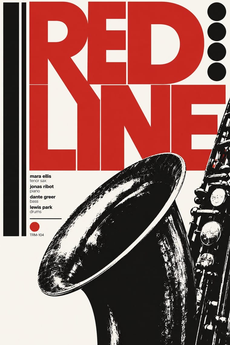
Same New York years and the same belief that the title can be the picture; give a Miles-style tinted photograph a Lubalin logotype whose letters touch and interlock instead of a plain blown-up grotesque.
Mix them and make something Blue Note Jazz Sleeve Modernism Phototype Expressive Typography
01
What each style brings
Each part of the design comes from the style with the stronger say in it, and each style gives at least two.
Blue Note Jazz Sleeve Modernism Phototype Expressive Typography (Lubalin & U&lc)
- Type from Phototype Expressive Typography
- Colour from Phototype Expressive Typography
- Form from Blue Note Jazz Sleeve Modernism
- Composition from Blue Note Jazz Sleeve Modernism
- Surface from Blue Note Jazz Sleeve Modernism
02
The type
Open fonts standing in for each style’s own type, which is often hand-drawn or commercial.
Display · Phototype Expressive Typography
Wow
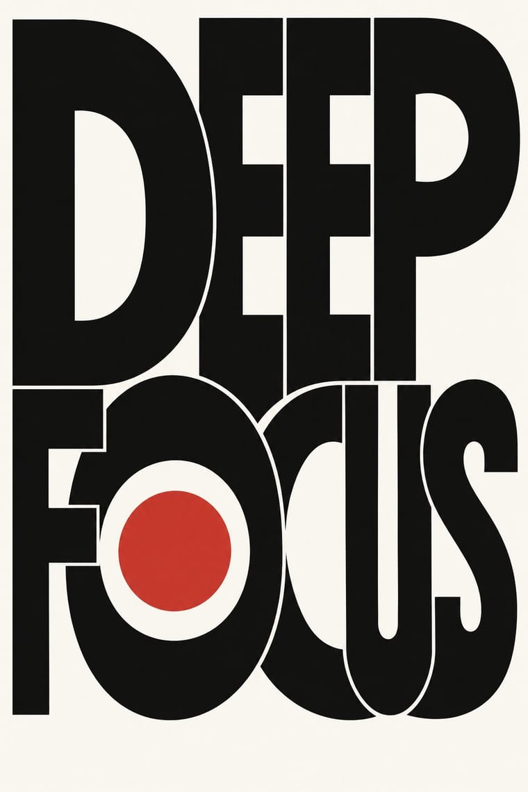
Josefin Sans, standing in for ITC Avant Garde Gothic (Herb Lubalin and Tom Carnase, 1970; 33 alternate characters and interlocking capital ligatures)
Text · Blue Note Jazz Sleeve Modernism
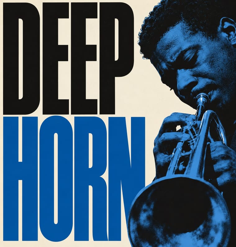
The record-sleeve language of Blue Note Records, set by art director Reid Miles, who designed some 350 twelve-inch LP covers between about 1956 and 1967, often around Francis Wolff's session photographs. With what Miles called 'one or two colors to work with', he tinted and cropped black-and-white photographs, ran flat bands of colour, and set titles huge in grotesques, slabs and fat faces that are stacked, squeezed, repeated or cut off by the edge. It made mid-century American modernism a serial system of photograph and type for one square format.
Archivo; Blue Note Jazz Sleeve Modernism used Trade Gothic and Trade Gothic Extended and Ultra Bodoni
03
The colours
The ground and leading colours come from Phototype Expressive Typography, with a counter-accent from Blue Note Jazz Sleeve Modernism. The ink reads on the ground at 4.5:1 or more.
Blue Note Jazz Sleeve Modernism Phototype Expressive Typography (Lubalin & U&lc)
-
#f8f6f1ground · 36% -
#111111ink · 14% -
#d1322baccent · 18% -
#8a8479accent · 14% -
#d19a39accent · 10% -
#0b50a1accent · 8%
As CSS
:root {
  --ground: #f8f6f1;
  --ink: #111111;
  --accent-1: #d1322b;
  --accent-2: #8a8479;
  --accent-3: #d19a39;
  --accent-4: #0b50a1;
  --font-display: "Josefin Sans", sans-serif;
  --font-text: "Archivo", sans-serif;
}
Use it with care
Blue Note Jazz Sleeve Modernism: The covers, Wolff's photographs, the Blue Note name and its oval logo are still owned and reissued by the label. Borrow the system (one tint, a hard crop, one giant word), never a particular sleeve, the label's logo or its catalogue-number line, and never present a new design as a Blue Note release. The photographs record named Black musicians at work: photograph or license your own named subject, or crop to an instrument, hands or an object, rather than inventing a generic Black jazz musician as period decor for 'cool'. Do not copy the generic 'tribal' pictograms of Afro-Cuban (1957) as shorthand for music of the African diaspora.
04
The two styles
05
More combinations
With Blue Note Jazz Sleeve Modernism
- Neo-Swiss Revival Contrasts · The atlas's nearest genome: both blow a grotesque up to fill the format on a white ground with one signal colour, but Swiss revival locks it to a modular grid, flush left, in one neo-grotesque; Blue Note crops and tints a documentary photograph, mixes in Ultra Bodoni and Clarendon, and squeezes, warps and runs words off the edge by eye. Choose Blue Note when the type should swing rather than align.
- Push Pin Style Contrasts · Same city and years, opposite method: Push Pin draws figures and revives Victorian display letters, while Blue Note crops a photograph and sets one grotesque huge.
- International Typographic Style Pairs well · Both rest on grotesque type, white grounds and asymmetric balance; add Blue Note's tinted, hard-cropped photograph, a fat Bodoni or Clarendon, and type blown up past the edge to loosen a Swiss layout.
- Risograph & Indie Print Culture Pairs well · Riso's two-ink duotones reproduce a Miles-style tinted photograph honestly, which makes the pair a natural fit for small-run gig posters and record sleeves today.
- Afrobeat Sleeve Art Contrasts · The same twelve-inch square used two ways: Lemi Ghariokwu packs it with painted, captioned satire, Reid Miles empties it to one photograph, one colour and one giant word.
- Drum Magazine & Sophiatown Photojournalism Pairs well · Two 1950s ways of picturing jazz musicians in black-and-white photographs with condensed capitals; take Blue Note's single giant word and one tint for a calmer, more modernist Drum page.
- Fania and Nuyorican Salsa LP Sleeves Contrasts · Cool restraint, cropped photography and grotesque type against salsa's loud crowded frontality.
- Bossa Nova Sleeve Modernism (César Villela and Elenco) Contrasts · The parent: Egeu Laus traces the first bossa-nova covers at Odeon to American jazz sleeves, and Vidal (2008) calls Reid Miles's Blue Note the main source of Elenco's covers too (compare Baden Powell à Vontade with Miles and Andy Warhol's line-drawn guitarist on Blue Note's Kenny Burrell), though Villela and Pereira denied it and blamed the economy on lack of money; Villela is often called the Brazilian Reid Miles. Both run a label's covers as a serial system of one or two inks and treated photographs of the players. Miles fills the square with a tinted, hard-cropped, often full-bleed photograph and flat colour bands, sometimes on black; Villela empties it to white, cuts the figure out and uses red only as a placed beat. Choose Elenco when the sleeve should breathe rather than shout.
With Phototype Expressive Typography
- Hipster Artisanal Revival Contrasts · Both pair a script with a geometric sans, but the craft badge tracks its capitals wide in a centred one-ink frame, while Lubalin kerns the same pairing until the letters touch and join. Set one against the other to decide whether the letters should breathe or fuse.
- Push Pin Style Pairs well · Push Pin revives old styles through drawn figures and Lubalin through the letters themselves; pair a Push Pin illustration with a swash, tightly kerned Lubalin headline for full 1970s New York warmth.
- Emigre & Early Digital Type Contrasts · Both were made by a new type technology; Emigre's bitmap and PostScript faces end the phototype era, so set a Lubalin ligature against a coarse bitmap word to show how the tool shapes the letter.
- International Typographic Style Contrasts · Even spacing, flush-left grotesque and a grid against letters squeezed until they fuse into one centred logotype: put the two side by side to decide whether type should stay neutral or carry the joke.
- Di Tella Graphic Design (Instituto Torcuato Di Tella) Pairs well · Both made the word the picture in the same years; add Lubalin's tight, playful letter-joins to Di Tella's blunt flat-ink title for a headline-led identity.
- Post-Binary Typography (Bye Bye Binary and Inclusive French Type) Contrasts · Both make new meaning by interlocking letters into ligatures, but Lubalin's phototype ligatures are tight-set display wit for headlines and logotypes, while post-binary ligatures carry gender inside the word, in running French text as well as on banners; choose Lubalin for a witty headline, post-binary glyphs when the grammar of the word is the message.
- Fluxus Graphics (Maciunas) Contrasts · Same New York years and the same habit of locking letters together until they touch, but Lubalin kerned polished phototype for advertising while Maciunas pressed leftover dry-transfer letters into puzzle monograms on kraft; choose between the commercial ligature and the scavenged one.
- Vyaz (Ornamental Slavonic Lettering) Pairs well · Lubalin's phototype logotypes also merge neighbouring letters into ligatures and crowd them into a single shape; borrow vyaz's shared stems and nested small letters for a Cyrillic logotype, and keep it to one or two words so it stays readable.