Style combination · Contrasts
Fluxus Graphics × Phototype Expressive Typography
Same New York years and the same habit of locking letters together until they touch, but Lubalin kerned polished phototype for advertising while Maciunas pressed leftover dry-transfer letters into puzzle monograms on kraft; choose between the commercial ligature and the scavenged one.
Mix them and make something Fluxus Graphics Phototype Expressive Typography
01
What each style brings
Each part of the design comes from the style with the stronger say in it, and each style gives at least two.
Fluxus Graphics (Maciunas) Phototype Expressive Typography (Lubalin & U&lc)
- Type from Phototype Expressive Typography
- Colour from Fluxus Graphics
- Form from Fluxus Graphics
- Composition from Phototype Expressive Typography
- Surface from Fluxus Graphics
-
Phototype Expressive Typography avoids paper & letterpress bite: this is where the two pull against each other, which is the point of the contrast.
02
The type
Open fonts standing in for each style’s own type, which is often hand-drawn or commercial.
Display · Phototype Expressive Typography
Yay!
Josefin Sans, standing in for ITC Avant Garde Gothic (Herb Lubalin and Tom Carnase, 1970; 33 alternate characters and interlocking capital ligatures)
Text · Fluxus Graphics
The house graphics George Maciunas made from 1962 until his death in 1978 for Fluxus, a network of artists who staged events and sold cheap multiples. Running text came straight off an IBM Executive typewriter in one condensed sans, enlarged by photostat. Headlines, credits and puzzle monograms were pressed from dry-transfer letters in mismatched faces and packed into tight rectilinear blocks running to the edge of the sheet, printed almost always in black alone on kraft or coloured stock beside old engravings borrowed from a public picture library.
Courier Prime; Fluxus Graphics used IBM Executive condensed sans typewriter and Dry-transfer lettering in mixed faces
03
The colours
The ground and leading colours come from Fluxus Graphics, with a counter-accent from Phototype Expressive Typography. The ink reads on the ground at 4.5:1 or more.
Fluxus Graphics (Maciunas) Phototype Expressive Typography (Lubalin & U&lc)
-
#f2efe7ground · 36% -
#141414ink · 14% -
#cbd04faccent · 18% -
#d1322baccent · 14% -
#b3905faccent · 10% -
#8a8479accent · 8%
As CSS
:root {
  --ground: #f2efe7;
  --ink: #141414;
  --accent-1: #cbd04f;
  --accent-2: #d1322b;
  --accent-3: #b3905f;
  --accent-4: #8a8479;
  --font-display: "Josefin Sans", sans-serif;
  --font-text: "Courier Prime", monospace;
}
04
The two styles
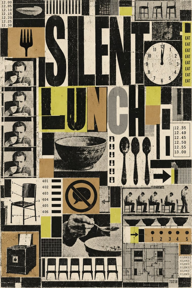
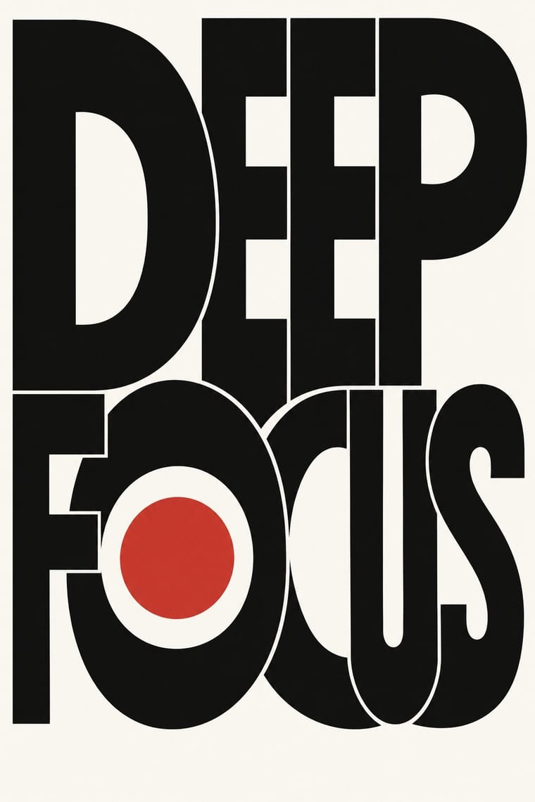
05
More combinations
With Fluxus Graphics
- Punk & DIY Zine Contrasts · Both mix found type with appropriated pictures, but punk tears and photocopies while Fluxus keeps a clean offset black, justified blocks and a tight edge-to-edge grid; use the Fluxus version when cheap materials should still look ordered.
- International Typographic Style Contrasts · Both rely on a sans and a rectilinear grid, but Swiss design spends white space where Maciunas abolished margins and mixed many faces within one name; set the two side by side to decide whether order should breathe or fill.
- Risograph & Indie Print Culture Pairs well · One ink on coloured stock, small runs and editions sent by post: print Fluxus-style cards and box labels on a riso in black on kraft or coloured paper, and let the stock colour change from copy to copy.
- Victorian Letterpress & Wood Type Pairs well · Maciunas took many of his pictures from old engravings in the New York Public Library's Picture Collection; pair a Victorian cut with a plain typewritten label in one sans for the same deadpan collision of old picture and flat text.
- Situationist Détournement Graphics Contrasts · Contemporaries who both took found pictures, but Maciunas packed them into a tight, deadpan black grid of mixed dry-transfer type, while Debord and Jorn scattered fragments under painted ink and aimed the joke at revolution; choose order or drift.
With Phototype Expressive Typography
- Hipster Artisanal Revival Contrasts · Both pair a script with a geometric sans, but the craft badge tracks its capitals wide in a centred one-ink frame, while Lubalin kerns the same pairing until the letters touch and join. Set one against the other to decide whether the letters should breathe or fuse.
- Push Pin Style Pairs well · Push Pin revives old styles through drawn figures and Lubalin through the letters themselves; pair a Push Pin illustration with a swash, tightly kerned Lubalin headline for full 1970s New York warmth.
- Blue Note Jazz Sleeve Modernism Pairs well · Same New York years and the same belief that the title can be the picture; give a Miles-style tinted photograph a Lubalin logotype whose letters touch and interlock instead of a plain blown-up grotesque.
- Emigre & Early Digital Type Contrasts · Both were made by a new type technology; Emigre's bitmap and PostScript faces end the phototype era, so set a Lubalin ligature against a coarse bitmap word to show how the tool shapes the letter.
- International Typographic Style Contrasts · Even spacing, flush-left grotesque and a grid against letters squeezed until they fuse into one centred logotype: put the two side by side to decide whether type should stay neutral or carry the joke.
- Di Tella Graphic Design (Instituto Torcuato Di Tella) Pairs well · Both made the word the picture in the same years; add Lubalin's tight, playful letter-joins to Di Tella's blunt flat-ink title for a headline-led identity.
- Post-Binary Typography (Bye Bye Binary and Inclusive French Type) Contrasts · Both make new meaning by interlocking letters into ligatures, but Lubalin's phototype ligatures are tight-set display wit for headlines and logotypes, while post-binary ligatures carry gender inside the word, in running French text as well as on banners; choose Lubalin for a witty headline, post-binary glyphs when the grammar of the word is the message.
- Vyaz (Ornamental Slavonic Lettering) Pairs well · Lubalin's phototype logotypes also merge neighbouring letters into ligatures and crowd them into a single shape; borrow vyaz's shared stems and nested small letters for a Cyrillic logotype, and keep it to one or two words so it stays readable.